Pensacola Ice Flyers Get Revamped!

For three years, they were the team with — unquestionably — the worst logo and uniforms in all of professional hockey. That all changed on Thursday.

The Pensacola Ice Flyers unveiled a brand new identity that's millions of miles beyond the monstrosity they entered into the world upon joining the Southern Professional Hockey League in 2009.

If you're struggling to remember said monstrosity, allow me to remind you. It was terrible. Objectively terrible, if that's even possible. I'm not sure that thing could actually be considered "design" as we know it. But now it is no more, I'm happy to report.

The Florida panhandle team still has a pretty awful name, but it has meaning to the people of Pensacola and, heck, these phenomenal logos just make the "Ice Flyers" moniker look cooler, if nothing else. This is a definite win in the minor league logo design department. And it may well be the best logo in the SPHL at this point — which, to be fair, isn't exactly saying much.

I'm very excited to see this team recognize the need for a revamp and hire a pro to make it happen. Incidentally, I haven't been able to track down the name of the designer or creative firm. If anyone knows, I'd love to be able to add a link to this post.

Here's a look at the new secondary marks designed for the Ice Flyers.

Certainly playing up the Top Gun theme. I sense some specialty jersey nights in the seasons ahead. All of these elements just look great — at least in comparison to their predecessor.

Anyway, enough gushing from me. Time for you to weigh in. While you put your thoughts together on this new look, I'll leave you with Pensacola's new set of sweaters.

Where Are They Now?

As the year comes to an end, I thought I'd update you guys on a couple of non-NHL related topics that dominated Icethetics in the later part of this year.

The USF Ice Bulls hockey club team came to Icethetics in August, looking for a new logo to get out from under the thumb of a fee-hiking university. Dozens of artists sent in amazing concepts. But only one could be chosen — designed by Gary Cekus.

Ice Bulls goalie maskGary's design has since been implemented on the club's home jersey as well as the mask of the starting goalie.

I had to get this picture posted — not just because the goalie happens to be my brother — but because this is an awesome mask design that came as a direct result of an Icethetics contest!

The mask was designed by Todd Miska of Miska Designs, who is responsible for the artwork that adorns the helmets of such NHL goaltenders as Ed Belfour, Miikka Kiprusoff and Evgeni Nabokov.

Now he's put his touch on the University of South Florida's team and that could not be more amazing. I highly recommend checking out some of Todd's other work on his web site.

Ice Bulls home jerseyThe Ice Bulls' white home jersey also features the Icethetics contest-winning logo but unfortunately the team didn't have a lot of time to put together the best overall design.

As you can see here, they've used the Dallas Stars' road sweater, which is rather lacking in color. And while the crest logo may be a little small, they are planning to fix that for the 2010-11 season.

The road black jersey is custom-designed with the word BULLS spelled out diagonally across the front and does not feature the new logo.

For more game and team photos, check out the Ice Bulls' photostream on Flickr.

Another big non-NHL story in 2009 was the controversy surrounding the logo selection of the SPHL's expansion franchise Pensacola Ice Flyers.

It yielded quite a bit of outrage — perhaps mostly from me — as the club announced a logo design contest then ignored the voting results right after.

Ice Flyers road jerseySo after choosing to brand themselves with the worst logo in minor league hockey, how are the Ice Flyers looking these days? Glad you asked. 

To the left you can see the jersey they had designed. Just as horrible as we all expected. It's dark blue with a lot of white and gold accents — including planes shooting across the bottom. We get it, your town is home to the Blue Angels.

The jersey is finished off with what is surely an iron-on logo on the chest. Have fun trying to embroider gradients.

Ice Flyers in home whitesHere's a look at the home whites. Not quite sure what's going on at the bottom there. But it's definitely not the same as what's on the dark jerseys.

I hate to sound so mean-spirited toward the Ice Flyers. I'm actually not even bothered that much, but I was a little disappointed to see the mess they made here. Especially when they started out with such great options in that online poll. 

Ice Flyers in their camosFor what it's worth, the atrocities don't end with the home and road sweaters. They're all about the specialty jerseys as well. And being in a big military market, it's not hard to understand why camouflage jerseys made an appearance at one point this season.

If you want to see some more low-resolution game action photos, you might want to check out their web site. But all I can say is it's probably not worth your time.

I'm sure I've missed an update here or there, but this is all I have time to type at the moment. Have a great night and see you in 2010!

Friday Variety

I'm normally not one to complain, but if you guys knew the week I've had in terms of technology fails, you'd sit down on the floor and cry. I mean grown men. On the floor. Sobbing. It's been that bad.

Only now do I finally have my new wireless router cooperating with my new MacBook Pro — and I say that with fingers crossed. Without going into boring details, the bigger problem with all of this was that every time something stopped working, it meant spending what little free time I had fixing it.

But I'll be back this weekend making loads of updates across the site. A lot has been going ignored while I was troubleshooting — concept art, logo news, and yes, the IceHL.

Live Chat Returns This Weekend

The first thing I want to mention is that I'm bringing back the Live Chat! We haven't done one of those since last November. It's well overdue. I don't have an exact time, but I'll let you know when I do. It'll probably be Saturday afternoon. I'll post a reminder in the sidebar as well as make an announcement on Twitter.

We can talk about whatever you guys want. I'm also going to use it as a platform to unveil the IceHL's New York Guardians logo. It was a tight race. Drop by if you want to hang out and chat. I'll also answer any questions you may have.

Twitter Mailbag Moves

This week only I'm moving the Twitter Mailbag to Saturday. There were a lot of great questions and mentions this week that I want to talk about, but I want to get to some other stuff today. So if you'd like to tweet any questions, now is your chance. Be sure to include @icethetics.

Wolf Packs Wants Your Jersey Designs

In case you missed it, the AHL's Hartford Wolf Pack are holding a fan jersey design contest.

After a very successful first year, the Wolf Pack Specialty Jersey Design Contest is back! We had hundreds of great entries last year and had a blast choosing the winner. Be creative and have fun because we loved all the different ideas that fans had. The winner of this year’s contest will receive a personalized jersey of their design along with tickets to see them worn by the team! During the TBA game, the jerseys will be auctioned right off the player’s backs! This year’s auction raised over $10,000, which benefited the March of Dimes organization.

On their web site, the Wolf Pack has a jersey template you can download and the email address you need to send your artwork to. Fans have until September 1 to get their entries in.And if you want instant gratification, send your design to Icethetics at the same time and it may just show up on the site.

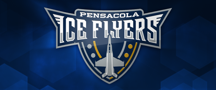
Following Up on the Ice Flyers

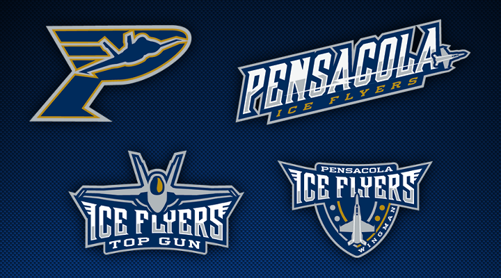
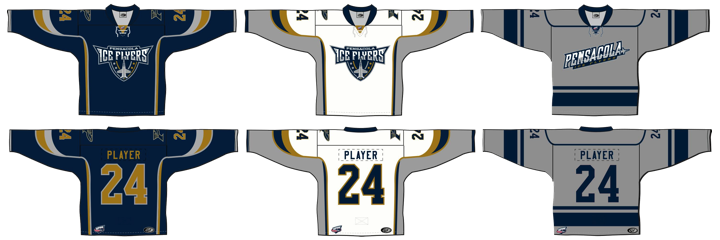
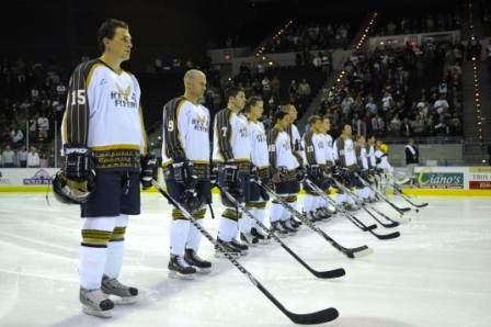
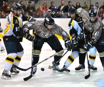
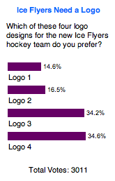
The SPHL's newest member, the Pensacola Ice Flyers, unveiled their coma-inducing logo two weeks ago at a fan event in north Florida. I had some comments.

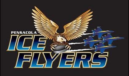
Now we have "official" word from the team on why they went with the logo with the fewest votes in an online poll — the worst one. Via Twitter, Icethetics reader Mike posed the following question to the minor league club.

mburmy @PcolaIceFlyers I know the poll was for 'entertainment only,' but WHY did you HAVE to use the LAST-place entry?"

To which the Ice Flyers' Twittermaster replied:

PcolaIceFlyers @mburmy Thanks for the comments... there were some copyright concerns and it was the best logo to modify and adapt for our use.

I buy the first part. Copyright issues are always a concern when you ask fans to design things. However, it was "the best logo to adapt for our use"? Seriously? I think I should just not talk about it anymore. At least now we have some closure on the subject.

Concept Art

My inbox tells me you guys have been longing for the return of concept art to the site. I had hoped the IceHL would fill that void. Yet all of that is artwork that's been floating around for months. So I am aiming to bring the occasional concept post back to the site via the Concepts section, accessible at the top of the page.

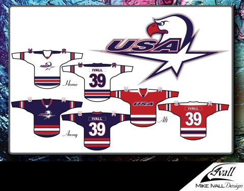
Until I can make time for that, I'll give you something here. When USA Hockey announced it would be unveiling new Olympic jerseys later this month, I asked you guys to send in your own concepts. Here is one by Mike Ivall.

I've also got a bunch more Ducks third jersey concepts. I'll either make a new post on the Concepts blog with all of them or I'll start posting them on Twitter — which is easier for me. Which do you guys prefer?

Anyway, I think I've taken up enough of your time with this post. Got any questions or comments? You know where they go.

Ice Flyers Unveil Logo... Ugh!

At my hands journalism takes a beating tonight, but I have to editorialize. Rarely do I feel the need to opinionize (new word), yet evil happens when good men sit idly by. And even when they don't, evidently.

The Pensacola Ice Flyers shocked probably no one but me when they unveiled their new logo earlier tonight. They did so before a small gathering of North Florida hockey fans and supporters celebrating the return of the sport to their town.

The Southern Professional Hockey League is expanding this season by adding the Ice Flyers along with the Mississippi Surge. They shouldn't have bothered. The following symbol will represent this team.

Ice Flyers' new logo

All right, by now you get my outrage, so I'll get back to my journalistic roots now.

Coach Todd Gordon and owner Tim Kerr (photo: Ben Twingley)

The Pensacola News Journal was there with Ben Twingley providing photographic evidence. Team owner and former Philadelphia Flyer Tim Kerr chatted to fans at the event alongside head coach Todd Gordon. Gordon wore the snazzy new shirt but Kerr did not. SPHL commissioner Jim Combs was also in attendance.

Two questions. 1) What did they do? 2) Why are they so happy about it? Damn, I switched back into editorial mode. All right, I know the answers. They sold enough ticket packages to bring hockey back this season and they're hockey fans so they're very excited about that. But honestly, I can't get over the logo.

Two weeks ago, the News Journal posted a poll which I wrote about here on Icethetics. It asked readers which of four logos they preferred. You can see the results here to the left. For reference, "Logo 1" is what's been plastered on the above shirts.

It finished with about 440 out of 3,011 votes. I know the poll was meant "for entertainment purposes only" but Kerr can't take a hint. Two of the logos each grabbed more than a third of the vote and they've been discarded. To see all four logos, click on the graphic.

Once again my strong feelings have emerged. So why do I feel this way? I think it's important that what represents hockey represents it well. This logo does not accomplish that. It was a missed opportunity. I feel bad for Six Zero and the other designers whose superior work was overlooked.

If the gradients, pedestrian typeface, and all-around clip-art feel of the design weren't bad enough, it seems they can't even decide how to properly symbolize the name Ice Flyers. Is it the Blue Angels or an eagle? They clash. Pick one.

I eagerly await the uniform unveiling to see what they're going to do. I literally couldn't begin to guess. It sounds crass, but it wouldn't surprise me to see them print up 20 of these logos on their ink-jets and glue them to jerseys.

Again, a missed opportunity here if you ask me. Anyone agree? Anyone disagree? The floor is yours.

Around the Minors

I've actually got a lot to talk about on this Friday, including a few minor league-relating items.

We'll begin with a shoutout to PuckDrawn, with a first look today at the new uniforms of the IHL's Quad City Mallards. Icethetics first took you "quack to the future" with the unveiling of the team's new logos back on July 1. Now see them on the jerseys.

Mallards unveil uniforms (via PuckDrawn)

You can see the home, road an alternate sweaters being modeled here. A little shockingly, those neon greens are not the third jerseys. So they're going to see a lot of ice time this year. The Mallards also made available the lowest quality images ever of the designs.

Typically, we like these images to be larger for the purpose of seeing the detail of the design. But we'll live. One thing worth noting is that the green in this image and the actual green of the jersey look nothing alike. I like the one shown here better.

It also appears that the alternate sweater in the photo is dark blue while seeming to be black in the following image. Not sure which one is playing tricks on my eyes.

Next, we move on to another obscure minor league — the SPHL. On Wednesday, the Pensacola Ice Flyers announced they have sold enough ticket packages to be able to field a team this season. Now it's time for a real web site. But that also means they need a logo.

This morning I checked back in on the poll being conducted by the Pensacola News Journal. Much to my disappointment, SixZero's design (Logo 3) has fallen behind option 4. After 2,776, Logo 4 is ahead with 35% of the vote, just three percentage points ahead of SixZero. Normally, I'd tell all of you to get over there and get voting, but this isn't for us, it's for hockey fans in North Florida. If that's what they want, that's what they get.

However, the poll, which began on July 17, indicates no end date. Therefore, there's no way to know when the Ice Flyers club will make its decision with regard to the team's logo. So I will keep an eye out for that and keep you all updated.