
Ice Flyers Unveil Logo... Ugh!
/At my hands journalism takes a beating tonight, but I have to editorialize. Rarely do I feel the need to opinionize (new word), yet evil happens when good men sit idly by. And even when they don't, evidently.
 The Pensacola Ice Flyers shocked probably no one but me when they unveiled their new logo earlier tonight. They did so before a small gathering of North Florida hockey fans and supporters celebrating the return of the sport to their town.
The Southern Professional Hockey League is expanding this season by adding the Ice Flyers along with the Mississippi Surge. They shouldn't have bothered. The following symbol will represent this team.
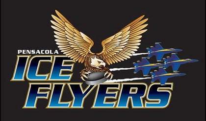 Ice Flyers' new logo
All right, by now you get my outrage, so I'll get back to my journalistic roots now.
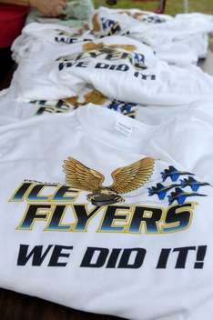
 Coach Todd Gordon and owner Tim Kerr (photo: Ben Twingley)
The Pensacola News Journal was there with Ben Twingley providing photographic evidence. Team owner and former Philadelphia Flyer Tim Kerr chatted to fans at the event alongside head coach Todd Gordon. Gordon wore the snazzy new shirt but Kerr did not. SPHL commissioner Jim Combs was also in attendance.

Two questions. 1) What did they do? 2) Why are they so happy about it? Damn, I switched back into editorial mode. All right, I know the answers. They sold enough ticket packages to bring hockey back this season and they're hockey fans so they're very excited about that. But honestly, I can't get over the logo.
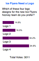 Two weeks ago, the News Journal posted a poll which I wrote about here on Icethetics. It asked readers which of four logos they preferred. You can see the results here to the left. For reference, "Logo 1" is what's been plastered on the above shirts.
It finished with about 440 out of 3,011 votes. I know the poll was meant "for entertainment purposes only" but Kerr can't take a hint. Two of the logos each grabbed more than a third of the vote and they've been discarded. To see all four logos, click on the graphic.
Once again my strong feelings have emerged. So why do I feel this way? I think it's important that what represents hockey represents it well. This logo does not accomplish that. It was a missed opportunity. I feel bad for Six Zero and the other designers whose superior work was overlooked.
If the gradients, pedestrian typeface, and all-around clip-art feel of the design weren't bad enough, it seems they can't even decide how to properly symbolize the name Ice Flyers. Is it the Blue Angels or an eagle? They clash. Pick one.
I eagerly await the uniform unveiling to see what they're going to do. I literally couldn't begin to guess. It sounds crass, but it wouldn't surprise me to see them print up 20 of these logos on their ink-jets and glue them to jerseys.
Again, a missed opportunity here if you ask me. Anyone agree? Anyone disagree? The floor is yours.