May Minor League Report

All this work on the IceHL's 13 Weeks of R&R project has kept from doing my real job on Icethetics — updating the blog with actual news. In other words, there's a lot to catch up on.

Hartford Wolf Pack officially return to AHL

Well that didn't take long. After playing parts of three seasons as the Connecticut Whale, the Hartford Wolf Pack identity has made a glorious comeback — thanks to their NHL parent club, the New York Rangers.

The Wolf Pack were established in 1997 when the Binghamton Rangers moved to Hartford. Then in 2010, Howard Baldwin happened. His effort to recapture Hartford Whalers failed miserably with the rebranding of the franchise as the Connecticut Whale.

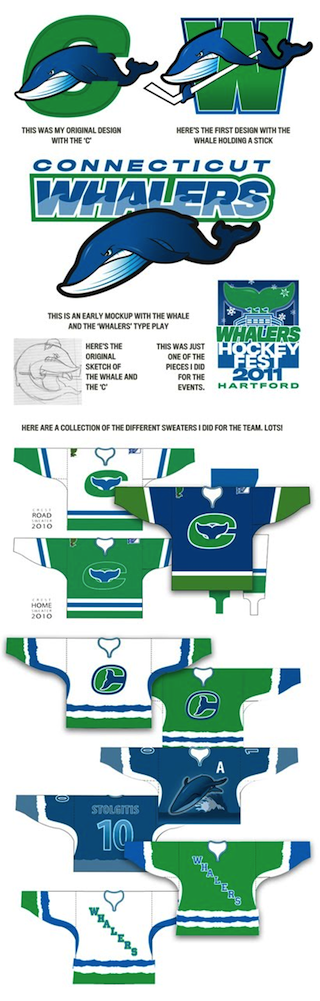
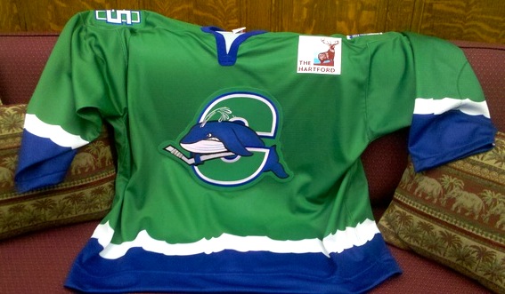
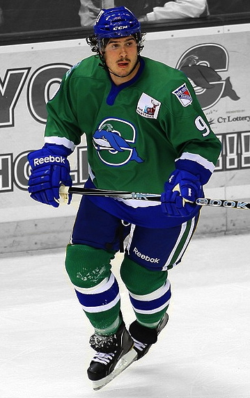
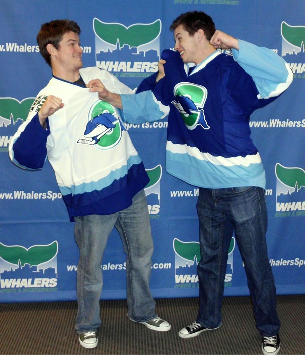
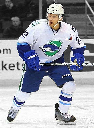
Connecticut Whale, 2010—2013

We applauded the judicious use of green but not the name or the terrible logo. Within two years, Baldwin was gone — which probably says more about his management style than his taste in sports branding. But we're all grateful nonetheless that the Pack is back.

And not for nothing, but the New York Rangers' AHL affiliate is now operated by the parent company of the Philadelphia Flyers, is it not? Global Spectrum is running things these days and it would seem they have two masters. Interesting.

The Rivermen are dead, long live the Rivermen

Speaking of the AHL, some craziness took place on Monday. The Vancouver Canucks who recently acquired the Peoria Rivermen franchise from the St. Louis Blues, announced the team would not operate out of Illinois next season. They don't know where exactly yet. Just not Peoria.

So it seemed the end of a brand that has existed for nearly 30 years. But the Rivermen are plucky. They won't go quietly. After 12 years in the IHL between 1984 and 1996, the franchise transferred to the ECHL for about a decade. Then in 2005, they got the upgrade to the AHL. In 2013, they move down — way down — to the SPHL, that's the Southern Professional Hockey League. (It exists!)

The SPHL is home to teams like the equally plucky Columbus Cottonmouths and the Pensacola Ice Flyers. And now it's also home to...

Bloomington Blaze switch from CHL to SPHL

The Bloomington Blaze are jumping the sinking ship that is the Central Hockey League for the equally crummy SPHL. A lateral move at best. But one they apparently feel is necessary.

The Blaze were founded just two years ago after the folding of the IHL's Bloomington PrairieThunder. (All these minor leagues you've probably never heard of.) They begin play in their new league this fall.

Now that we're on the CHL, we might as well talk about their newest expansion team.

Brampton gets Beast to replace lost OHL team

Earlier this year when we learned the OHL's Brampton Battalion were moving to North Bay, Ontario, it seemed like the good people of Brampton would be without a team. But that's when the Central Hockey League jumped in, expanding into Canada for the first time.

On April 27, the Brampton Beast were revealed to the world. Along with a very vanilla CHL-like logo. I won't pass judgment too hard since somebody was obviously trying. (I just don't know what they were trying for.) In any case, the Beast begin play in the fall. Like Peoria, hockey fans of Brampton won't miss a beat.

For the record, the North Bay Battlion also begin play in the OHL this fall. They will keep the same logo they had in Brampton.

Confirmed: Wolf Pack Coming Back

It was first speculated two months ago. Now multiple sources are reporting that the AHL's Connecticut Whale will once again become the Hartford Wolf Pack next season.

The news turned up online Tuesday morning, via WTIC's Scott Gray, who cited team sources saying the league has approved the name change. Later, the Hartford Courant said Connecticut Wolf Pack was a possibility for the club's rebranding, but the Bridgeport Sound Tigers didn't like the idea.

Apparently an official announcement could be coming within a week.

Neither report was clear on whether they'd also go back to the old Wolf Pack logo, created in 1997 with the team's arrival from Binghamton, New York. But if you ask me, they'd be insane not to. (It was on my list of the best AHL logos last year.)

What do you think of the imminent return of the Wolf Pack?

Connecticut Whale to Be No More?

Silly name and logo could soon be gone

It sounds too good to be true, but just three years after the Connecticut Whale brand was introduced, it may be disappearing, according to the Hartford Courant.

With Howard Baldwin no longer at the helm and new ownership in the picture, there's the possibility the franchise could revert to its previous (better) identity — the Hartford Wolf Pack. The article isn't specific about when the change would happen, but I'm hoping they don't do another midseason rebranding.

Evidence indicates return of Hartford Wolf Pack brand

Here's some of what writer Paul Doyle had to say on the matter — and why he thinks the Wolf Pack could be staging a comeback:

The Connecticut Whale brand was created by Howard Baldwin's Whalers Sports & Entertainment in 2010 and that company no longer runs the business side of the franchise, although it allowed current XL Center operator AEG to use the name and logo this season. The franchise is owned by MSG, but Global will run the team's day-to-day operation in Hartford and handle the marketing.

Unless MSG and Global decide to work out an agreement with WSE, the team's name will likely change. The team could return to the Hartford Wolf Pack, the name of the franchise from 1997 until it was re-branded in 2010. MSG has kept the brand alive by retaining uniforms and has even renewed the hartfordwolfpack.com domain name, updating data base information on the domain name Saturday.

Another possibility is to simply call the team the Rangers — Hartford or Connecticut preceding the name — although that could be a public relations risk. Returning to the Wolf Pack would be simple, especially with the still visible around the team and the XL Center.

The activity with the domain name is interesting. Why keep it if you have no intention of using it again? Plus, we all know the Connecticut Whale name and logo are just dumb.

I'm rooting for the Wolf Pack!

Whale Tale Gets Even Worse

Original artwork / Scott JohnsonThis is one of those stories that, as a creative professional, I can only shake my head at.

Earlier this month I wrote a post called Timeline of a Connecticut Fail — referring to the AHL's Connecticut Whale. As has been made clear, I'm not a fan of the team's recent rebranding efforts. And I'm not alone.

We felt like we were sold a bill of goods, thinking the spirit of the Hartford Whalers was actually coming back. Because that's what we were told.

But we were lied to. First it was the name. Then it was the logo. And now we find out that very logo may have been outright stolen without even bothering to credit the original artist.

Graphic designer Scott Johnson outlined his treatment by Howard Baldwin & Co. on his personal blog. It's staggering, to be honest.

When the new group wanting to bring Whalers hockey back to Hartford was in town, that colleague connected them with me. What a chance for me — creating a uniform for the team in Hartford!

Things went pretty well in the process at first. Lots of back-and-forth of what they wanted, lots of sketching, designs, and artwork. I thought we were going great — I did what they asked and more, and they used almost all of the work I did. The thing is, they just didn't appreciate it enough to pay for it.

The worst part for me wasn't the lack of payment, it was that another artist was allowed to take credit for my work — with the Whale's blessing. ... It's disappointing and unfortunate.

That's putting it awful mildly.

This is a huge thing that he is accusing this team of doing. And rather horrible too.

Despite having expressed my disappointment with the final product, I must admit I actually like Scott's original artwork. The whale is still a bit goofy, but he was following instructions he was given. Still, some of those jerseys are outstanding.

The "C" with the whale tail protruding in from the side is spot on. I'm not a fan of the wavy stripes, but as a logo it's perfect if what you want is to recall the spirit of the Whalers.

Anyway, we all have our own opinions on what looks good and what doesn't. But I think we can all agree that logo theft is completely unacceptable in every way. This goes beyond disappointing and unfortunate.

The sad thing is, it's not a rare event. Just this week our friends at PuckDrawn reported on a USHL team that purchased a logo design it had no idea was stolen — from a PuckDrawn concept competition.

These are minor league and junior teams, yes, but they still sell merchandise to turn a profit just like the pros. To see them stealing from talented artists is just repulsive and illegal.

Short of putting an end to displaying much-loved concept art on Icethetics, I wish there was something we could do to stop it. Just have to keep an eye out for thieves, I guess, and make their transgressions as public as possible.

Timeline of a Connecticut Fail

On Tuesday afternoon, something terrible happened in New England. The AHL's Connecticut Whale unveiled two more jerseys and we were all a little worse off for having seen them.

This story started earlier this year, when the American Hockey League franchise formerly known as the Hartford Wolf Pack assigned marketing duties to Howard Baldwin. How excited we all were by the prospect of resurrecting the Whalers moniker and colors, as Baldwin had proposed.

Even if it was in the minors. And even if it was with Baldwin at the helm. How naïve of us.

Readers were left with no option but to invent new words to express their disappointment. On Sept. 29, this logo (left) was unveiled much to chagrin of anyone with aesthetic taste, along with the name: Connecticut Whale. Uh, didn't you forget the 'S'? we all wondered.

We were indeed horrified by the name and the logo's complete lack of artistic competence. It's a pathetic cross between clip art and something a teenager might draw on a notebook. It really is that bad. And on the day it was unveiled, Icethetics readers were left with no option but to invent new words to express their disappointment.

"It's horr-awful," Connor Hanley commented, "my eyes are bleeding."

On Nov. 24, it got horr-awfuler when a picture of the team's new sweater hit the web.

Connecticut Whale unveil green jerseyYou might say the one saving grace to the new mark would be its use of the tail shape from the original Hartford Whalers logo. But I say that just tarnishes the memory of one of the best logos in the history of professional hockey.

And I do understand the value of marketing to children and the idea of giving a mascot a fierce face, but some teams do it well (Chicago Wolves). Some do not.

If it sounds like I'm being harsh, let's be honest, they kind of deserve it. I get we're talking about the minors here, but it's still professional hockey. Just one rung down from the NHL.

Brodie Dupont / photo by Chris RutschTwo days after the "unveiling," the players hit the ice for the first time as the collective "whale." They skated out wearing green — and not Reebok Edge. This was obviously a rushed job.

Any time a decision is made to fundamentally change a team's identity in the middle of a season, you know things are going to be overlooked. You wouldn't think, however, that would be the jerseys. But Reebok couldn't deliver on time.

Since the forthcoming blue and white home and road jerseys were not ready for game use, the team made its debut in a third jersey, of all things. And actually, I liked it on the ice. Right up until I saw the crest and took a closer look at the stripes.

The green and blue make a fantastic combination on a hockey uniform, one we could really use more of it in the NHL. However, the logo, a topic we've put to bed by now, is bad. And the stripes? Really look at them. Foamy waves?

One could only hope the regular home and road sweaters would be an improvement. After all, how could they not be?

That brings us back to Tuesday, when the new Reebok Edge jerseys were finally revealed to us.

Players model new Whale sweatersJared Nightingale and Lee Baldwin were on hand to model the new sweaters for the media. Perhaps this picture (left) from the Whale's website says the most.

While some might see a silly pose meant to highlight the sport's more physical nature, I see it another way. I see two players scrambling to help each other remove the awful sweaters that have been forced on them.

It's really more altruistic and friendly than it looks.

Seriously, though, I think all of this can be summed up in one succinct tweet by @gonzotherooster:

Nigel Williams modeled the green Whale jersey and got traded. Lee Baldwin modeled the blue jersey and got sent to the ECHL. I see a pattern.

The white jersey made its debut in a pair of home games over the weekend.

Ryan Garlock / photo by Chris RutschIt's just not good. And where did the baby blue come from? No chance we could get some green in the socks or the sweater itself? It's like the Vancouver Canucks with green all over their uniforms but not to be found in the primary logos.

And I hate to keep beating a dead horse, but that is just a terrible logo. Almost any Icethetics concept artist could improve it, and most are not professionals.

In fact, let's do a contest. Who can create the best logo for the Connecticut Whale? Email in your work and I'll make it the next post on the Concepts page.

By the way, great game photos from Chris Rutsch. If only the team gave him something a little better to photograph. You can find more pics on the Whale's Facebook page.

The next road game is Wednesday, so I'm guessing that will bring the debut of the blue sweater. Not that anyone here will be clamoring to see it in action.

One more thing.

Back on that Sept. 29 post, Dave Delisle added, "Some will call it the 'Connecticut Fail' eventually."

Why put off the inevitable?