
Timeline of a Connecticut Fail
/On Tuesday afternoon, something terrible happened in New England. The AHL's Connecticut Whale unveiled two more jerseys and we were all a little worse off for having seen them.
 This story started earlier this year, when the American Hockey League franchise formerly known as the Hartford Wolf Pack assigned marketing duties to Howard Baldwin. How excited we all were by the prospect of resurrecting the Whalers moniker and colors, as Baldwin had proposed.
Even if it was in the minors. And even if it was with Baldwin at the helm. How naïve of us.
Readers were left with no option but to invent new words to express their disappointment. On Sept. 29, this logo (left) was unveiled much to chagrin of anyone with aesthetic taste, along with the name: Connecticut Whale. Uh, didn't you forget the 'S'? we all wondered.
We were indeed horrified by the name and the logo's complete lack of artistic competence. It's a pathetic cross between clip art and something a teenager might draw on a notebook. It really is that bad. And on the day it was unveiled, Icethetics readers were left with no option but to invent new words to express their disappointment.
"It's horr-awful," Connor Hanley commented, "my eyes are bleeding."
On Nov. 24, it got horr-awfuler when a picture of the team's new sweater hit the web.
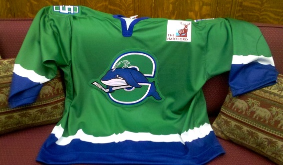 Connecticut Whale unveil green jerseyYou might say the one saving grace to the new mark would be its use of the tail shape from the original Hartford Whalers logo. But I say that just tarnishes the memory of one of the best logos in the history of professional hockey.
And I do understand the value of marketing to children and the idea of giving a mascot a fierce face, but some teams do it well (Chicago Wolves). Some do not.
If it sounds like I'm being harsh, let's be honest, they kind of deserve it. I get we're talking about the minors here, but it's still professional hockey. Just one rung down from the NHL.
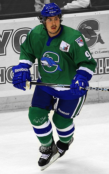 Brodie Dupont / photo by Chris RutschTwo days after the "unveiling," the players hit the ice for the first time as the collective "whale." They skated out wearing green — and not Reebok Edge. This was obviously a rushed job.
Any time a decision is made to fundamentally change a team's identity in the middle of a season, you know things are going to be overlooked. You wouldn't think, however, that would be the jerseys. But Reebok couldn't deliver on time.
Since the forthcoming blue and white home and road jerseys were not ready for game use, the team made its debut in a third jersey, of all things. And actually, I liked it on the ice. Right up until I saw the crest and took a closer look at the stripes.
The green and blue make a fantastic combination on a hockey uniform, one we could really use more of it in the NHL. However, the logo, a topic we've put to bed by now, is bad. And the stripes? Really look at them. Foamy waves?
One could only hope the regular home and road sweaters would be an improvement. After all, how could they not be?
That brings us back to Tuesday, when the new Reebok Edge jerseys were finally revealed to us.
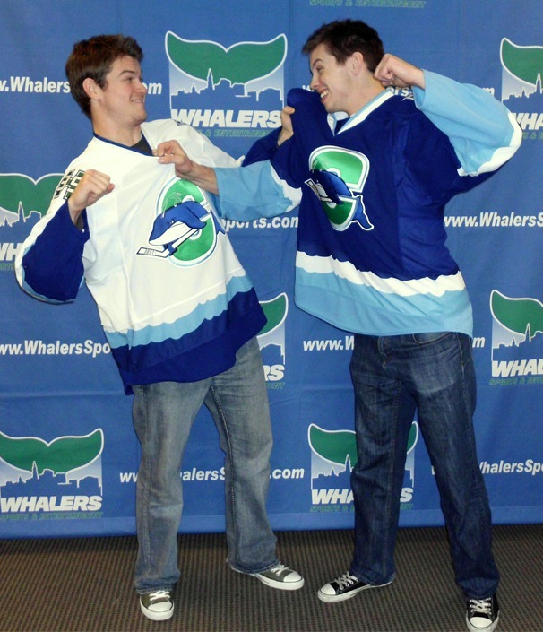 Players model new Whale sweatersJared Nightingale and Lee Baldwin were on hand to model the new sweaters for the media. Perhaps this picture (left) from the Whale's website says the most.
While some might see a silly pose meant to highlight the sport's more physical nature, I see it another way. I see two players scrambling to help each other remove the awful sweaters that have been forced on them.
It's really more altruistic and friendly than it looks.
Seriously, though, I think all of this can be summed up in one succinct tweet by @gonzotherooster:
Nigel Williams modeled the green Whale jersey and got traded. Lee Baldwin modeled the blue jersey and got sent to the ECHL. I see a pattern.
The white jersey made its debut in a pair of home games over the weekend.
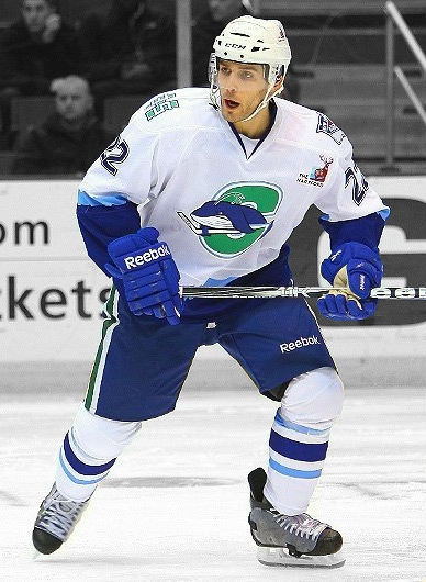 Ryan Garlock / photo by Chris RutschIt's just not good. And where did the baby blue come from? No chance we could get some green in the socks or the sweater itself? It's like the Vancouver Canucks with green all over their uniforms but not to be found in the primary logos.
And I hate to keep beating a dead horse, but that is just a terrible logo. Almost any Icethetics concept artist could improve it, and most are not professionals.
In fact, let's do a contest. Who can create the best logo for the Connecticut Whale? Email in your work and I'll make it the next post on the Concepts page.
By the way, great game photos from Chris Rutsch. If only the team gave him something a little better to photograph. You can find more pics on the Whale's Facebook page.
The next road game is Wednesday, so I'm guessing that will bring the debut of the blue sweater. Not that anyone here will be clamoring to see it in action.
One more thing.
Back on that Sept. 29 post, Dave Delisle added, "Some will call it the 'Connecticut Fail' eventually."
Why put off the inevitable?