
Florida Panthers unveil new logos, uniforms
/
The highly anticipated new look of the Florida Panthers was officially unveiled to the world today!
It confirmed the Uni Watch leak from April and lined up nicely with the descriptions offered up by beat writer George Richards dating back to December.
There's so much to discuss but I'll hit the highlights in this post and circle back for a more in-depth review after an interview with Panthers owner Vincent Viola.
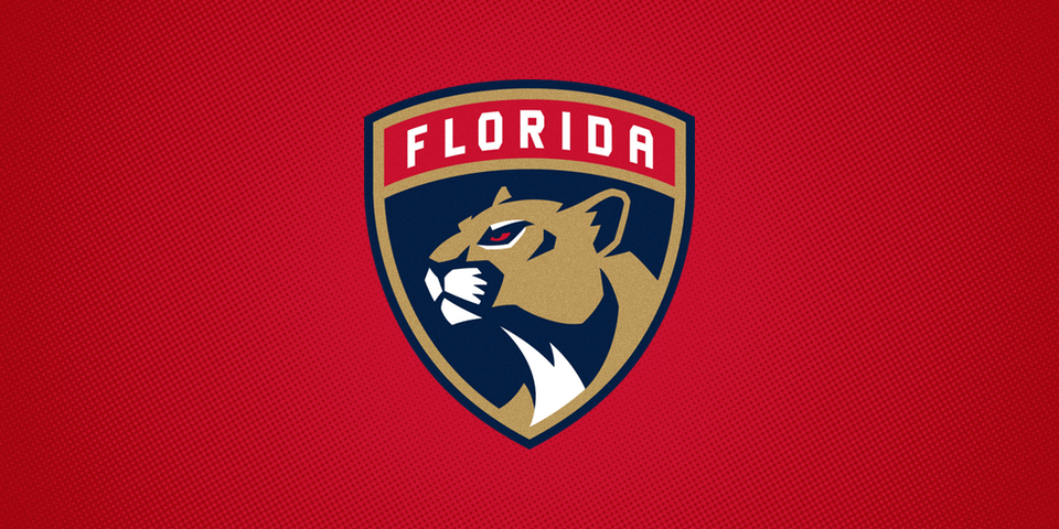
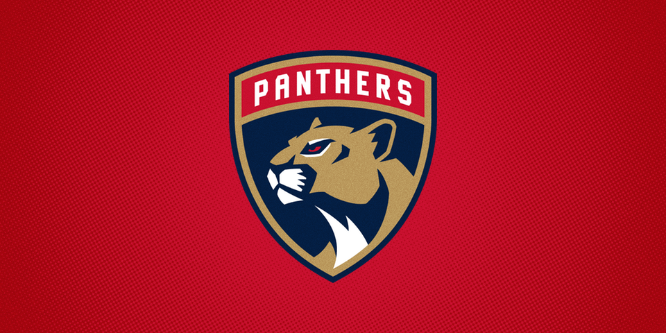
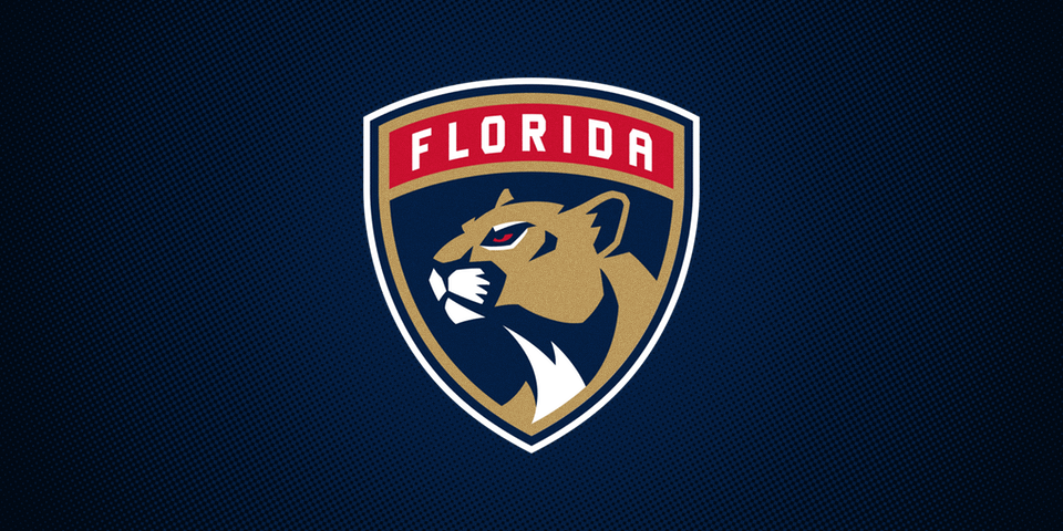
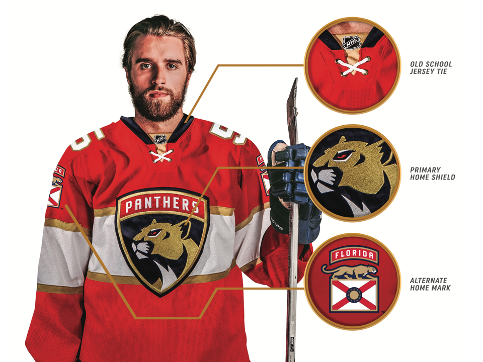
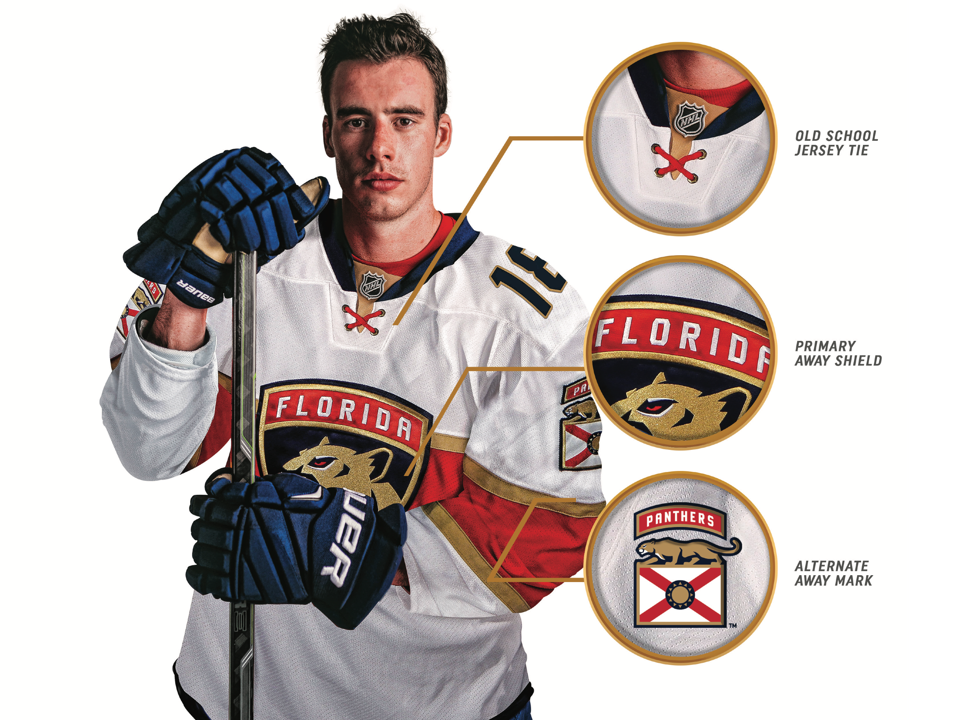
First, the new primary and secondary marks come with lots of version as you can see above. The primary for the road jersey is labeled "FLORIDA" with the home sweater crest labeled "PANTHERS" across the top. And neither version utilizes a white outline unless it's on a blue background.
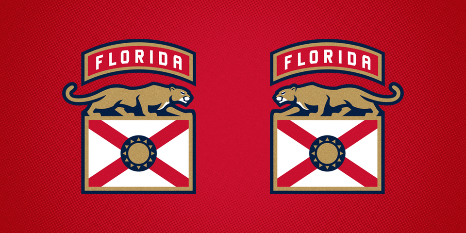
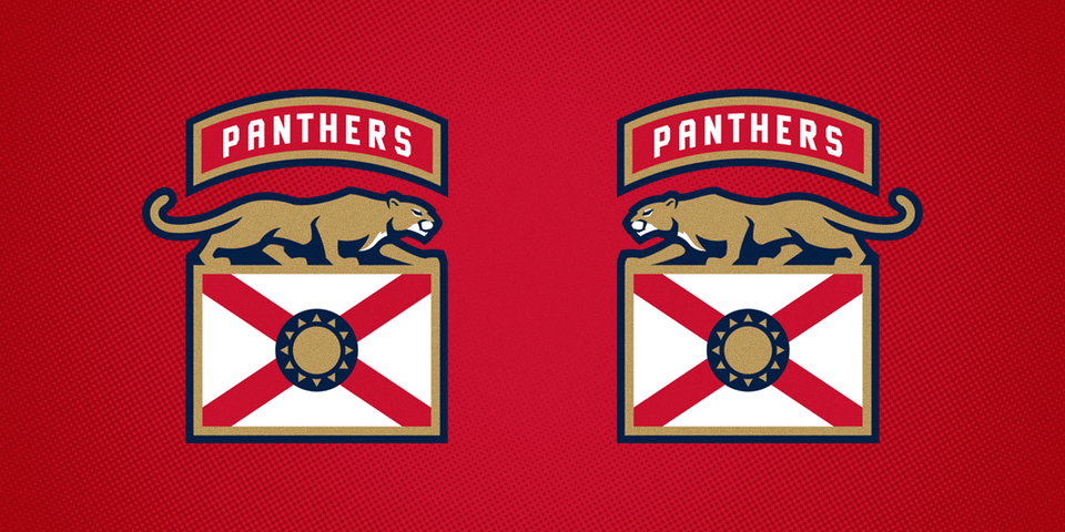
Then there's the secondary mark and sleeve patch which pictures a prowling panther atop a simplified version of Florida's state flag — a gold sun replaces the seal in the center — under a banner that reads "FLORIDA" for the home jersey and "PANTHERS" for the road sweater. If you find it difficult to remember, it's just the opposite of what's on the crest.
But of course the panther on the patch needs to be pointed forward no matter which sleeve you're looking at, so there's a version where he's facing right and a version where he's facing left — a different patch for each sleeve on each jersey, essentially.
Speaking of the jerseys, take a look.
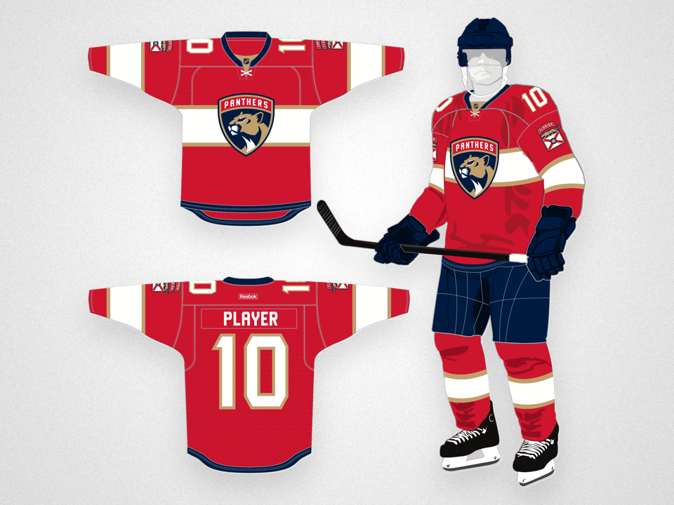
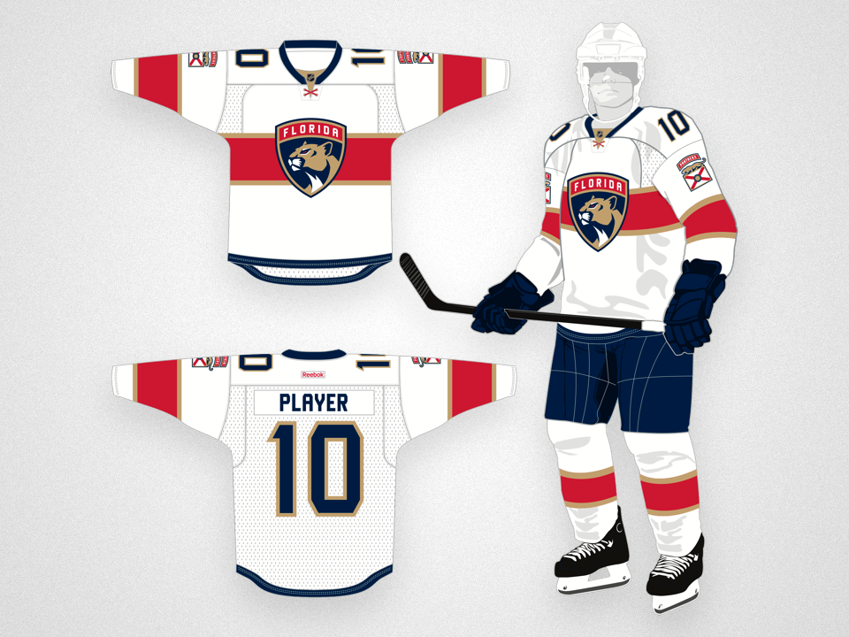
Note the sleeve numbers have been shifted to the top of the shoulders, switching places with the patch on the sleeve. We saw that number positioning this past season on the Edmonton Oilers' orange throwback jersey but these are really the only two instances I can recall. Will it become a trend in NHL sweaters?
During the unveiling, Viola's son John pointed out that the jersey tie on the collar is crossed as a subtle nod to the design of the state flag — it's more obvious on the white sweater where the tie is red, like the flag stripes.
The Panthers have also instituted a completely new type design for the back.
Luckily, the large stripe across the chest on which the crest sits, does not wrap around to the back of the jersey. That definitely makes the numbers easier to read.
But what's not as easy to read and what's also perhaps the most unique aspect of these sweaters are the captains' patches. Forget a simple "C" or "A" on the chest.
The word "captain" or "alternate" is positioned above the sleeve patch on the left shoulder. The military insignia inspiration is most clear with this feature.
My favorite part of this new identity, however, is its veneration for what came before.
The fact is, there was nothing really wrong with what is now the old logo. It was difficult to embroider, I get that. But that problem has been solved with this simplification of the original design — not unlike what the Nashville Predators did in 2011. But looking at all of these new marks together, I don't blame the team for going with the new shield design as the primary.
That said, don't be surprised if this one turns up on a third jersey in the not too distant future.
The new look of the Panthers is sharp! I really like it. And I'm a diehard Tampa Bay Lightning fan, so that's tough to admit. After this week don't expect me to utter anything like that ever again.
I'll aim to have a more complete review posted within the next week featuring more background on the design process. For now, what's your take on the new Florida Panthers?