Submission Criteria

Concept art is accepted via email. The following criteria is not required for submission, but it will help get your work posted sooner.

Preferred file type
PNG with transparent background

Image dimensions
960 x 600 pixels

Use your own original artwork. Don't steal from others. Borrowing NHL team logos to demonstrate a concept is acceptable.

Icethetics branding elements will be added to your submission before posting. If you would like to discuss an alternative method of presentation, that can be arranged.

Featured Artists
If your work has been featured on this page and you would like to make any revisions based on reader feedback, you are welcome to do so. I can add your revised work to the original post.

Twitter
Saturday
Feb232013

0371: Waddell's Winter Classic, Finale

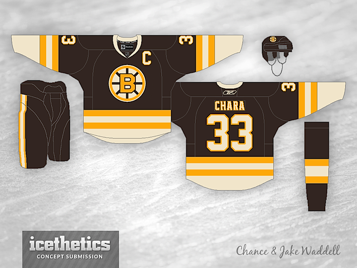
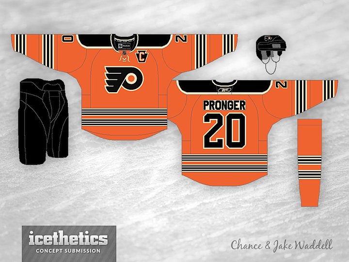
Love it or hate it, this is the end of the Winter Classic series brought to you by the Waddell brothers, Chance and Jake. They created mock throwbacks for all 30 teams. And today, we wrap it all up with the Bruins and Flyers — opponents in the real NHL Winter Classic in 2010.

With this sub-series complete, we have a handful of unique and varied Winter Classic concepts to come over the next few weeks. If you have an idea for a design, send it along!

« 0372: Cleveland Carp | Main | 0370: More Monochromatic Isles »

Reader Comments (5)

Great Work you guys! This series was fantastic!
I hope to see more concepts from you two.

Feb 23 · 9:31 AM PST | Registered CommenterZack Paps

Love the Boston jersey, only thing I would change is the sock stripes mimicking the sleeve stripes, and a lace-up collar. Other than that, great work!

The Flyers jersey might've worked better with 3 thicker stripes instead of multiple smaller ones, but I do think that given the Flyers lack of jersey changes over the years, this one must have been difficult.

Great series guys, keep it up!

Feb 23 · 10:17 AM PST | Unregistered CommenterVancity

Sens and Canucks

Feb 23 · 9:55 PM PST | Unregistered CommenterSmrt

Smrt: Funny one. But if you're really interested: Canucks & Senators

Feb 24 · 1:48 AM PST | Registered CommenterChris

Love the cream outline on the Flyers yoke, but too many stripes on sleeves and body. They actually felt like they were moving when I looked at them for too long. I truly think that the Flyers should incorporate the Keystone Captaincy letters on their current home and roads. I love it that much on my Winter Classic. The Bruins sweater is very well done, however. Can't pick that one apart. Agree with the socks-matching-the-sweater comment, though. Whether the bottom is black or cream, they should both match. Either would look spankin-hot.

Mar 12 · 7:04 AM PDT | Unregistered CommenterStan

PostPost a New Comment

Enter your information below to add a new comment.
Author Email (optional):
Author URL (optional):
Post:
 
All HTML will be escaped. Textile formatting is allowed.