
0337: North Carolina Tar Heels
/
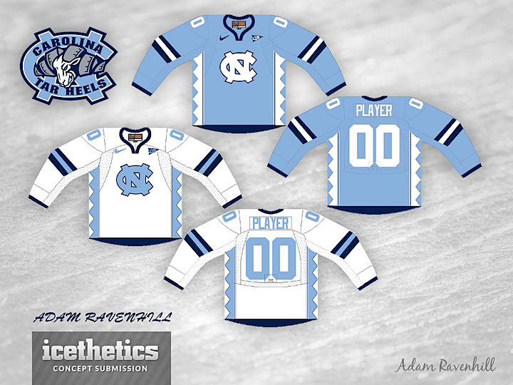
The Tar Heels are the featured team on this University Sunday. Adam Ravenhill put together this UNC concept for us today.
The Tar Heels are the featured team on this University Sunday. Adam Ravenhill put together this UNC concept for us today.