
0140: Bruins Re-Bourne
/
Andrew Bourne's NHL makeover series continues today with the Boston Bruins. His comments about this design can be found below.
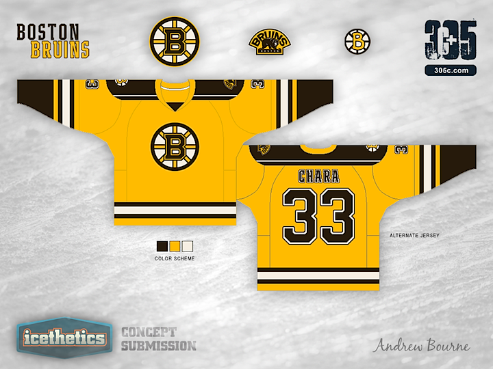
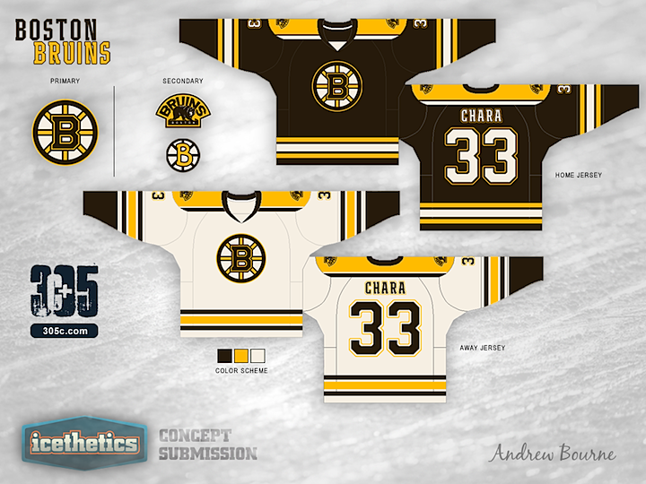
The current color scheme for the Bruins is black, gold and white. It is cool because you can say that you are rooting for the black and gold (which sounds way better than rooting for the brown and gold), but I believe that the Bruins should embrace their past and have one of the more unique color palettes in the NHL. Who else could pull off a brown jersey? No one, that's who.
I actually didn't change too much on these jerseys because I believe that the Bruins organization has gotten it right (as far as overall jersey layout is concerned). The small difference from the NHL layout to the 305cHL layout shows up in the striping and in the shoulder area. As far as the alternate jersey goes, The Bruins need a gold jersey that works. Gold is a rare color in the NHL (at least it was) and they need to embrace their uniqueness.