Submission Criteria

Concept art is accepted via email. The following criteria is not required for submission, but it will help get your work posted sooner.

Preferred file type
PNG with transparent background

Image dimensions
960 x 600 pixels

Use your own original artwork. Don't steal from others. Borrowing NHL team logos to demonstrate a concept is acceptable.

Icethetics branding elements will be added to your submission before posting. If you would like to discuss an alternative method of presentation, that can be arranged.

Featured Artists
If your work has been featured on this page and you would like to make any revisions based on reader feedback, you are welcome to do so. I can add your revised work to the original post.

Twitter
Saturday
Jul212012

0154: Quebec Reset

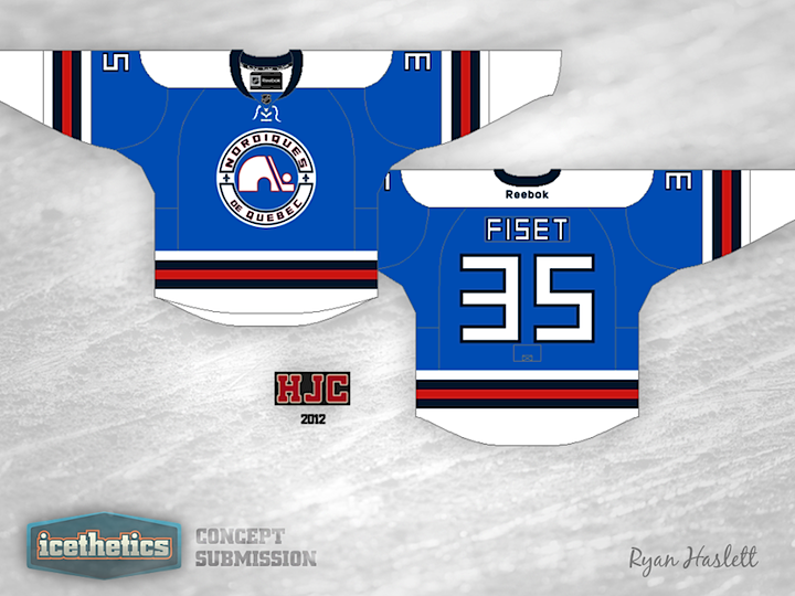
The Quebec Nordiques haven't gotten as much love as they should on the Icethetics Concepts page but Ryan Haslett is here to take care of that. If the Nordiques still existed today, they're home and road jerseys would probably feature a wolf. So I like to think of this design as what they might be wearing today as a throwback jersey.

« 0155: Rollin' on the River | Main | 0153: The Gotham Rogues »

Reader Comments (5)

It was NOT a wolf, but a husky. Besides, I don't think those hideous jerseys would have survived, they would've been wiped out for something better after the lockout.

Jul 21 · 9:35 AM PDT | Unregistered CommenterFrank

Not at all impressed. Lack of Fleur de Lis, a font that doesn't match a team name such as the Nordiques, white yokes (UGH) AND THE COLOUR BLACK ?! Ryan's really good at designing jerseys, that's no doubt. But this? In my opinion, I don't like it. Not even as a mere concept.

Jul 21 · 4:43 PM PDT | Unregistered CommenterREDrover

Your link says "probably feature a wolf" but the story does say it's a husky.

Jul 22 · 3:45 AM PDT | Unregistered CommenterSimon

I like this, feels vintage, but has some modern flair.

Not to nitpick, but Chris your link to the "wolf design" article clearly states that it's a Husky and not a wolf. :)

Jul 22 · 1:01 PM PDT | Unregistered CommenterBill Blazina

@RedRover

That's cool that you don't like it. I'm totally okay with anyone who doesn't like it. I just thought I should clear a bit up. That darker colour is navy, not black. The Fleur de Lis are in the primary logo at the sides. And I have no defense for the font, I thought it looked sharp and cold.

Jul 23 · 12:00 PM PDT | Unregistered CommenterRyan H.

PostPost a New Comment

Enter your information below to add a new comment.
Author Email (optional):
Author URL (optional):
Post:
 
All HTML will be escaped. Textile formatting is allowed.