Submission Criteria

Concept art is accepted via email. The following criteria is not required for submission, but it will help get your work posted sooner.

Preferred file type
PNG with transparent background

Image dimensions
960 x 600 pixels

Use your own original artwork. Don't steal from others. Borrowing NHL team logos to demonstrate a concept is acceptable.

Icethetics branding elements will be added to your submission before posting. If you would like to discuss an alternative method of presentation, that can be arranged.

Featured Artists
If your work has been featured on this page and you would like to make any revisions based on reader feedback, you are welcome to do so. I can add your revised work to the original post.

Twitter
Wednesday
Apr042012

0046: Admirals With a Dash of Lightning

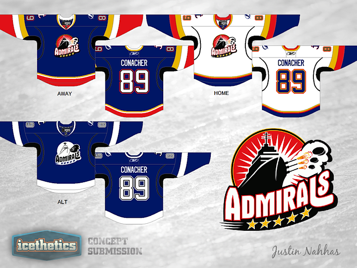
The Norfolk Admirals are in the midst of a record run, an insane winning streak. It's not just breaking AHL records, it's breaking records of other sports leagues. So while the Ads continue to mop up anyone who would be dumb enough to face them, how about a couple of concepts? It is Minor League Week, after all. Justin Nahhas has created a set of Admirals uniforms based off the third jersey of their NHL affiliate, the Tampa Bay Lightning.

But that's not all for today. I want to revisit a classic.


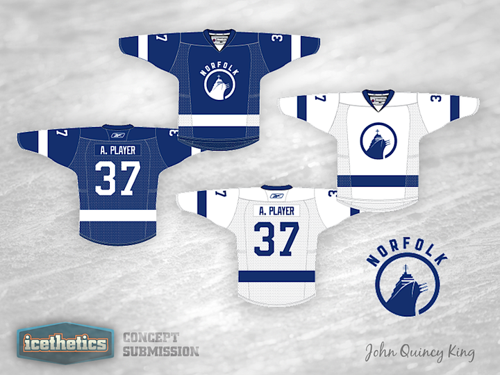
This is one of my all-time favorite concept designs. John Quincy King overhauled the Admirals' look to match new Lightning's new look. It was first posted on Icethetics last May, and since we were talking about Norfolk, I thought a reprise was in order.

« 0047: Solar Bears Prelude | Main | 0045: Remaking Rochester in Buffalo's Image »

Reader Comments (2)

It's a shame that this may all be for not, as rumors swirl around Tampa not being interested in renewing their affiliation with Norfolk due to the cost of transportation.

As far as the jerseys go, both concepts look decent, but I would really like to see the red dropped in favor of battleship grey on both the home and road sweaters.

Apr 4 · 9:47 AM PDT | Unregistered Commenterfordaith

I think Minor League teams should have more creative jerseys (since the vast majority of their logos are) instead of replicating the pro teams jersey (especially since the Bolts have fairly horrible jerseys).

Apr 4 · 12:41 PM PDT | Unregistered CommenterBlack[box]

PostPost a New Comment

Enter your information below to add a new comment.
Author Email (optional):
Author URL (optional):
Post:
 
All HTML will be escaped. Textile formatting is allowed.