Submission Criteria

Concept art is accepted via email. The following criteria is not required for submission, but it will help get your work posted sooner.

Preferred file type
PNG with transparent background

Image dimensions
960 x 600 pixels

Use your own original artwork. Don't steal from others. Borrowing NHL team logos to demonstrate a concept is acceptable.

Icethetics branding elements will be added to your submission before posting. If you would like to discuss an alternative method of presentation, that can be arranged.

Featured Artists
If your work has been featured on this page and you would like to make any revisions based on reader feedback, you are welcome to do so. I can add your revised work to the original post.

Twitter
Sunday
Apr292012

0071: Vintage Maple Leafs

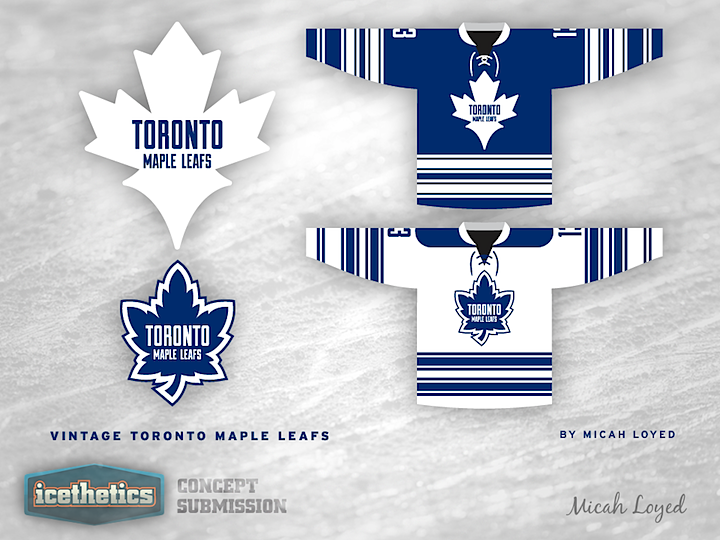
Vintage Week continues on this Winter Classic Weekend as Micah Loyed provides another great concept, this time for the Toronto Maple Leafs. The instinct for many may be to dislike it since it doesn't feature the classic Maple Leaf shape, but the style is certainly very retro.

« 0072: Vintage L.A. Kings | Main | 0070: Vintage Red Wings »

Reader Comments (8)

Not really a fan of this. The striping is definitely vintage but not much different than other Leafs concepts we've seen. As for the logos, aside from the lettering, I don't really get a vintage vibe at all. The logo on the dark jersey is a bit awkward looking and pulls my eye in an odd direction. The other isn't bad but is a little too cartoonish for my taste. Not bad overall though. I don't think there is a tougher task than rebranding the Leafs.

Apr 29 · 10:05 AM PDT | Unregistered CommenterGunnar Stahl

I like the bottom one becaus It is close to ones that they have actually worn

Apr 29 · 11:42 AM PDT | Unregistered CommenterE

I like the Wings's design a little better, but these are still great! I wish the font was more arched though.

Apr 29 · 12:08 PM PDT | Unregistered CommenterNick N

I like the top one (although I think you should remove the two stripes near the end of the sleeve), mainly due to the fact because its different. Since the chris started posting the winter classic concepts of Toronto and Detroit, they've all seemed to be blending together by just adding more stripes. This is at least unique and different. Good job.

Apr 29 · 12:23 PM PDT | Unregistered CommenterBlack[Box]

I think most fans wouldn't care for the logo on the blue variant but the logo on the white is very sharp and would be a favorite.

Apr 30 · 7:51 AM PDT | Unregistered CommenterJo

Love the bottom design. Has a very Leafs-esque feel to it. The top one however doesn't do it for me. A team like the leafs doesn't need a drastic new logo, and that's what the top one screams to me.

Apr 30 · 2:44 PM PDT | Unregistered CommenterB. Hesse

The top logo is odd to say the least, the bottom is better, but i think it's still too simple of a design

Apr 30 · 5:35 PM PDT | Unregistered CommenterScottyMo

Maybe without the text in the Leaf it'd be OKAY.

But I really dislike this.

May 1 · 5:59 PM PDT | Unregistered CommenterShep

PostPost a New Comment

Enter your information below to add a new comment.
Author Email (optional):
Author URL (optional):
Post:
 
All HTML will be escaped. Textile formatting is allowed.