Submission Criteria

Concept art is accepted via email. The following criteria is not required for submission, but it will help get your work posted sooner.

Preferred file type
PNG with transparent background

Image dimensions
960 x 600 pixels

Use your own original artwork. Don't steal from others. Borrowing NHL team logos to demonstrate a concept is acceptable.

Icethetics branding elements will be added to your submission before posting. If you would like to discuss an alternative method of presentation, that can be arranged.

Featured Artists
If your work has been featured on this page and you would like to make any revisions based on reader feedback, you are welcome to do so. I can add your revised work to the original post.

Twitter
Wednesday
Mar282012

0039: A Throwback Third for the Jets

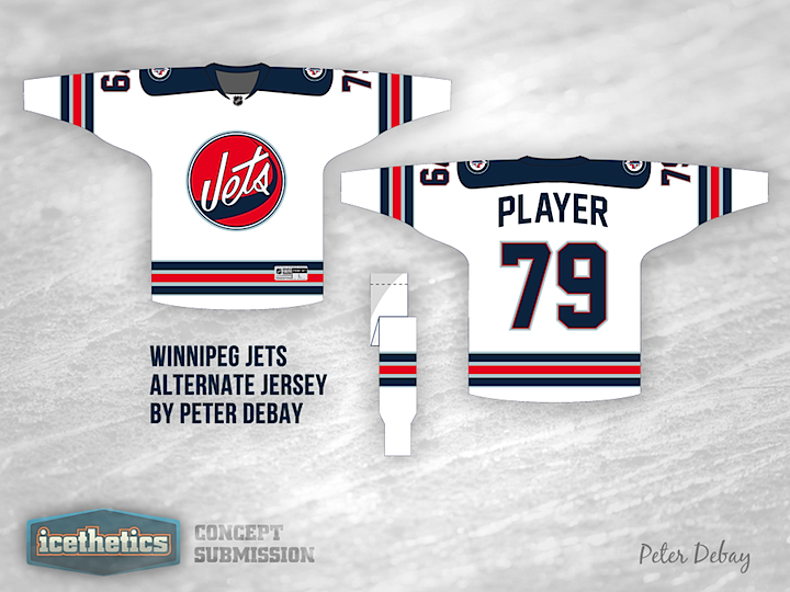
A lot of us are hoping the Winnipeg Jets are considering a third jersey for 2012, if for no other reason than it would mean we'd get to see a new jersey in the NHL this fall. But if it happens, what should it look like? Peter Debay recommends a bit of a throwback. Personally, I like the old logo but I'm worried the striping is too reminiscent of the Rangers. Maybe something close?

« 0040: Marooned | Main | 0038: Dreaming of Electric Stripes »

Reader Comments (8)

I think all thats holding this jersey back from being good is the logo

Mar 28 · 9:59 AM PDT | Unregistered CommenterTRAVIS A.

Every time I look at the logo I think it is saying "Vets"..

Mar 28 · 12:16 PM PDT | Unregistered CommenterChris S.

I actually really like the logo, I think what's holding back the Jet's is their inability to use different colors (all canadian teams use one of three colors).

Mar 28 · 12:26 PM PDT | Unregistered CommenterBlack[box]

Don't really like the logo here, but it's better than having their current shoulder patch being the logo.

Mar 28 · 12:31 PM PDT | Unregistered CommenterLindle

Too much like the Rangers away jerseys in my opinion.

Mar 28 · 7:52 PM PDT | Unregistered CommenterDavid

Well, the original Jets NHL jersey was, in essence, a Ranger jersey, albeit a failed pajama design that could not have disappeared fast enough

Mar 29 · 6:08 AM PDT | Unregistered CommenterQB

I love these, I think grey instead of light blue would make it better though.

Mar 29 · 1:31 PM PDT | Unregistered CommenterTyler J

I like this concept, the only change I'd make woutld be to have "Winnipeg" writen in the blue jet "wash" or swoosh, I'd lower the blue swoosh just beloe the Jets word and have a small jet fighter at the tip of the jet wash. I like the use of the original colour scheme.

It would make the chest logo similar to the original Winnipeg Jets logo of WHA vintage.

Anyway, those are my thoughts, would love to see a mock-up like I described.

May 3 · 9:12 AM PDT | Unregistered CommenterCecil W.

PostPost a New Comment

Enter your information below to add a new comment.
Author Email (optional):
Author URL (optional):
Post:
 
All HTML will be escaped. Textile formatting is allowed.