
QMJHL: Sherbrooke Rises from the Ashes
/
 Sherbrooke Phoenix jerseys unveiledThe QMJHL's only U.S.-based team shut down over the summer, but a new one will be resurrected in that franchise's old home next fall as the Lewiston MAINEiacs give way to the Sherbrooke Phoenix.
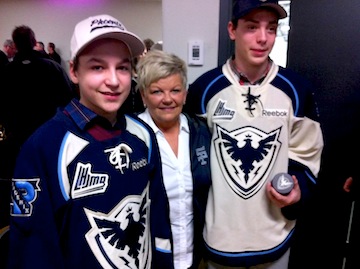
The club's new name, logos and uniforms were unveiled at a press conference today, according to this release written in French (translated). Click here for more photos from the event.
As you may have read in the (incomplete) Icethetics Season Preview, the league bought out the floudering franchise after last season and ceased operations.
At the same time, it announced an expansion franchise had been awarded to Sherbrooke, Quebec and an ownership group led by ex-NHLer Jocelyn Thibault to begin play in the 2012-13 season. I find it a little weird. Why end the lineage of one of the league's oldest franchises? Why not simply transfer the franchise? (In the end, I'm sure it all comes down to money.) As I wrote in the Season Preview post...
The franchise itself is actually one of the QMJHL's oldest. The Trois-Rivieres Ducs were a founding member of the Q in 1969. They were renamed the Draveurs in 1973. In 1992, the club relocated to Sherbrooke and became the Faucons for six seasons. In 1998, the name was changed to Sherbrooke Castors. The club moved across the border into Maine in 2003.
There had been speculation that one of the previous Sherbrooke monikers would make a comeback, specifically Castors or Faucons. But as it turns out, they went the more literal route for a team that's "rising from the ashes." Of course this will be confusing for folks in Quebec if the Phoenix Coyotes end up moving there. (Kidding!)
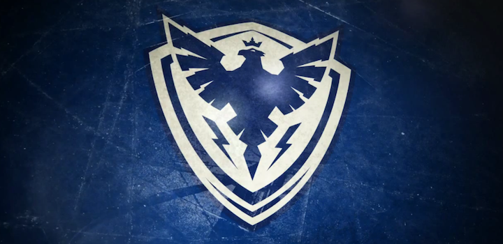
Here are the other logos that were on display at today's unveiling.
 Sherbrooke Phoenix secondary logos
Brilliant logos and a fantastic overall look for this team. I'm impressed. But are you noticing a trend? Two other Q teams, the Armada and Olympiques, introduced monochromatic logos this season, just like the Tampa Bay Lightning and Los Angeles Kings. Seems like a trend toward less color. If so, I'm not sure that's a good thing.
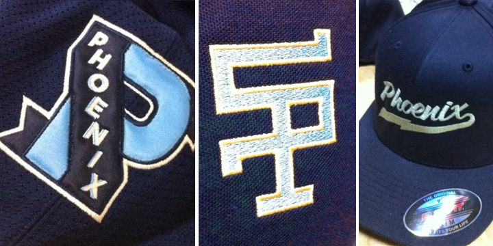
But when you look at Sherbrooke's jerseys and logos, it's clear they're still a three-color team: dark blue, powder blue, and yes, that's the trendy vintage white rather than actual white. Don't get me wrong. I think these colors look great together, but they tick all the boxes in terms of what's "in" right now.
A local creative agency called Lubie designed the new brand (with an awesome video), which appears to have been influenced by the municipal coat of arms of the city of Sherbrooke, Quebec.
Anyway, what do you think? How is this not a great look for a hockey team?