
Falcons Saga Isn't Over Yet
/Many were outraged by the blatant logo theft by a certain NAHL team last month. Now, the story gets even more pathetic as they throw everything at the wall to see what sticks.
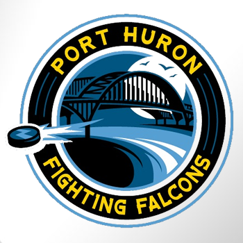
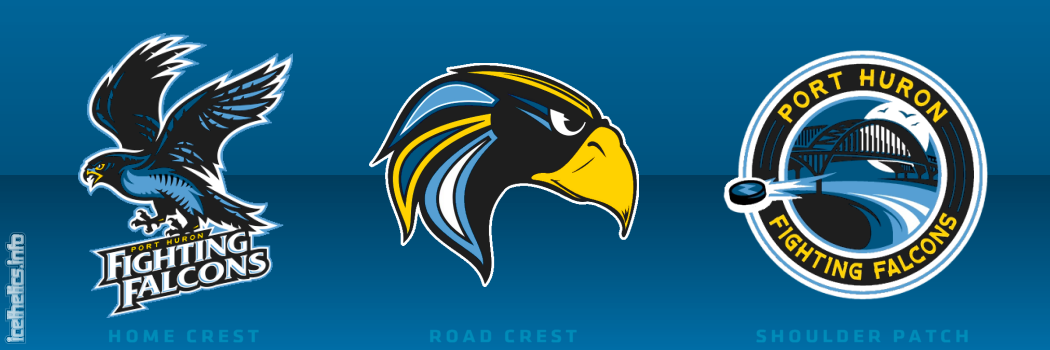 NAHL's Port Huron Fighting Falcons 2010-11 identity package
On Friday, the NAHL's Port Huron Fighting Falcons officially unveiled not one, not two... but three new logos. And the worst part, is that the primary mark is the same one — with more minor alterations — that got them in trouble in the first place.
Nothing has ever really made sense about this team's branding decisions.Times Herald beat writer Paul Costanzo has been covering the team throughout Falconsgate. He says the logo above labeled "road crest" has been designated by the club as the official primary logo. The secondary logo, which presently appears on the team's website, will be worn on the home jersey.
The logo posted on Icethetics last week will more fittingly be a shoulder patch on both sweaters. By the way, not to add to the confusion, but the NAHL's website has it flipped, saying the home crest is the primary mark. And it would be odd if the home sweater gets the secondary logo. But nothing has ever really made sense about this team's branding decisions.
Which brings me to my next point: Who thought these three logos made for a single cohesive identity? Holy mismatch, Batman! They all use the same colors, mercifully, but not in the same manner. Only the home crest and shoulder patch appear to be in the same neighborhood, and you'll find out why in the next paragraph.
Having said my peace, I do like the new home crest. It is very much a solid minor league logo. In fact, I learned tonight that it was created by an Icethetics concept artist. Chad Stilson, who is also active in Icethetics contests, was hired by the Falcons to create the home crest and shoulder patch. You can see his full identity package here. (For the record, he says the team hired someone else to rework Mike Ivall's logo again.)
My thanks to Mike B. for keeping on top of this epic saga and introducing the term Falconsgate into the Icethetics lexicon.
By the way, this week's minor league wrap-up continues below, so keep reading.
Admirals go black on the road

 Milwaukee Admirals unveil road jerseyThe AHL's Milwaukee Admirals unveiled a brand new road sweater on Thursday.
The Ads will wear the black jersey to the right for away games starting in the fall as they retire the grey one which has been in use for the past four seasons. Here's an excerpt from the release posted on the team's website:
The new jersey features the traditional Admirals colors (white, black, and ice blue) with black being the most prominent. Just like the home white jerseys, an Admiral skull adorns the chest, while blue accents run down the sides and also on the sleeves. The name and numbers on the backs of the jersey are white with a blue outline.
“We are excited to unveil this new look for Admirals hockey for the 2010-11 season,” said Greenberg. “The new black jerseys represent the toughness and ‘Never Say Die’ attitude by which our team plays and we look forward to playing in them for our 10th season in the American Hockey League.”
In case you don't have instant recall of the old gray sweater, all they did was fill in the gray parts with black and add a blue outline to the crest. The striping remains the same.
Kudos to C.J. for the heads-up on this one!
Chilliwack finally adds third jersey

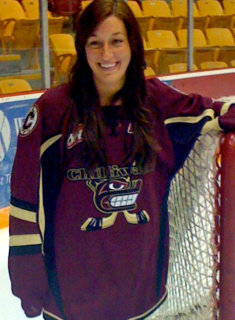 Chilliwack unveils third jerseyThe WHL's Chilliwack Bruins unveiled their first-ever third jersey on Tuesday.
The maroon sweater will make its debut in October, according to the team. It will mark the club's 5th anniversary in the WHL. Additional details in this block quote:
For the first time in franchise history, the Bruins will wear a third jersey. The jerseys will debut on October 2nd versus the Kamloops Blazers as part of the Bruins First Nations Night. The jerseys worn that night will be auctioned off during the game and winning bidders will receive their jersey immediately following the game.
In other words, the Bruins like their new alternate jersey so much, they're giving them away as soon as the game is over. No, but seriously, if you're a Chilliwack fan, get one!
The Canadian junior clubs tend to be pretty good about designing awesome uniforms. It's those shady Americans you have to watch out for.
Thanks to Matt M. for the tip!
When Third Jerseys Attack!
 Lastly, the OHL's Owen Sound Attack will also debut their first-ever third jersey this fall. The announcement, made on July 22, says the jerseys will be unveiled in "mid August."
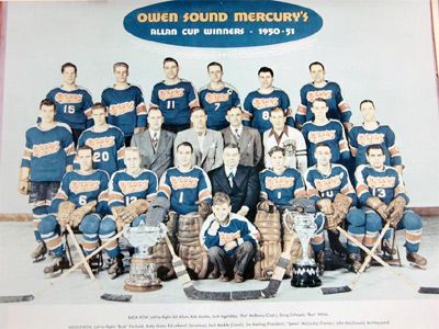 Owen Sound Mercurys, 1951The alternate sweater will pay tribute to area's original hockey team, the Owen Sound Mercurys, which played from 1947 to 1957. They wore blue and orange, in contrast to the Attack's red and gold.
This team photo of the 1951 Allan Cup champion Mercurys (right) was the best image I could find on short notice depicting the historic uniforms the Attack will replicate this season.
The PR director had this to say on the team's website:
“Reebok has done an exceptional job in making this come to life”, says Brent Fisher, Director of Marketing and Public Relations.
“The jersey is an exact replica right down to the heavy stitching and felt crest and they have matched the pants and gloves perfectly. I wasn’t around during that time, but hopefully those who were or had relatives play on the team will be proud to see the uniform again. I hope it means something to them.”
“This is the first time the Attack have worn a third jersey and I know many of the fans and also the players are very excited about it. We can’t wait for the guys to hit the ice on September 25th,” said Fisher.
The jerseys will be worn for every Wednesday night home game throughout the season, plus the home opener on Saturday, Sept. 25. Replicas will be sold in the team store and game-worn sweaters will be auctioned off throughout the season.
Thanks to C. McPhee for the link!


