
Lightning finally reveal new alternate uniform!
/
It’s the longest we’ve ever had to wait for an official third jersey unveiling in the NHL. Tonight, the Tampa Bay Lightning finally let their latest creation loose on the world with the introduction of their new all-black uniform. The team debuted the ensemble during warm-ups prior to their game against the St. Louis Blues.
Though fans we had to wait until until Feb. 7 to see the new sweater in an official capacity — almost two-thirds of the way into the 2018-19 season — the design did leak more than three months ago. That leak proved accurate tonight.
Most regular readers know I’m a lifelong Lightning fan. I’ve never made any effort to hide that fact. So I tend to have stronger feelings when it comes to Lightning jerseys than with others. This one is no exception. Since the leak in November, I’ve tried to steer clear of making any judgments until I saw the full kit.
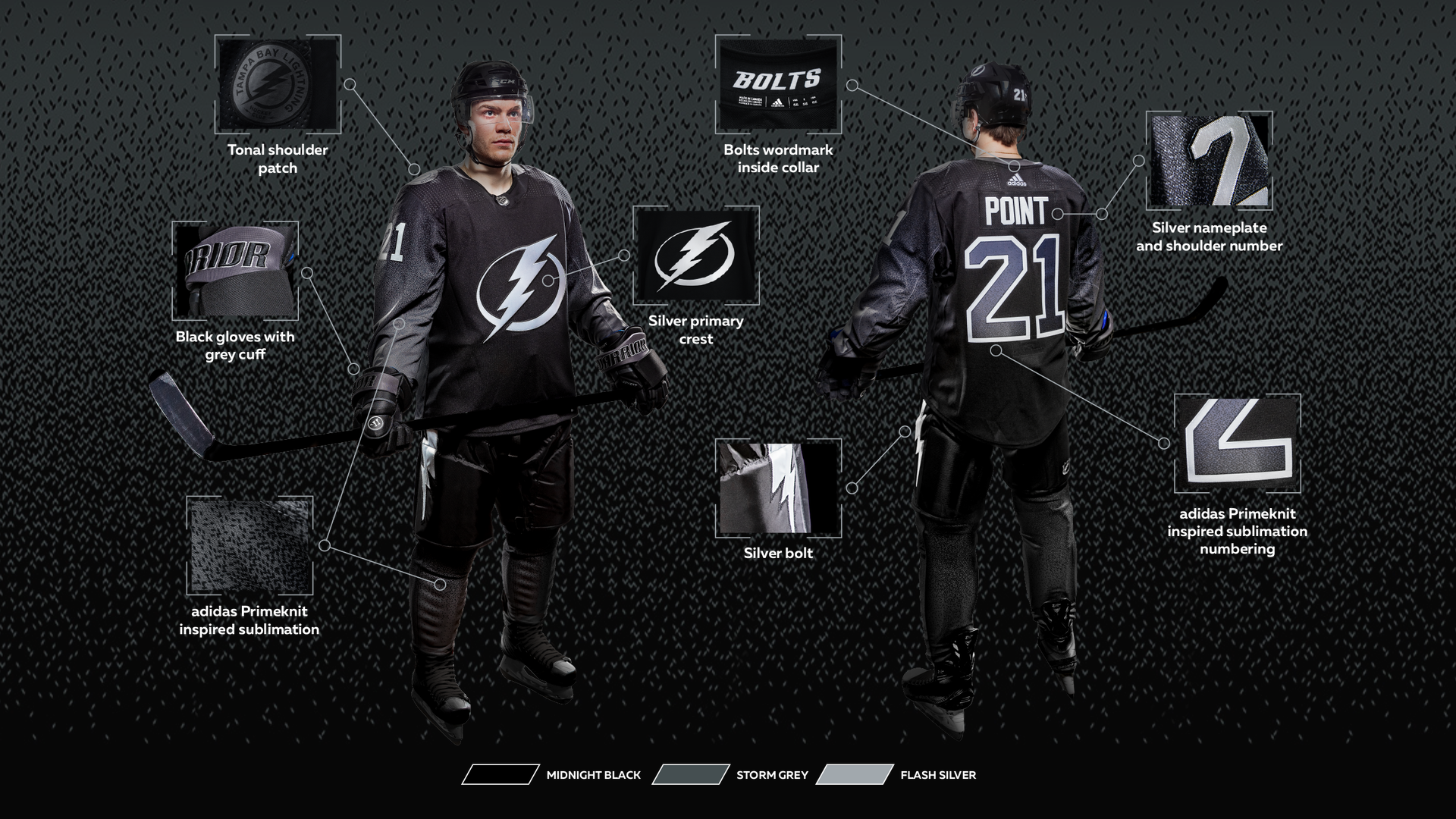
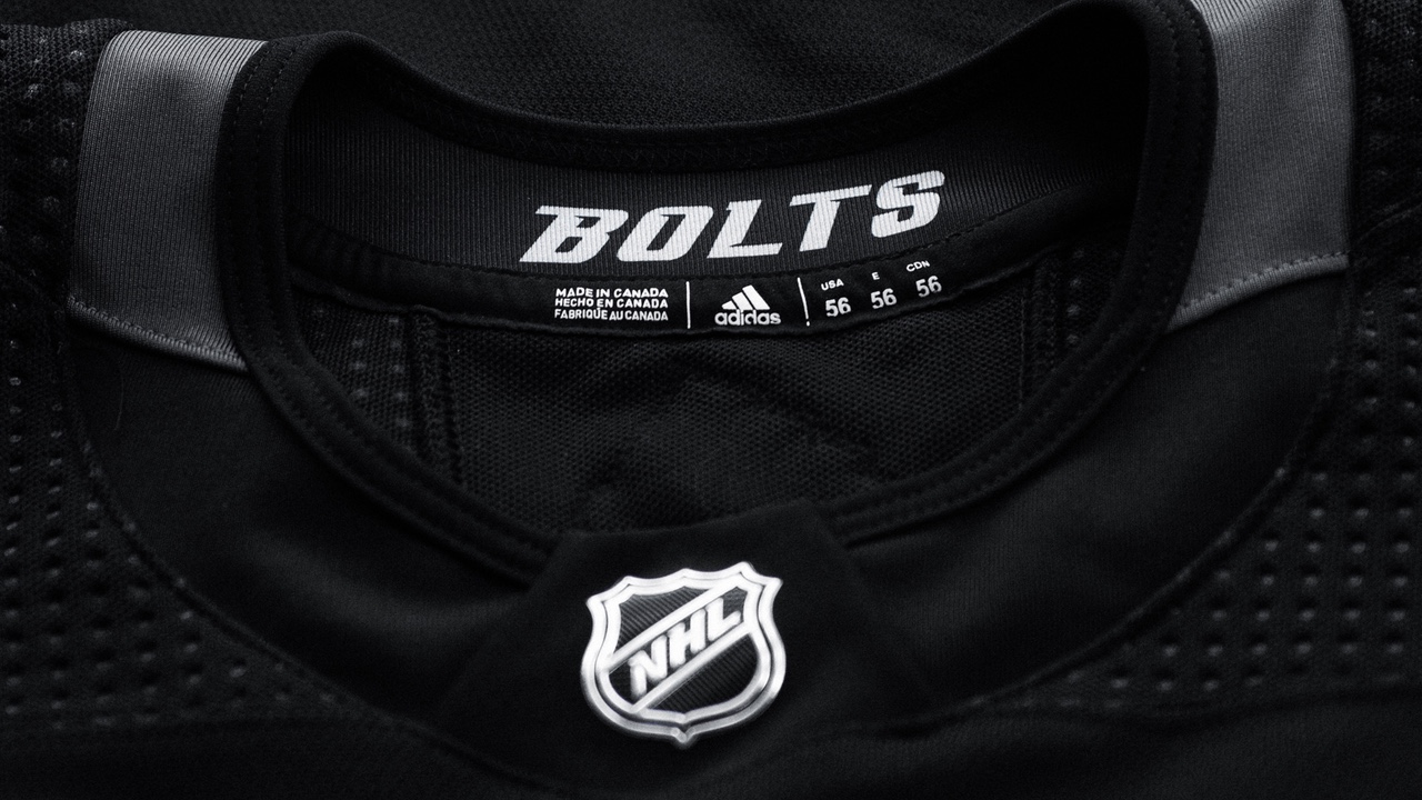
Now that I’ve seen the whole thing in action, there’s a lot to like about it. For one thing, black should never have been removed from the Lightning’s primary color palette. It’s integral. It’s original. And it’s what we wore during that incredible Stanley Cup run in 2004. But it would’ve been nice to see black and blue together again instead of on separate uniforms. It’s sort of the same problem I had with the previous black third jersey in 2014. Though I prefer this one because I never liked the “BOLTS” crest much.
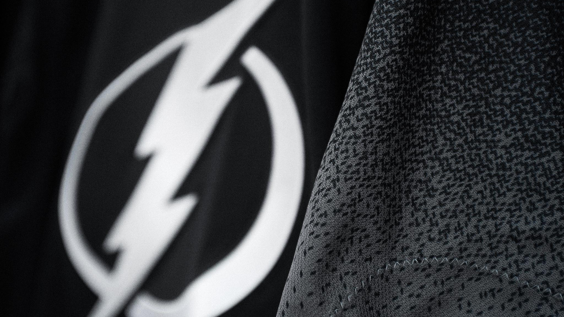
I’ll be honest, like a lot of people, I thought the leaked image made the jersey look a bit dull. Not a whole lot going on. Very monochrome. But that ignores the purpose, which was to create something bold on the ice — black from head to toe. The San Jose Sharks did something similar earlier this year with their black third jersey. But with the teal stripes and white numbers, it doesn’t quite have the same effect. The dark grey and silver tones mixed into the Lightning’s uniform give it a real moody feel.
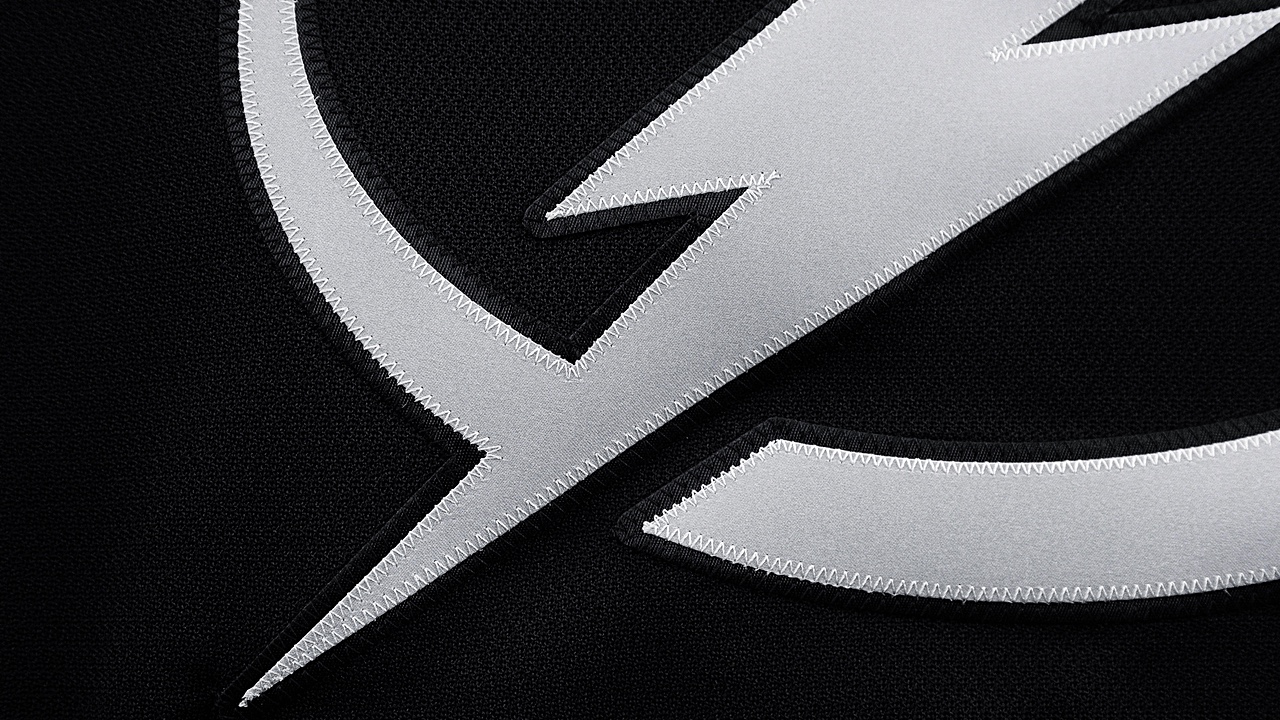
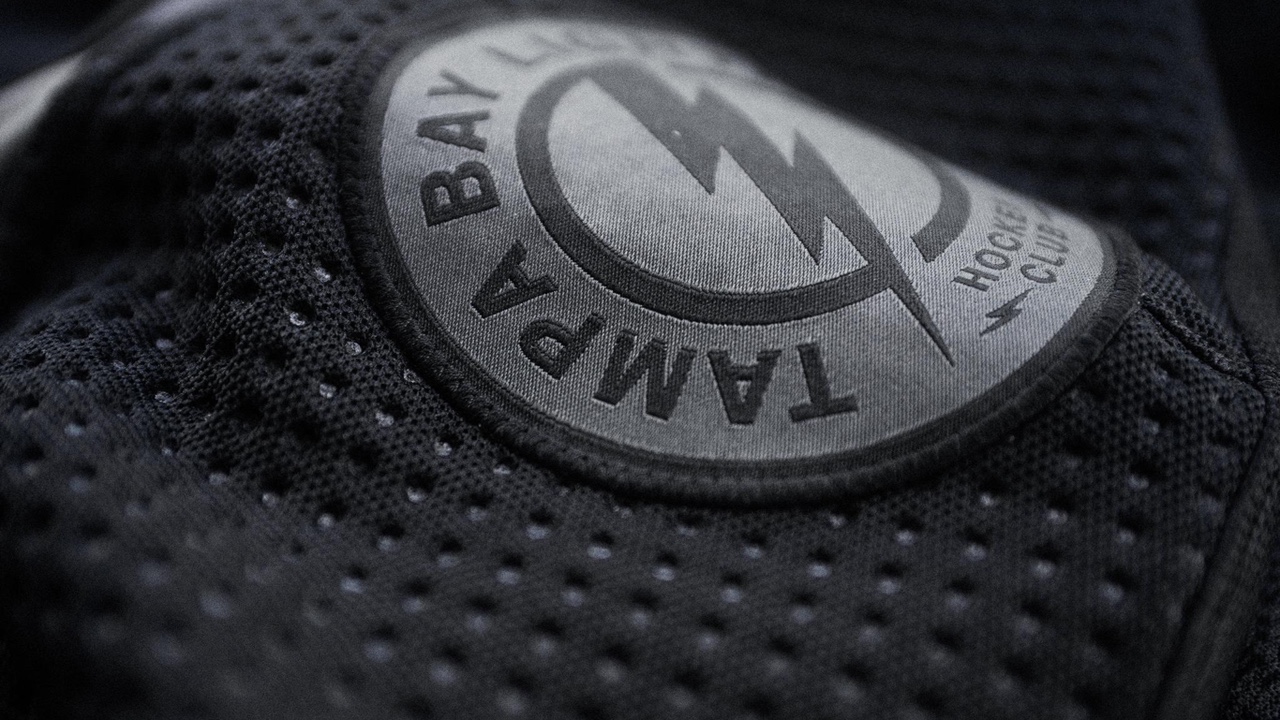
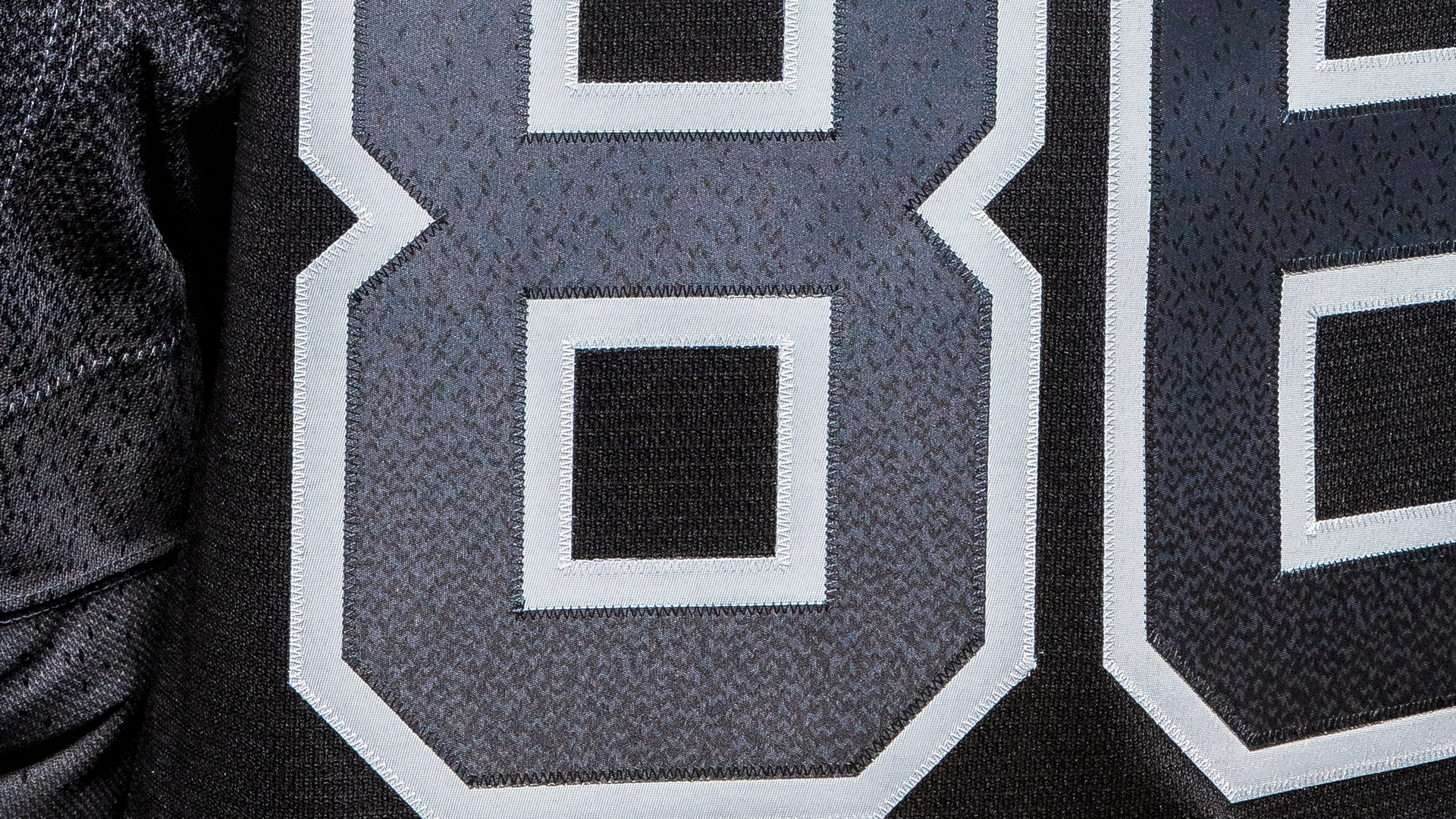
In fact, the colors of this jersey (if you can call them that) are officially named Midnight Black, Storm Grey, and Flash Silver. (And yes, that would be the very same “Storm Grey” we saw on the Carolina Hurricanes’ black third jerseys in the fall.) The Lightning and Adidas definitely made an effort to keep the branding intact as they went down this road.
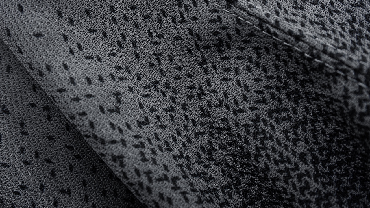
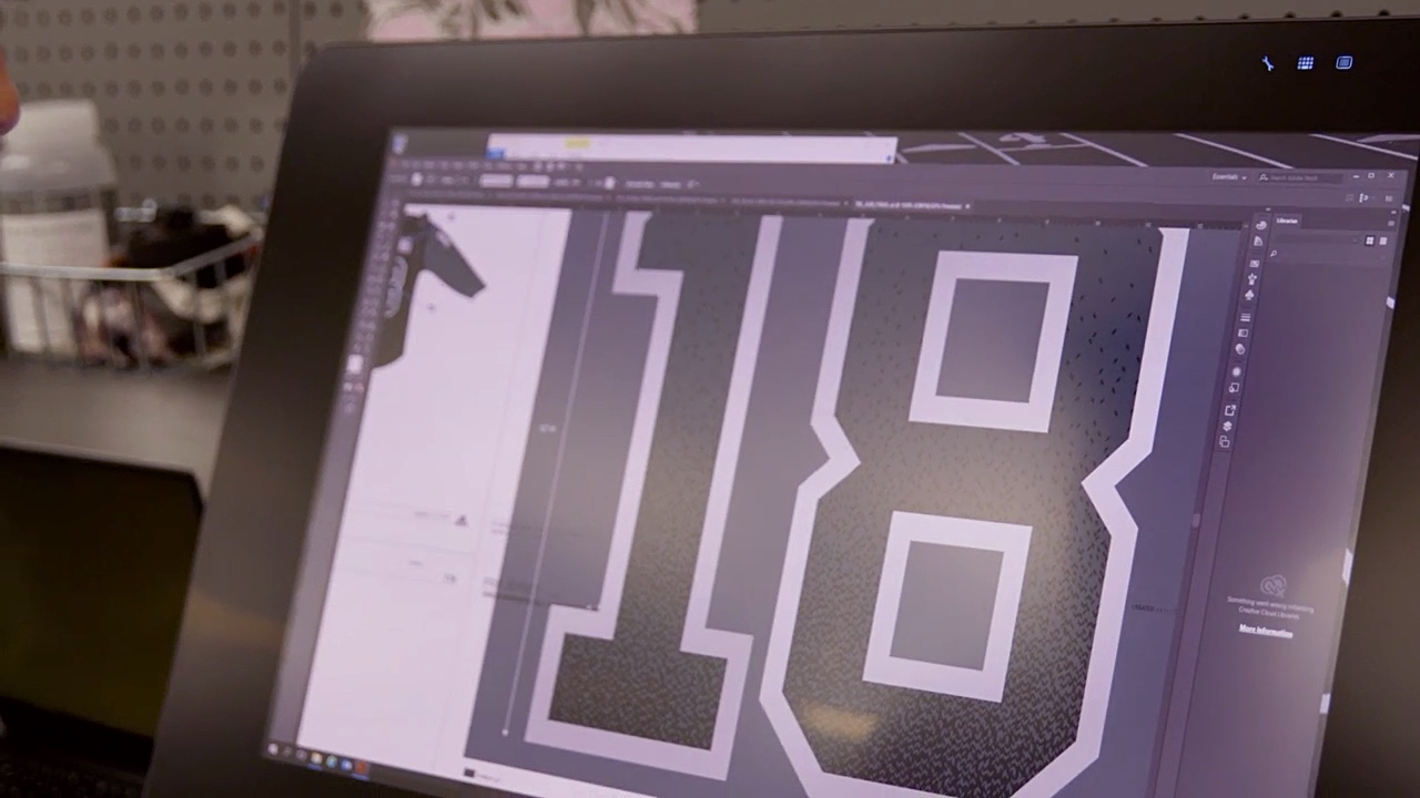
I have to say one thing I’ve never liked on NHL jerseys is a gradient. I still don’t. Vancouver did it with two third jerseys in their history. It’s a cheap look. But the reason I’m not as opposed to it on this Lightning jersey is because it’s not really a gradient. Yes, it’s sublimated, which is still a black mark in my book, but the unique dot pattern that’s visible up close is enough to make it feel a little higher end. I have yet to see this jersey in person, but the photos make it look pretty sharp.
I won’t go so far as to say I’m impressed with the overall presentation, but it’s not bad by any stretch. Certainly not as bad as Twitter might lead you to believe. But that’s another story. The lack of contrast does leave a little something to be desired. And not to harp on it, but it wouldn’t hurt to use black and blue in equal measure on the same jersey one of these days.
I get the sense this is one of those jerseys that will grow on me more in time. And even if I’m wrong, it’s still exactly what a third jersey should be — unique and experimental. Would I like it as the primary home sweater? Not in a million years. But as an alternate for the next few? I’m good with that.
Here are some more random thoughts:
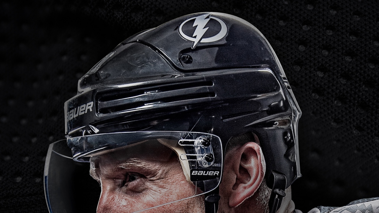
The silver effect on the crest is an interesting touch, but the metallic sheen on the helmet decals is really cool. Sometimes it’s the little things.
Andrei Vasilevskiy may have been the best looking player on the ice for Tampa Bay tonight. I guess I mean that two ways. He stopped everything the Blues threw at him for 64 minutes, but the new mask and black and grey pads were absolutely imposing! (Now, if only he could’ve spray-painted his stick black too.)
Because of the late start, the new sweater won’t get a full 15-game run this season. We’ll see it six more times for Saturday home games throughout February and March.
During the first intermission of tonight’s game, Lightning CEO Steve Griggs was interviewed on FOX Sports Sun about the new threads. He said they’ve been researching this look for about two years and invoked “millennials” as the impetus for the less traditional elements of the uniform. I’d be curious to see some of that research for myself, actually.
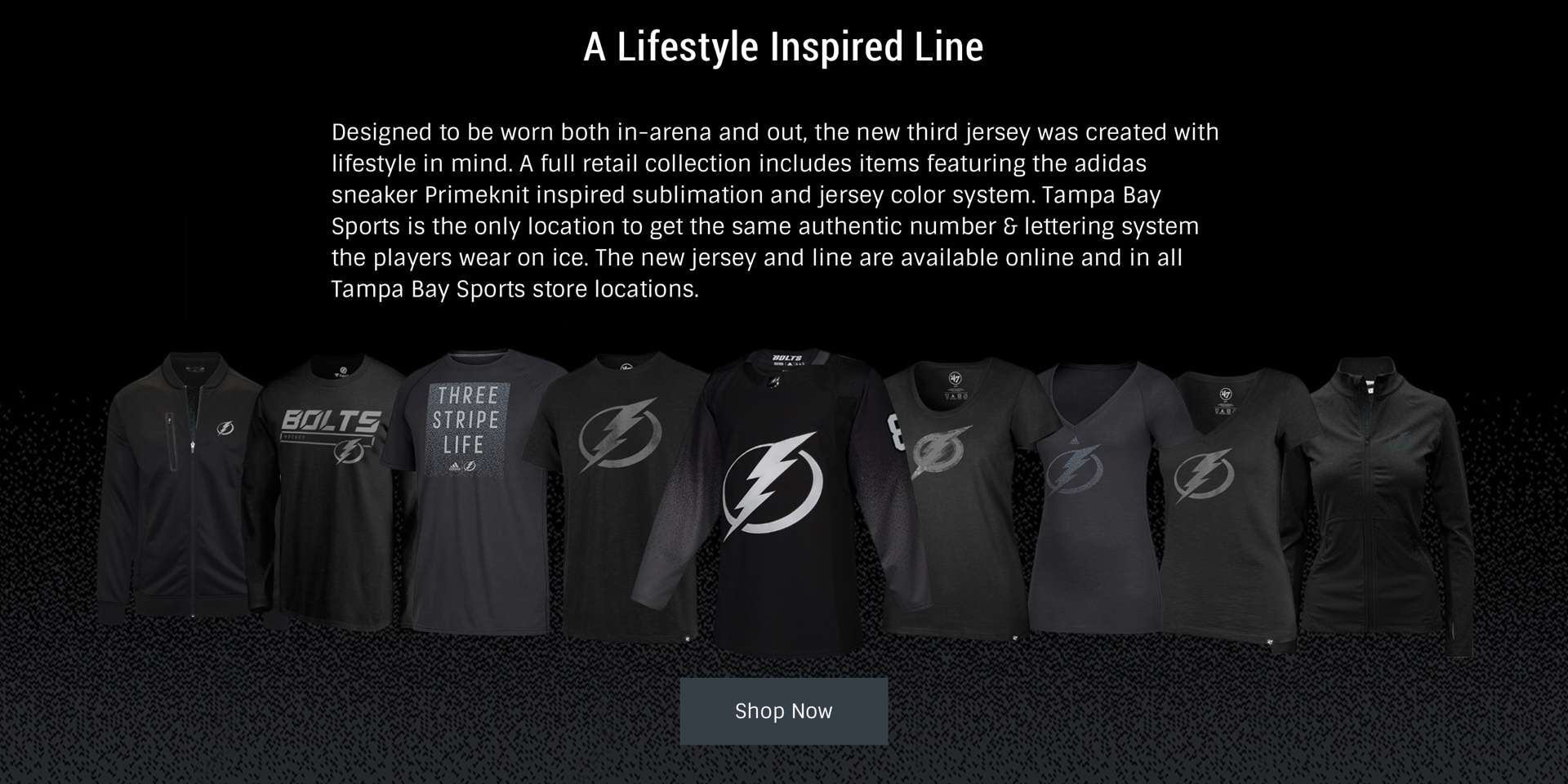
Lastly, it turns out the new third jersey has inspired a full line of apparel that’s black, grey and silver. This really feels like an over-correction in response to complaints about the monochromatic blue primary uniforms.
So what do you think? Has your opinion changed since the leak?