
Loose Threads: Sharks leak, Isles script, and Sens future
/A quiet couple of days just gave way to a sudden avalanche of news tonight! There’s quite a bit to cover — all from out of nowhere — but we’ll start with the obvious.
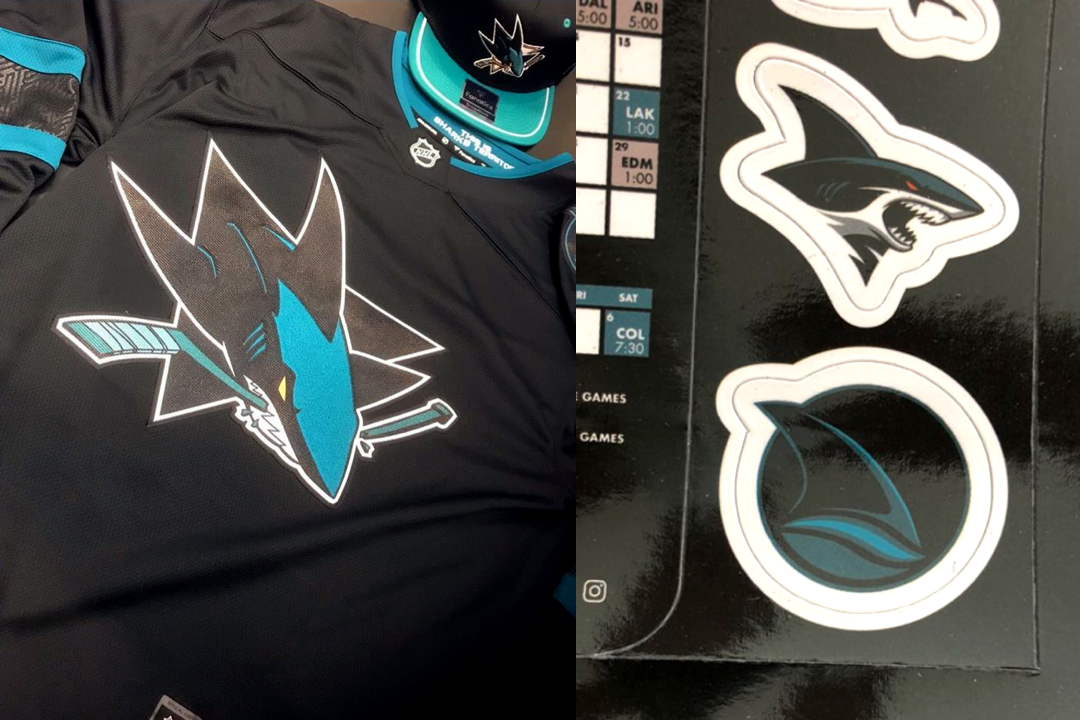
Images via Twitter from @arnottky and @joero49
It appears the San Jose Sharks third jersey may have leaked on Instagram with the new shoulder patch on that same jersey coming not much later on Twitter.
The photo of the jersey was shared to the Instagram account of the Pro Image Sports store in a southwest Utah mall — in a small town called St. George not too far from Las Vegas. The photo was apparently deleted by that account, but screenshots allow it to live on for the rest of us.
We can’t see the full sweater in the photo, but what we can see reveals a new crest — a darker version of the Sharks’ primary logo — along with a unique sleeve pattern made out of some sort of reflective material all on a black base.
On the left shoulder, a sliver of a logo is visible which seems to have been fully revealed by yet another leak tonight. This one came in the form of what appears to be a magnetic schedule — a freebie commonly handed out to fans early in the season across the NHL.
That is unmistakably an updated retro logo! That fin patch is essentially the same one the Sharks wore on their shoulders during their early seasons but in darker colors. Sharks co-president Jonathan Becher did say on NBCSN California in February that the fin logo would make a “surprise special appearance” in 2018-19. This could be what he was talking about.
And not for nothing, but the Sharks most recent tweet as of this posting was from a wine event featuring a Sharks-inspired wine called FINtage 408. The label features the retro fin logo.
Becher also said in that TV interview that the “yelling Shark logo” would become more prominent. But if he was referring to the shoulder patch design on the teal home sweater, that logo doesn’t appear to be part of this new third. Maybe it will become more prominent in other ways — marketing, perhaps? You can see it on that schedule magnet.
Taking a wide angle view, if this jersey is really the Sharks’ new third, it wouldn’t be that surprising. Since 2001, the Sharks have worn a black alternate during every season that alternates were permitted — 2007-08 and 2017-18 being the lone exceptions.
What is surprising is just how black the jersey is. They’ve replaced most of the orange with varying shades of teal — apart from the shark’s eye. It almost looks like a fashion jersey, particularly with that exotic sleeve pattern — not to mention the shoulders don’t use the same material as every other Adizero jersey in the league. But it does have the hallmarks of a replica Breakaway jersey complete with Fanatics branding.
So it’s a strange one to be sure — but we have seen stranger things this summer. No word yet on when to expect an official announcement by the Sharks.


Elsewhere, the New York Islanders began handing out T-shirts today that feature a new script mark — one we may have gotten a glimpse of last week. It’s tough to tell from that grainy leaked image of the Islanders’ new third jersey, but there appears to be a new script logo featured on the helmet of the uniform set.
A couple of photos that were tweeted today offer a good look at the new design.
Interesting that the later tweet commented about the jersey possibly being navy blue. It’s tough to tell from the leak because you can never be sure about lighting conditions, but it doesn’t sound that far-fetched to me. In fact, the Islanders did wear navy blue from 1995 until 2010.
And lastly, there’s the Ottawa Senators. I get so exasperated just thinking about this team. While I wasn’t expecting anything new for 2018-19, some things bubbled up today that are worth discussing. Two paragraphs in a TSN story have Sens fans buzzing.
The Senators will also wear their red Centennial Classic jerseys for every Thursday night home game this season — that is the jersey they sported for the outdoor game against the Montreal Canadiens last season.
According to [Senators chief operating officer Nicolas] Ruszkowski, the club is working diligently on a plan for a permanent logo for the 2019-20 season — and he did not dismiss returning to the original 2D Sens logo or moving forward with the Heritage O version.
The return of the red Centennial Classic jersey is news to me! I had heard that the Sens had no plans for a third jersey in 2018-19 — but looking back I wonder if that was more about not having plans for a “new” design. Semantics, maybe.
Strictly speaking, the red Centennial Classic jersey is already an Adizero design having been introduced last season — so it’s easy to slip back into the mix. Plus it’s a nice-looking jersey so I can’t imagine anybody will be disappointed by this news.
The article also said the jersey would be worn for every Thursday home game. By my count, the Senators will host 11 of those in 2018-19. Third jerseys usually make 10-15 appearances a year so that’s right on target. Here’s the list of games and opponents:
Oct. 4 vs. Chicago Blackhawks
Nov. 1 vs. Buffalo Sabres
Nov. 8 vs. Vegas Golden Knights
Nov. 15 vs. Detroit Red Wings
Nov. 29 vs. New York Rangers
Dec. 6 vs. Montreal Canadiens
Feb. 7 vs. Anaheim Ducks
Feb. 28 vs. Edmonton Oilers
March 7 vs. New York Islanders
March 14 vs. St. Louis Blues
March 28 vs. Florida Panthers
As for that second paragraph, it’s now probably safe to put the Senators down for a rebrand in 2019-20. New logos and jerseys would be nice. Regarding the line about the “original 2D logo” and the “Heritage O” — nobody would dismiss anything at such an early stage. That doesn’t mean they’re doing it. But we’ll hold onto the positive thoughts anyway.
That wraps us up for tonight. Who knows what tomorrow will bring. But we do know what Friday has in store — the official unveiling of the new Winnipeg Jets third jersey!