
Hurricanes ‘Take Warning’ with reveal of new third jersey!
/
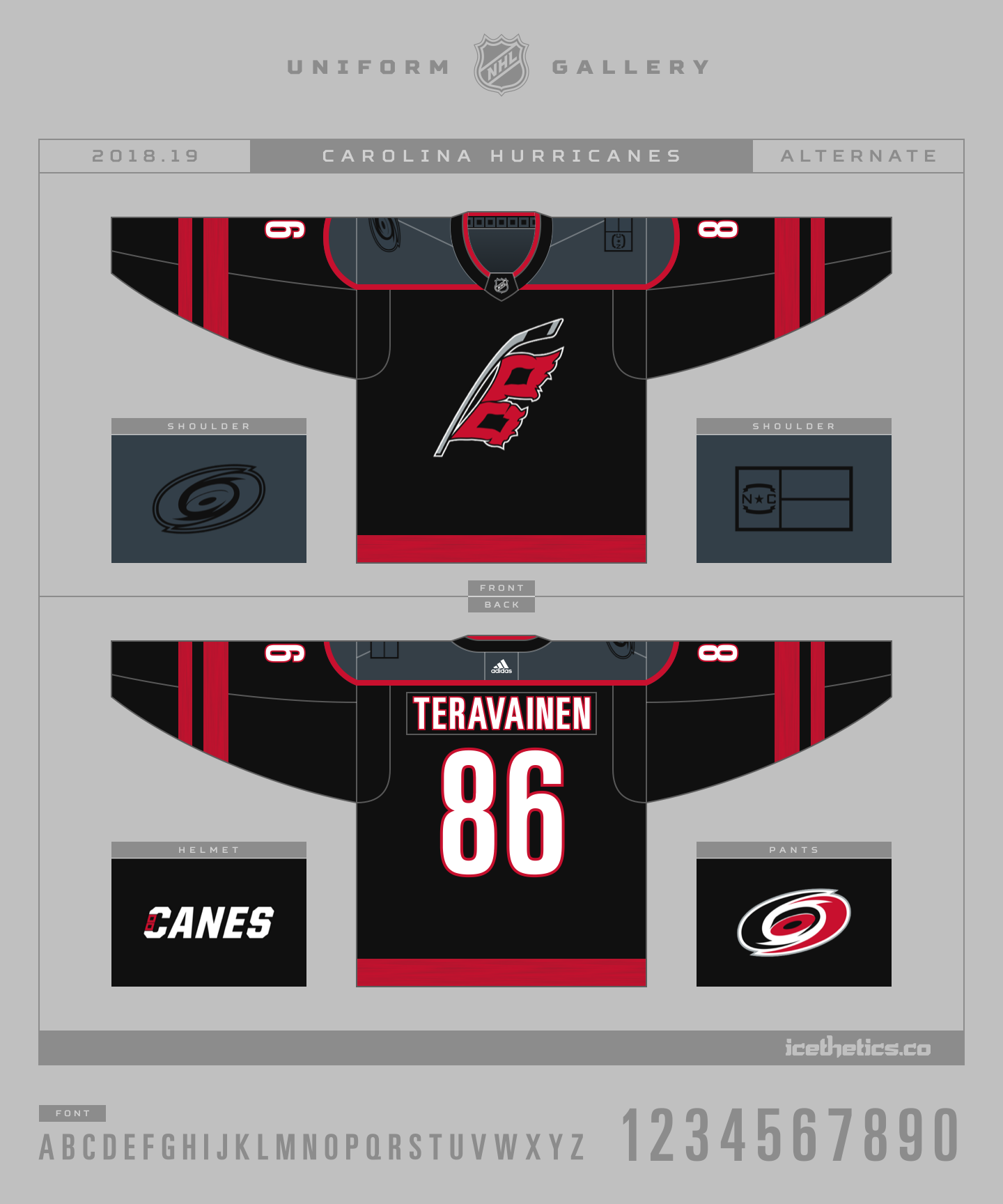
2018-19 third jersey / Provided by Carolina Hurricanes
The Carolina Hurricanes unleashed a storm of new branding elements tonight with the unveiling of their new third jersey, alternate logo, and wordmarks! It's so much that I can't even think about the draft that's taking place right now.
There's a lot to unpack, but let's start with the main event — the jersey itself. It's an evolution of the only other third jersey the Hurricanes have ever worn. The black base remains, but nearly every other element has been reimagined and carefully considered. The attention to detail is remarkable.
The story that follows was made possible by the Hurricanes' Senior Director of Marketing and Brand Strategy, Mike Forman, and his talented team of artists. Lauren Baxter is the Manager of Creatives Services. Kyle Fowlkes and Ashley Knappenberger are the graphic designers that executed a vision of a fresh start — though Fowlkes has recently decided to move on to a new job that Forman describes as "a good move for him ... but sad for us."
I spoke to Mike Forman this week about how the creation of the new third jersey went down. He credits his in-house creative team with the design. His insights provide context to the new jersey they just shared with the world.
First and foremost, the central element of the design is a logo that has finally received the attention it deserves. For 20 years, the Hurricanes' secondary logo — with its singular storm flag — has symbolized a weather event decidedly less powerful than the one that inspired the franchise's fearsome name.
Indeed, we've all heard from the armchair experts for years about how the single flag represents a mere tropical storm — a cyclone with sustained winds below 74 MPH. You need two flags together to signify an oncoming hurricane. Says who? It all harks back to a system of signal towers established in 1898 along the U.S. coastline, designed to warn mariners of approaching weather.
COastal Warning Display System / NOAA
In the decades that followed, the advent of radio broadcasting diminished the need for the flags. The National Weather Service retired the Coastal Warning Display Program in 1989, banishing the flags into obsolescence.
Until an inland hockey team made them relevant again in 1997.
A decade after that, in 2007, the U.S. Coast Guard re-established the signal program at a handful of small boat stations, once again making those flags official. A year later, the Hurricanes put a tropical storm warning signal on the front of their alternate uniform. Face in palm.
Another ten years on, as we prepare for the 2018-19 NHL season, the Hurricanes have patched a long known bug in their code. Today we find two red flags emblazoned on their latest jersey. Now a serious storm is on the way. But the club wouldn't be rushed in arriving here. The process of creating this new mark dates back to 2015.
"The secondary logo is something we've been looking at for at least three years now," Forman said, adding that it was "overdue." The third jersey reset, prompted by Adidas's takeover and revamp of NHL jersey production, provided a "great opportunity" to finally execute the plan.
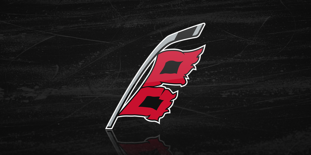
Not satisfied with merely adding a second flag to the existing logo, the design team explored ways to make it special. Forman said: "We knew there'd be space between the two flags. What if we could put in a hidden message?"
Even if you just paused a moment to take the logo in, there's an Easter egg right in the center that you probably haven't noticed yet. In the negative space between the flags is the unmistakable outline of the place the Hurricanes call home — the state of North Carolina.
Do you see it now?
It's a stroke of genius that has to remind you of what Peter Good accomplished at the birth of this NHL franchise when he created a logo for the Hartford Whalers in 1979. And if you don't know that wonderful story, go back and click the link when you're done here.
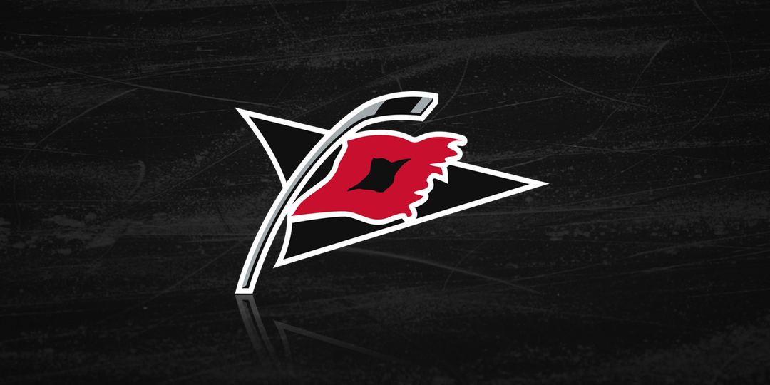
Of course the hockey stick flagpole remains as a through line from the Hurricanes' original identity, established in 1997. In modernizing the logo, the designers dropped the black triangle that Forman described as "outdated."
This change left the mark with somewhat unusual proportions. It creates a lot of negative space on one side of the chest. But Forman insists the layout and positioning on the jersey will enhance the overall look. I'm not sure I completely agree, but I'll reserve final judgment until I see the full uniform in game action this fall.
And if you're curious about where the captains' letters will sit, join the club. Forman says the design team is still figuring that part out themselves.
Knowing that the old storm flag logo was used as a shoulder patch on the Hurricanes' primary uniforms from 1997 to 2013, I had to ask whether we should expect to see the new one on the current home and road sweaters. Forman said it will not happen this year, but the team is discussing it for the 2019-20 season and beyond.
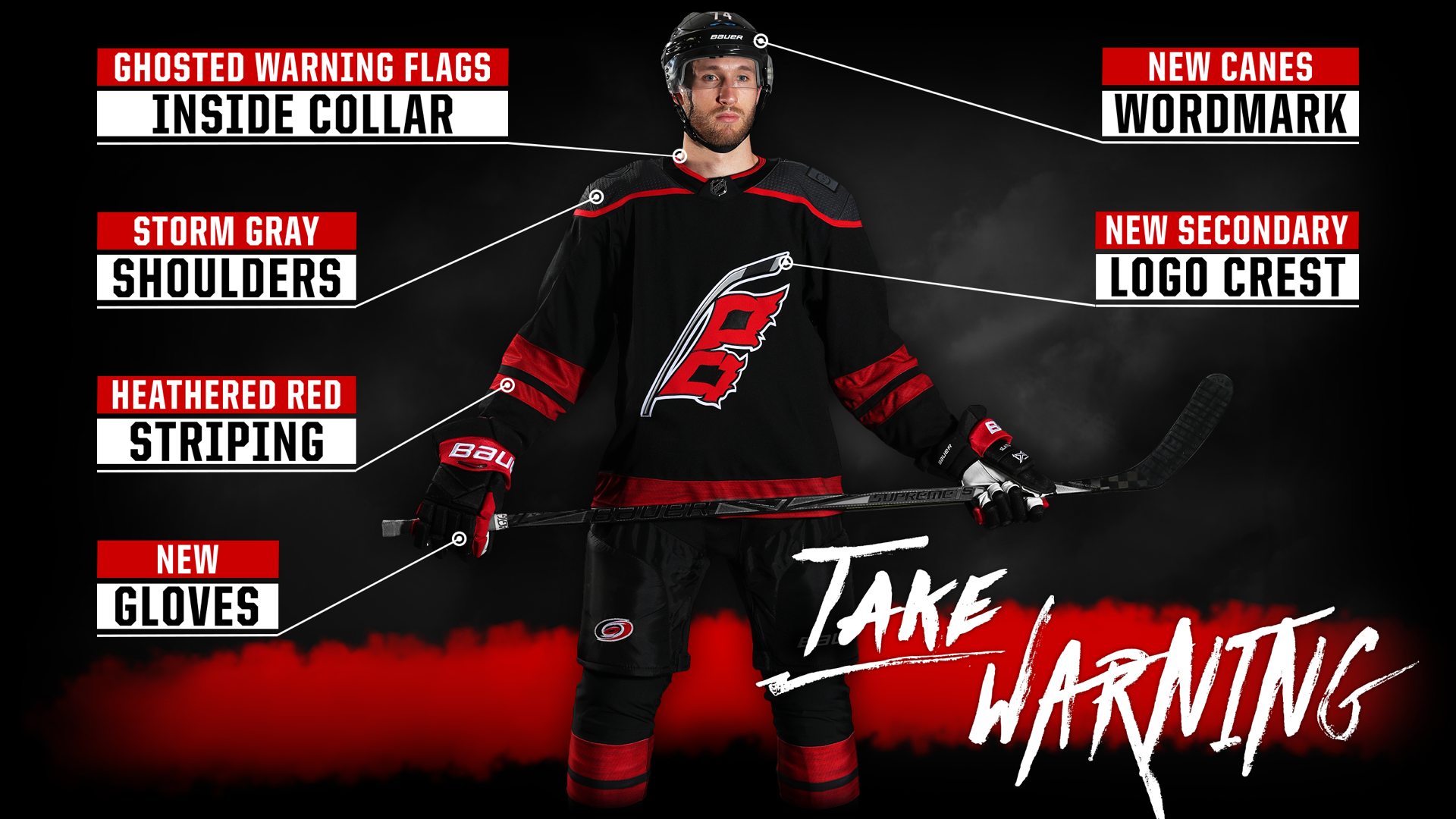
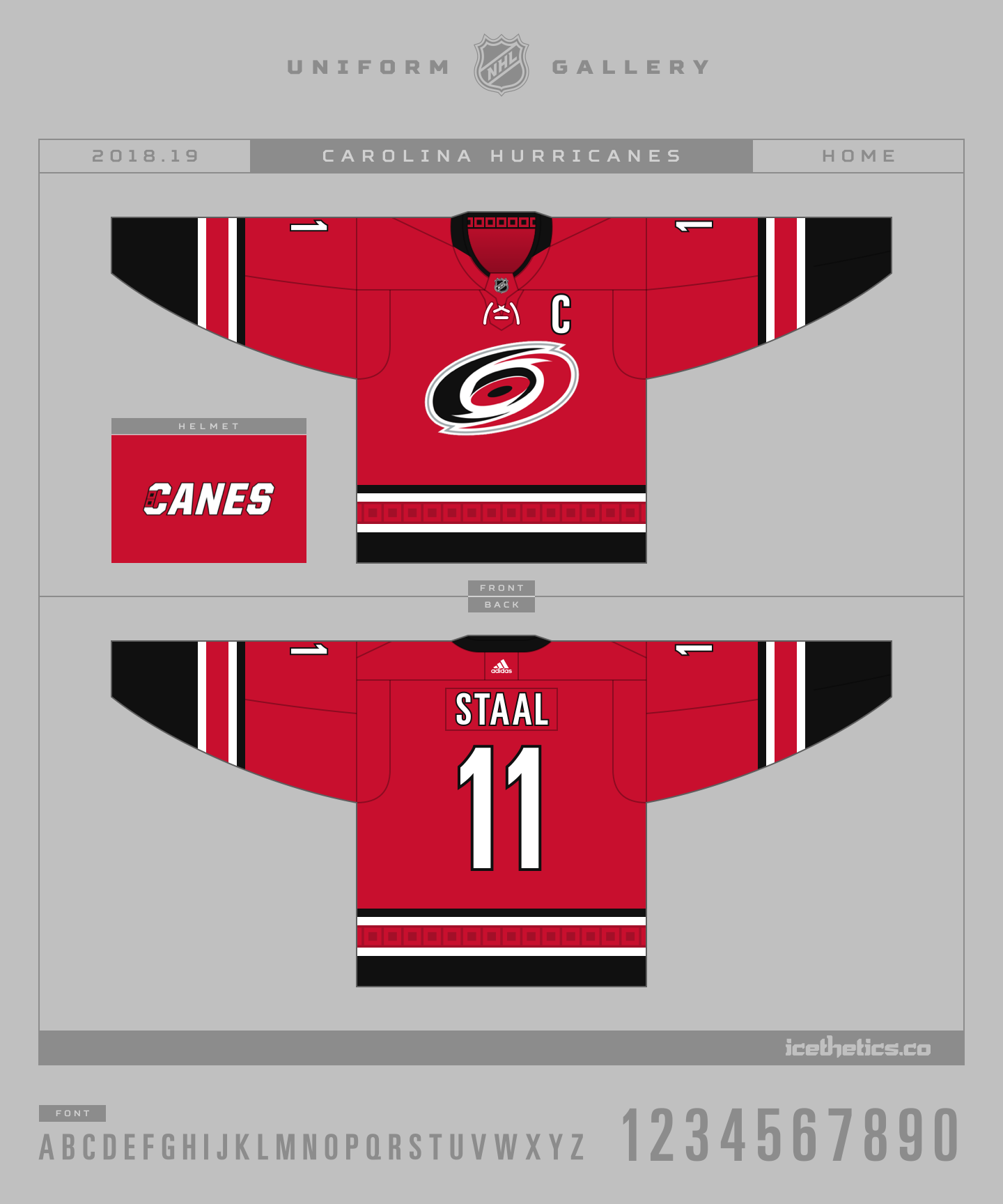
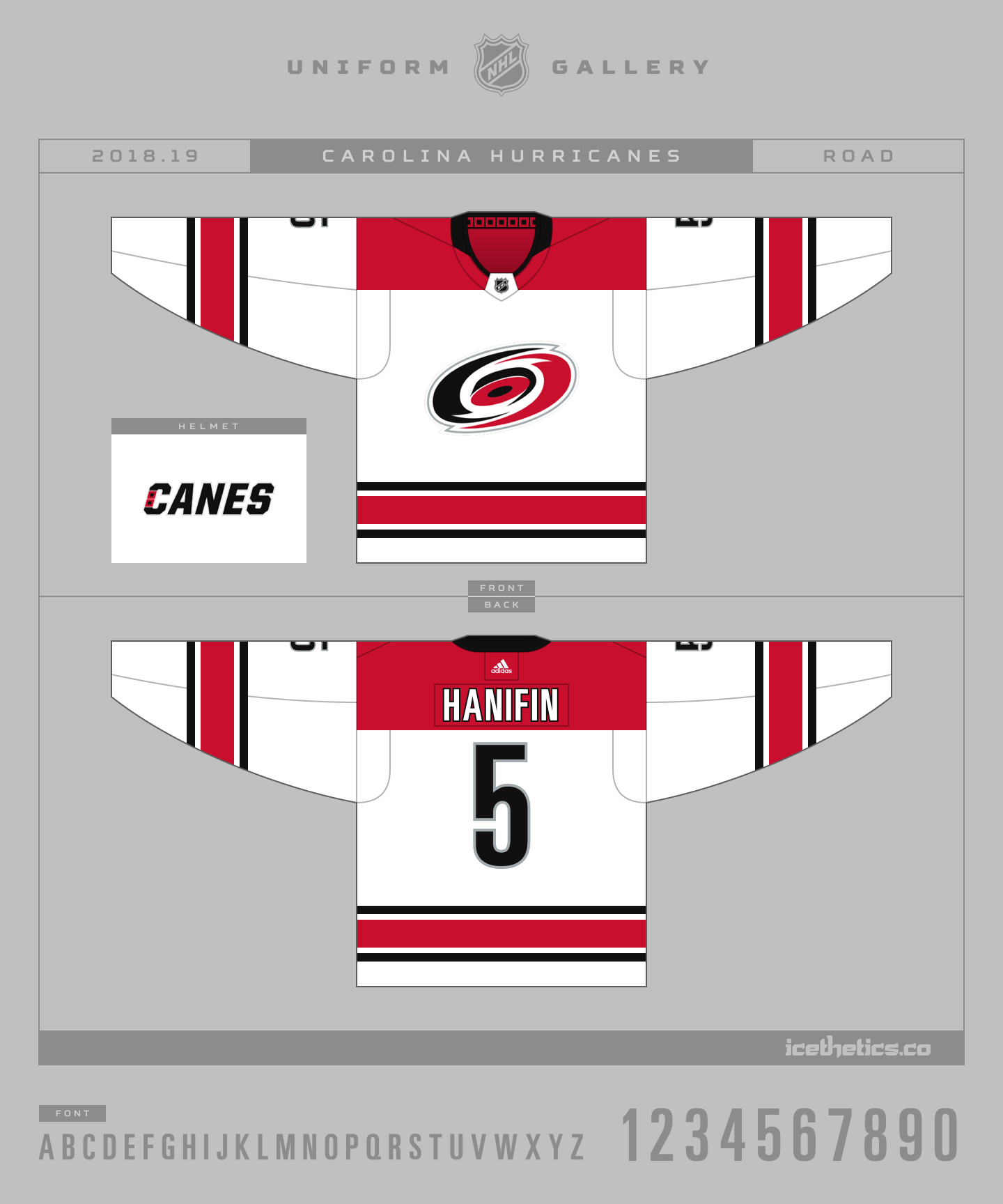
Pushing past the crest, though, there are several other touches that make this sweater distinctive and interesting. Just take a look at these infographics provided by the Hurricanes.

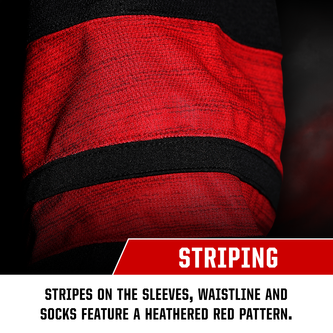


These images reveal some elements that were visible in the teaser video the Hurricanes released more than a week ago — but that none of us seemed to pick up on. We saw the shoulders and the sleeve stripes, but did anyone point out the storm grey or the heathered red hiding in plain sight? Going back, you probably see it now. Clever Canes.
If the heathered pattern in the striping on the sleeves and socks looks familiar, it should. It was inspired by the stripes on the Team North America jersey in the 2016 World Cup of Hockey. That was Adidas's first outing in Adizero uniform design. As of today, the Hurricanes are the only NHL team to make use of this feature — and probably the most appropriate given the weathered look.
Forman told me the team entertained concept designs that were entirely storm grey — and entirely black. The aha moment came when they brought the two colors together. He said they asked Adidas for the darkest grey they could make work and that became the shoulder yoke.
The design team wanted the primary Hurricanes logo to be present on the uniform, so they carried over the "ghosted" shoulder patch from their 2008 third jersey. But again, that wasn't enough. The group wanted something to make this jersey special. They considered military-style insignia as a tribute to American veterans but eventually settled on the simplicity of the state flag.


"We worked with North Carolina Governor Roy Cooper on that," Forman said as the team needed approval from the state to use the flag. It didn't hurt that Cooper was a "really big Canes fan prior to taking office," Forman added.
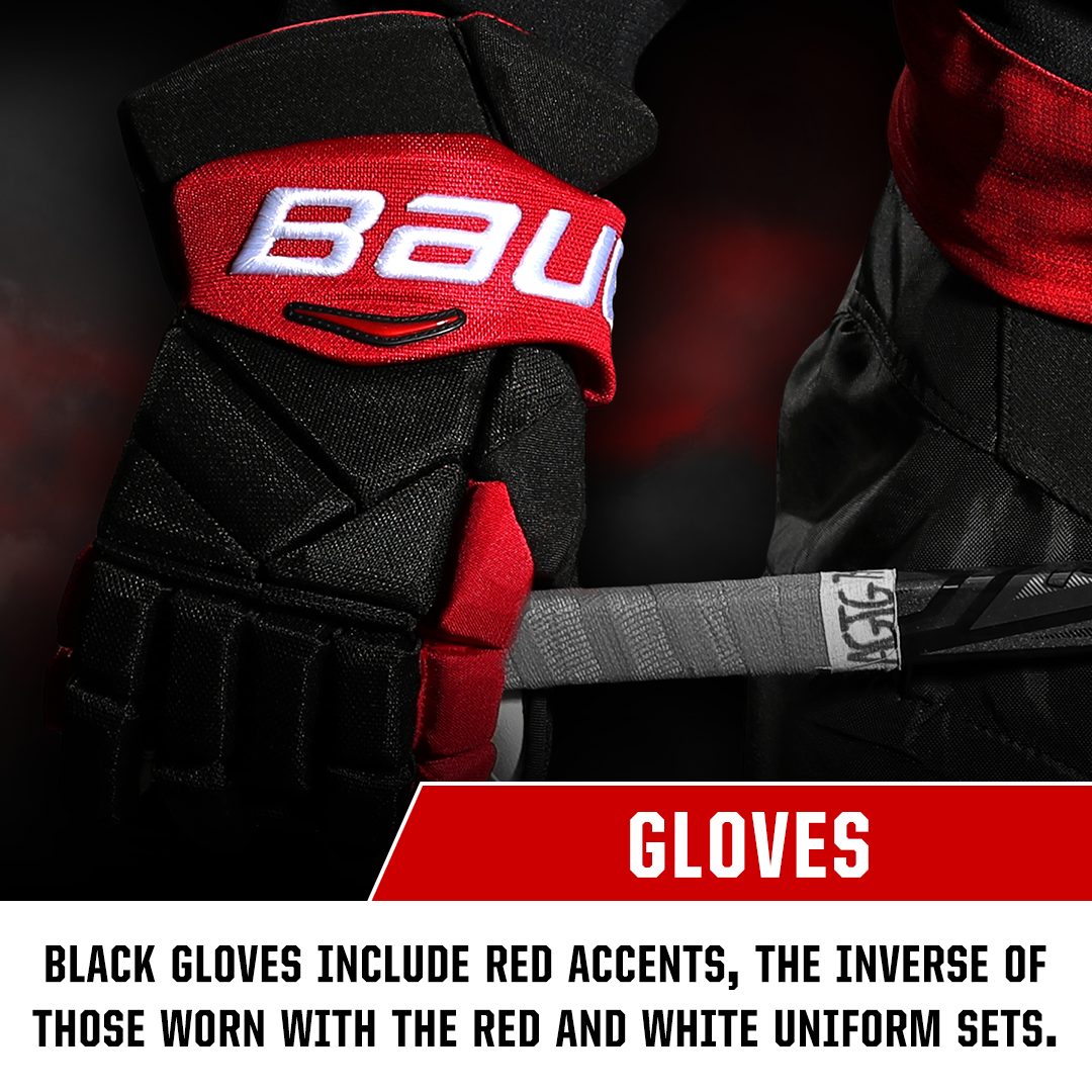
As for the number and name font, it remains the same as what we see on the primary uniforms — though now the red and white have been reversed. White numbers with red trim.
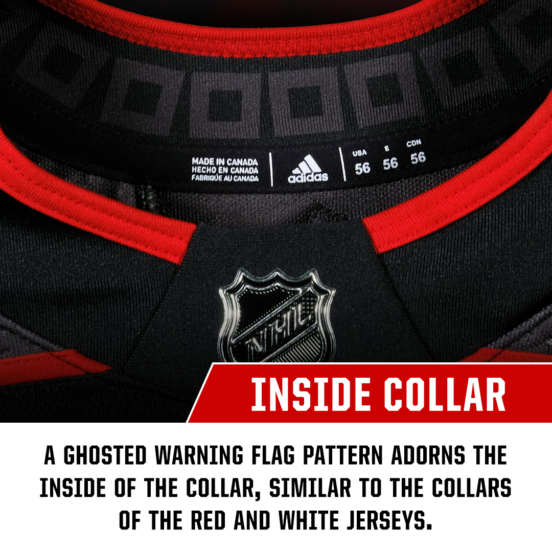
In addition, the ghosted storm flag pattern is present on the inside of the collar — the hanger effect. It's the element that connects all three Hurricanes uniforms together.
Lastly, the helmet introduces us to a new wordmark — that leaked via the Canes' owner in March.
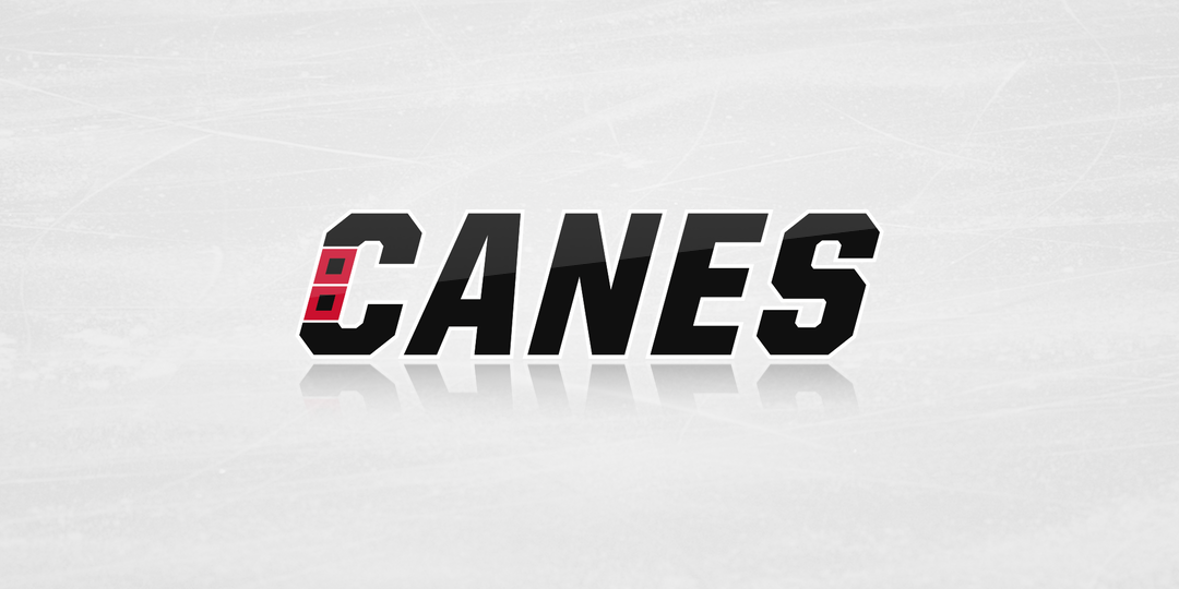
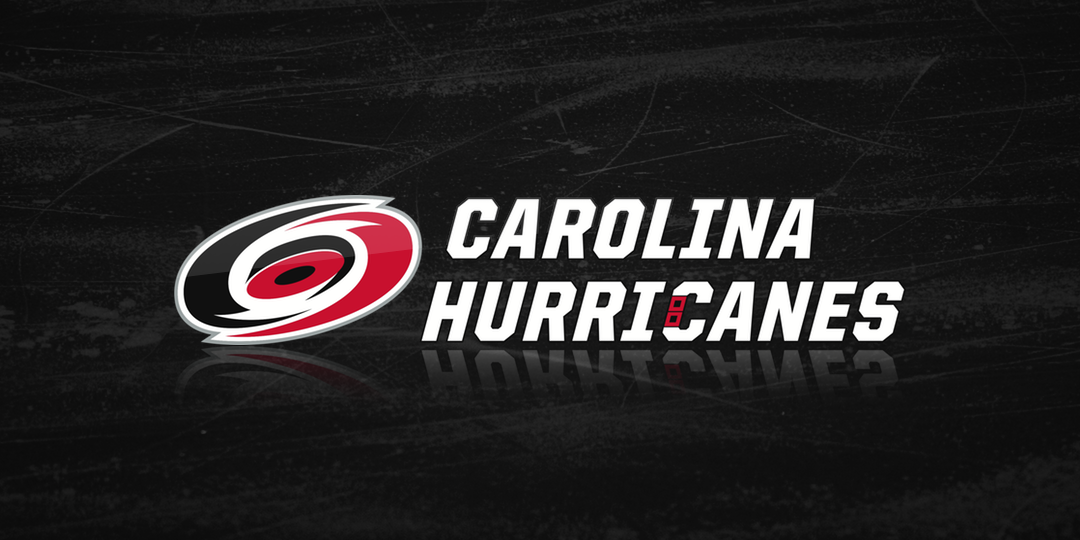
Even though we've seen it before, tonight's unveiling was confirmation. What we also know now is that this design will replace the helmet decal on the home and road uniforms as well. You can see the red and white versions above, along with a new full wordmark.
Like the third jersey, the wordmark incorporates a dual storm flag design, finally answering the critics' concerns across every uniform the Hurricanes will wear this season.
Or does it?
Team owner Tom Dundon been anything but silent over wanting to see his team pay tribute to its history in Hartford. Are Whalers throwback jerseys really possible in Raleigh next season? I had the Hurricanes' brand strategy guy on the phone so I had no choice but to ask.
The answer? Well... Forman wouldn't answer that one. But he did concede that he and I would probably have a reason to talk again down the road. Take that how you will.
For now, these are the three uniforms the Hurricanes will wear in 2018-19.
For more, check out the great minisite the Canes put together.