
The 7: Hanger effects on NHL jerseys in the 2017-18 season
/This week's edition of The 7 deals with a part of the NHL uniform that's rarely seen. In fact, it's really only seen while a jersey is hanging up in the locker room.
Introduced by Reebok in 2013 and first featured on the new Stars and Hurricanes jerseys that year, the "hanger effect" is a special design on the inside of the collar — so named because it's only visible while the jersey is on a hanger.
This season, 28 of the 69 jerseys worn in the NHL had this hanger effect. Let's take a look at the different types of designs that were used.
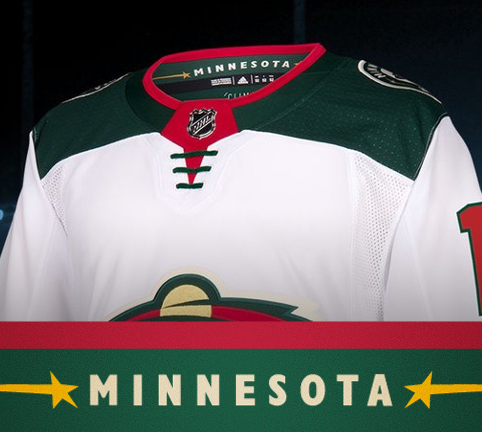
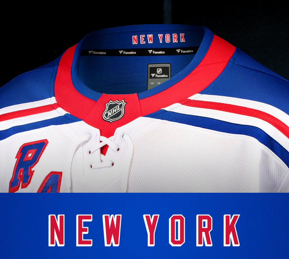
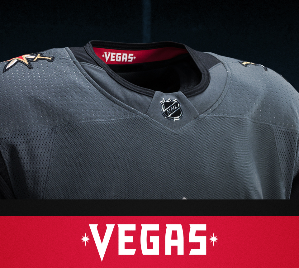
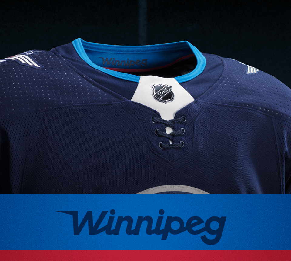
1 // Pride of Place
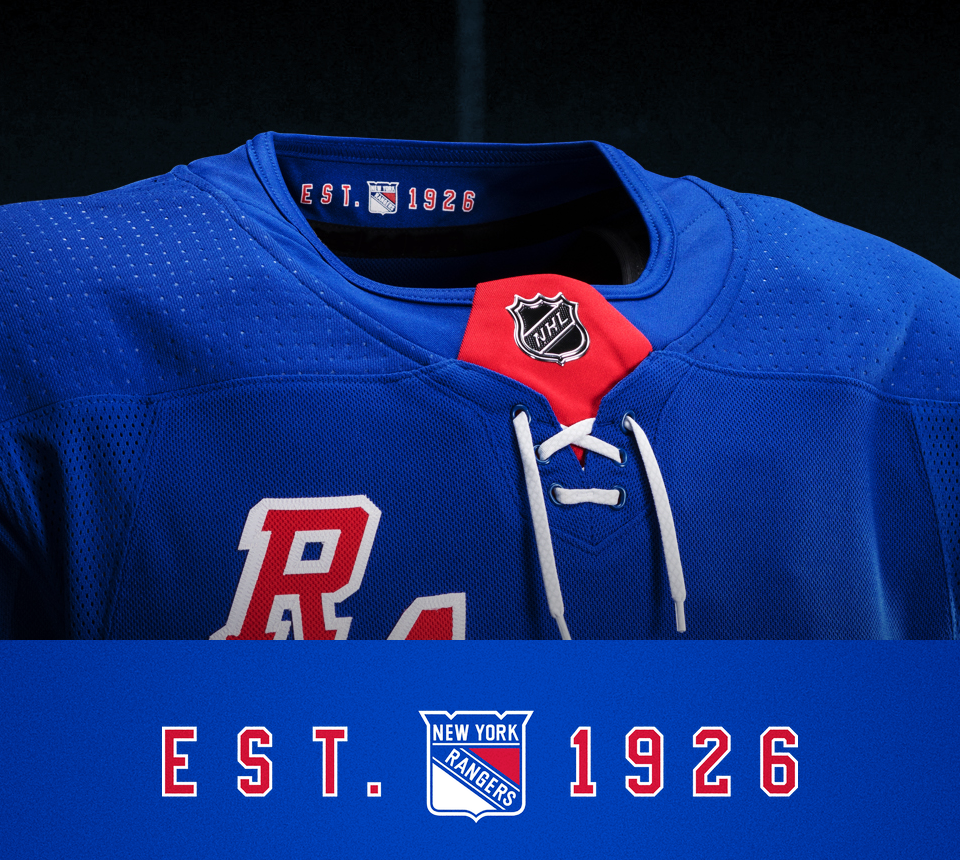
Some teams use a wordmark in their collar to show pride in their hometown. The Minnesota Wild and New York Rangers do this on their road jersey. The Vegas Golden Knights and Winnipeg Jets do it on both of their uniforms.
The Rangers' design is set in the same font as the player's name on the back. The Minnesota and Vegas designs both come directly from their wordmarks. Winnipeg's is a special design only found in the collar.
Minnesota and Winnipeg carried their designs over from their previous Reebok jerseys.
2 // City Symbol
Another way to show hometown pride is by waving your flag, as it were. The Calgary Flames use the flags of Canada and Alberta on their shoulders, for example.
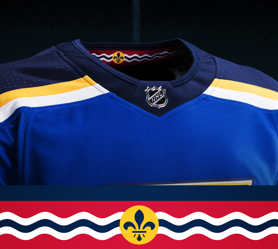
The St. Louis Blues, on the other hand, use symbolism from the city flag of St. Louis on the inside of their collar. It's the first time we've seen red in the Blues' uniforms since the 1997-98 season.
3 // Pertinent Patterns
A few teams use special patterns of significance to their branding or region.
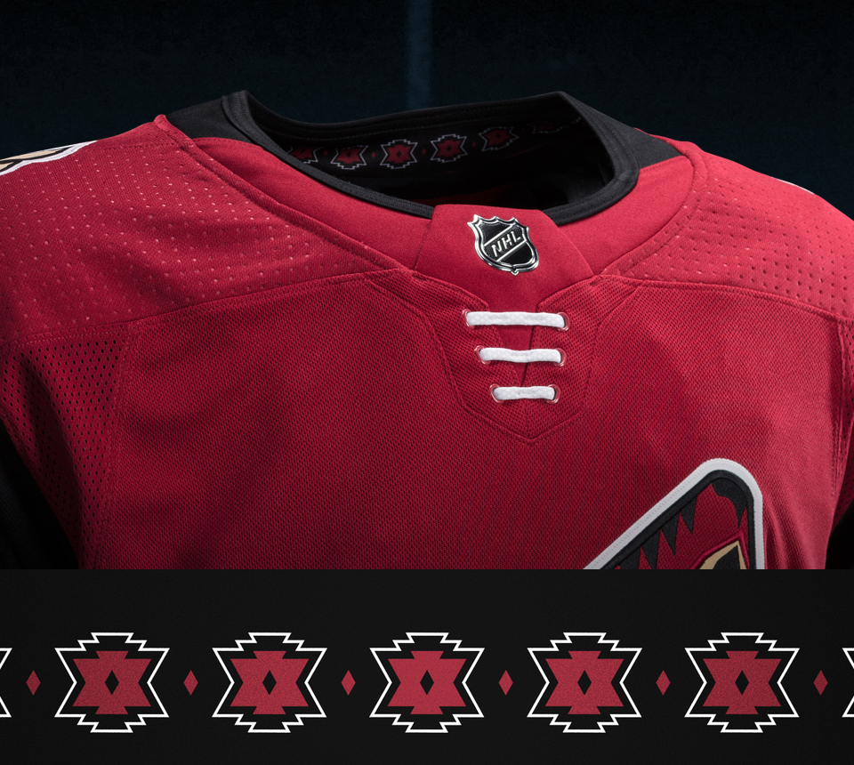
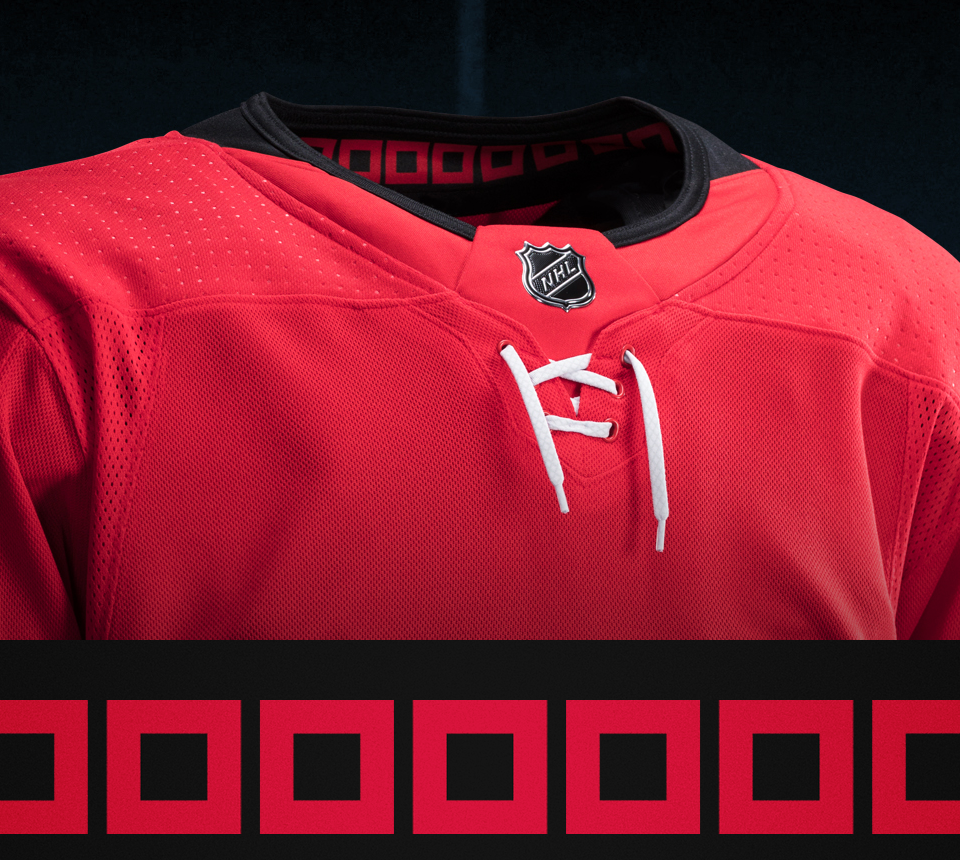
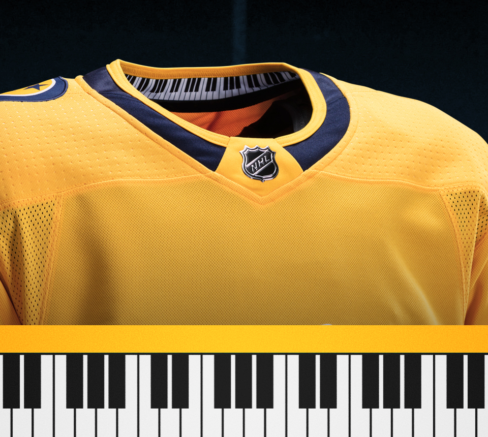
The Arizona Coyotes use a pattern inspired by Pueblo art. The Carolina Hurricanes have a string of tropical storm flags, similar to those you find around in the waist stripe on the home jersey. And the Nashville Predators use piano keys. It's Music City. What else would you expect?
4 // The Establishment
One of the more common collar designs has been involved a team's founding year — though this season the New York Rangers were the only team to do it. The Rangers, by the way, are the only team with two different designs for their primary jerseys.
(The Blues and Flyers are among the teams that have done this in years past.)
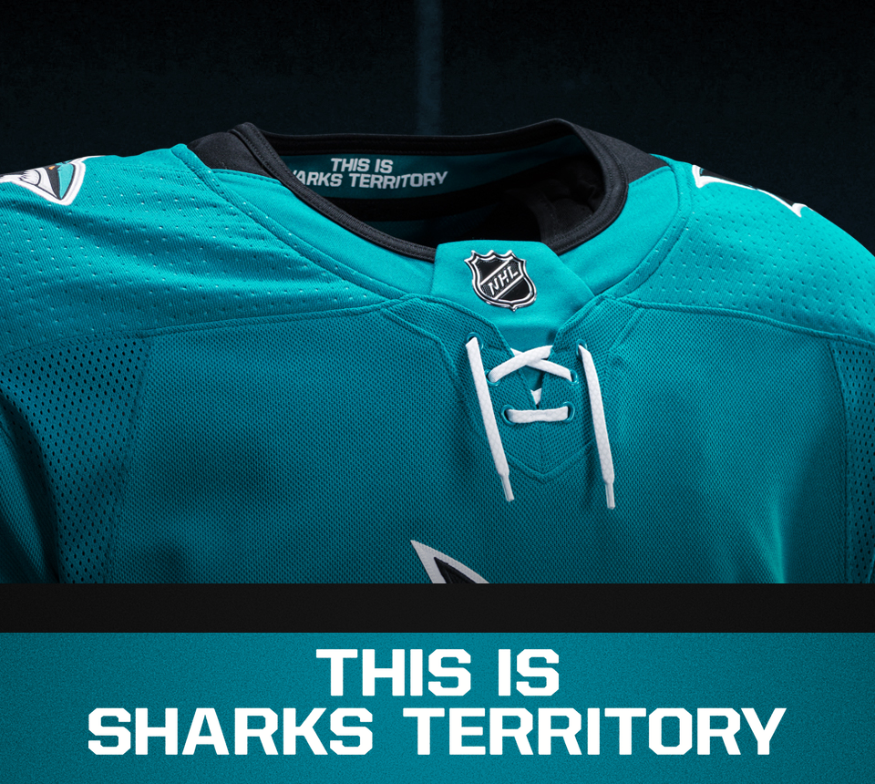
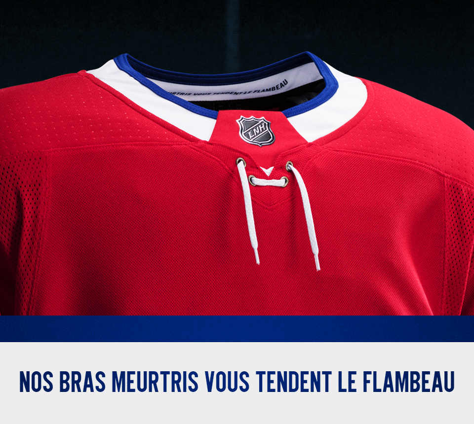
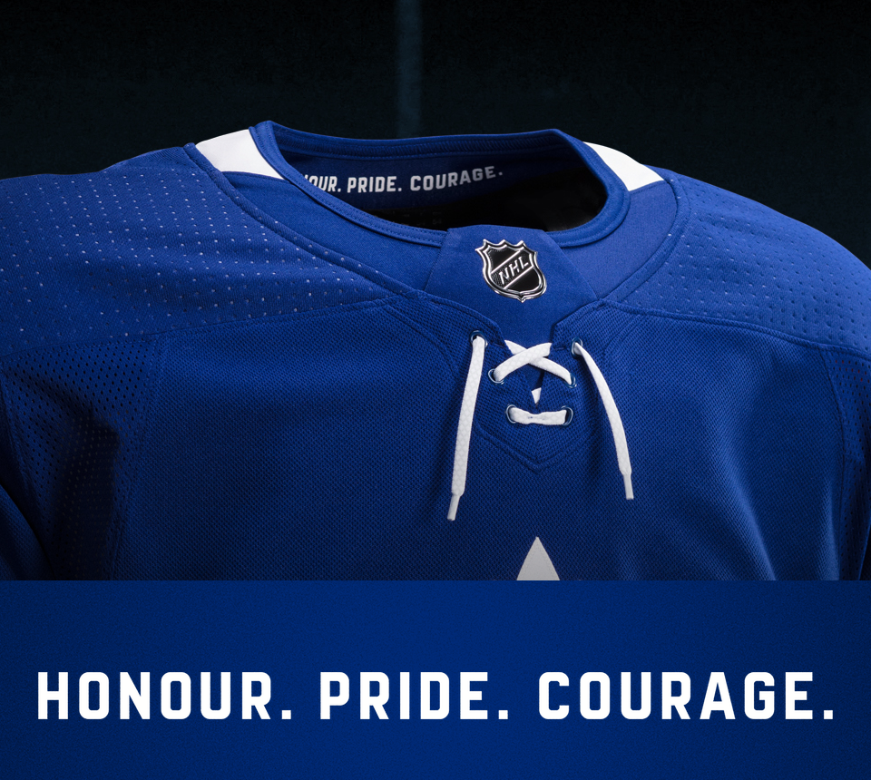
5 // Motivating Mantras
Several teams currently use slogans for their hanger effect designs.
The Montreal Canadiens use a French phrase, "nos bras meurtris vous tendent le flambeau." It's an excerpt from the 1915 war poem "In Flanders Fields" by John McCrae and translates as: "To you, from failing hands, we throw the torch." It's also posted in the Habs' dressing room.
Meanwhile, the San Jose Sharks use a rather straightforward slogan — "This is Sharks territory." No translation needed.
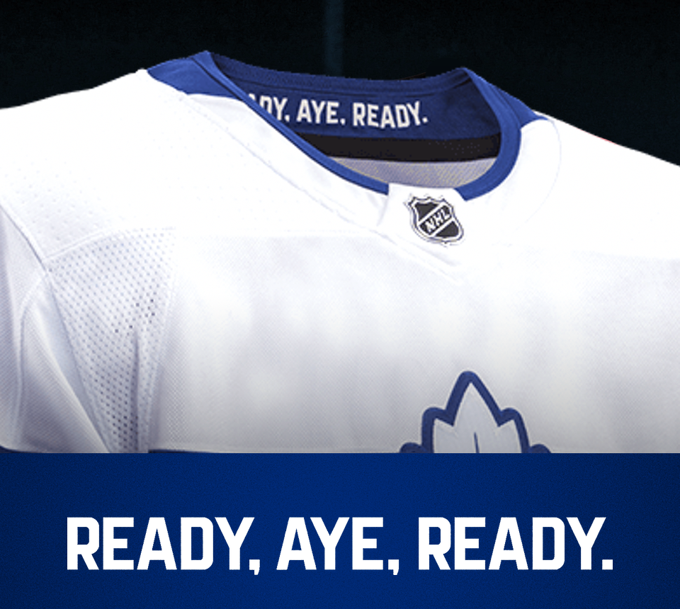
In 2016, the Toronto Maple Leafs introduced their motto, "Honour. Pride. Courage." And this year, on the Stadium Series jersey, the collar featured the Royal Canadian Navy motto, "Ready, Aye, Ready."


6 // Go Green
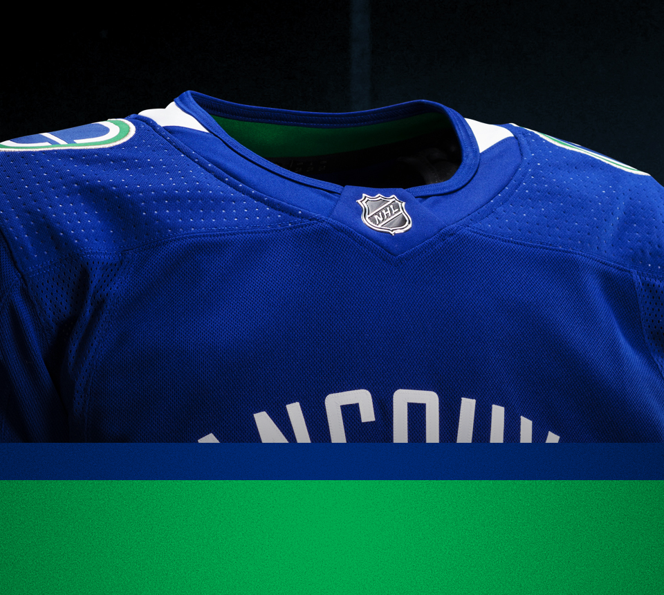
Sometimes the collar just needs to be green. The outside of the Vancouver Canucks jersey collar is blue and white. But the inside is green. If only they could've used more green where we could actually see it.
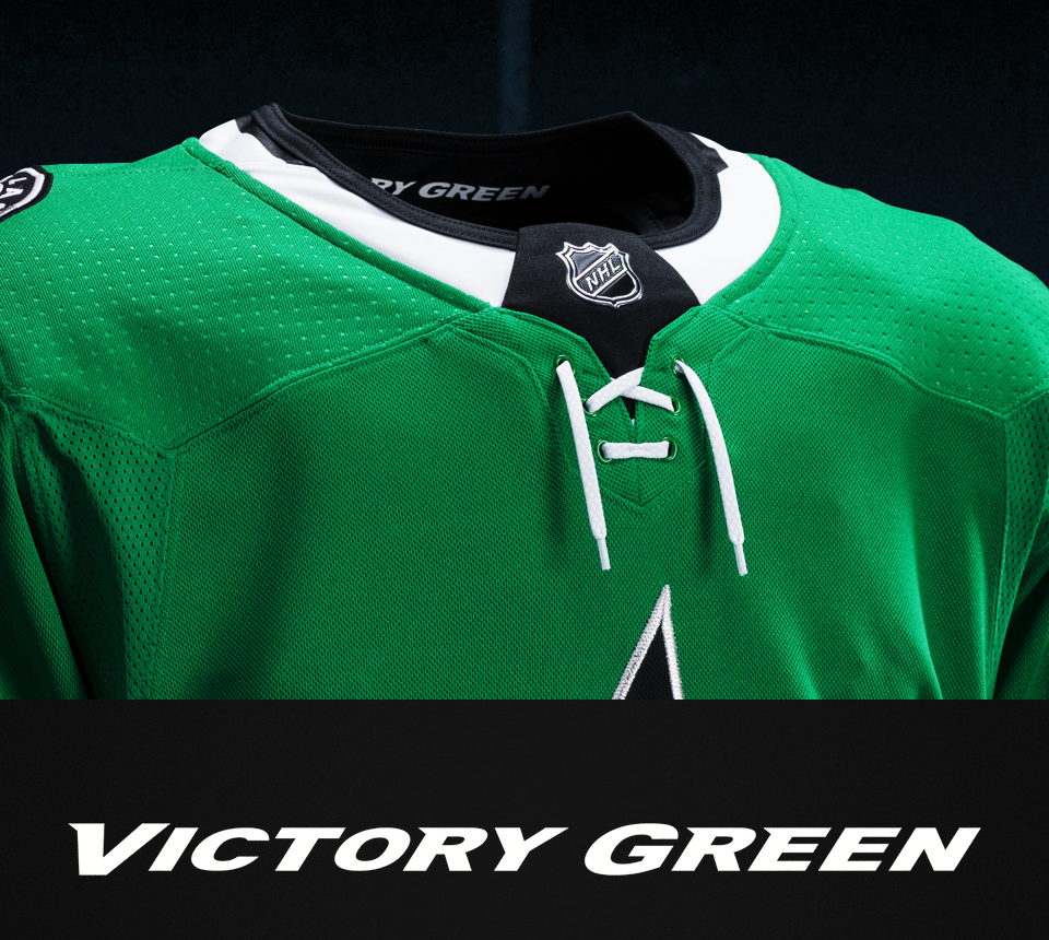
On the other hand, the Dallas Stars collar simply reads "Victory Green" — the official name of their jersey color. The problem is neither the text or the material it's printed on is green. White text, black collar. Go figure.

7 // Cup Conceit
This last one could probably fit in the previous category, but really it has its own theme. The New Jersey Devils use their collar to brag about the years of their three Stanley Cup championships — 1995, 2000, and 2003 — all on a green background as a tribute to their original colors. Assuming they'll update the design if they win another Cup.
Green, of course, is seen nowhere else in the Devils' current uniforms. But in recent years they have started wearing throwbacks around St. Patrick's Day.
What do you think of these collar designs? Of the teams that don't use this feature, is there one that should? Also, if you have any ideas for future editions of The 7, let me know!
Editor's Note: This post was updated April 21 to include the Rangers' road collar design.