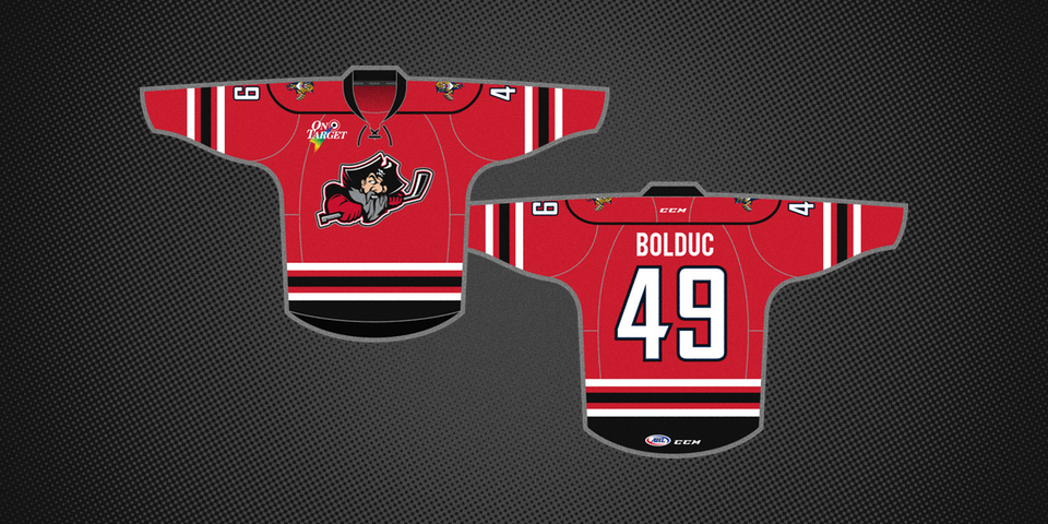
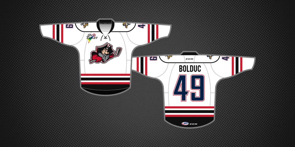
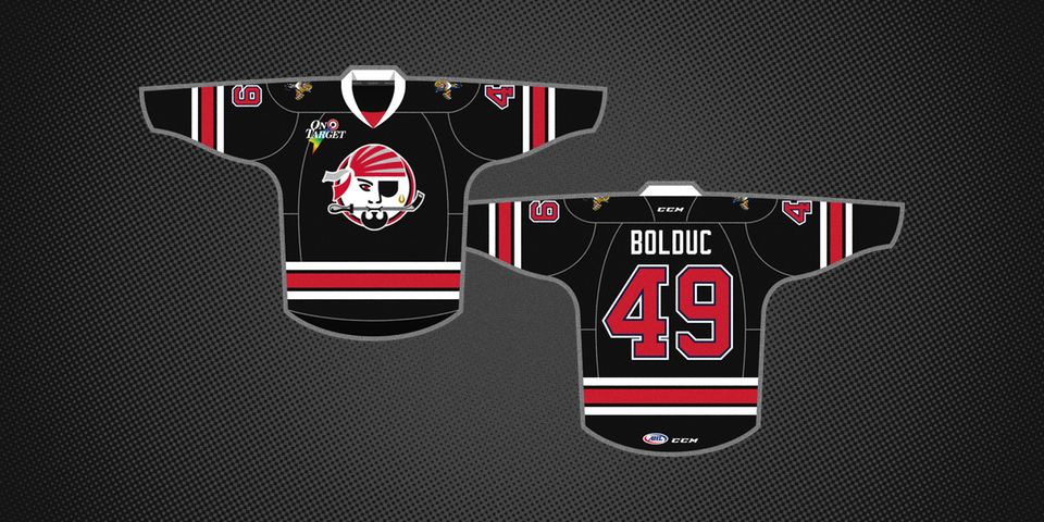
Portland Pirates unveil new jerseys with familiar design
/


Overshadowed in yesterday's NHL jersey leak was the official unveiling of a new set of uniforms for the AHL's Portland Pirates.
Shame because this is quite a story in itself.
The Pirates recently entered a new affiliation agreement with the Florida Panthers. But rather than simply swapping out a shoulder patch, they decided to update their entire wardrobe.
From the team's press release:
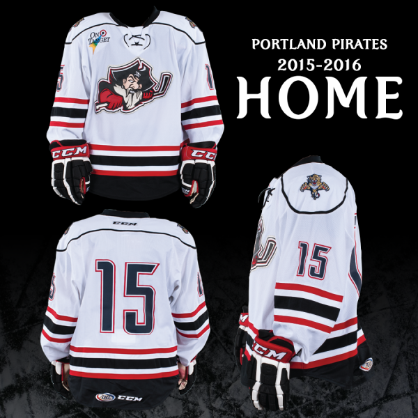
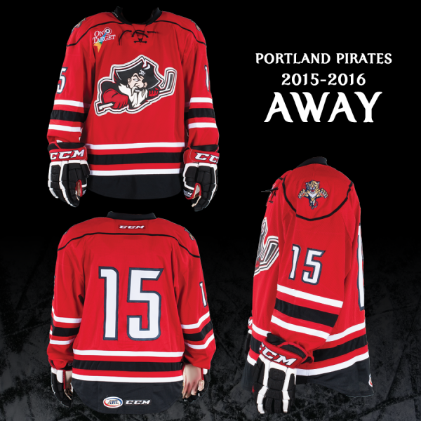
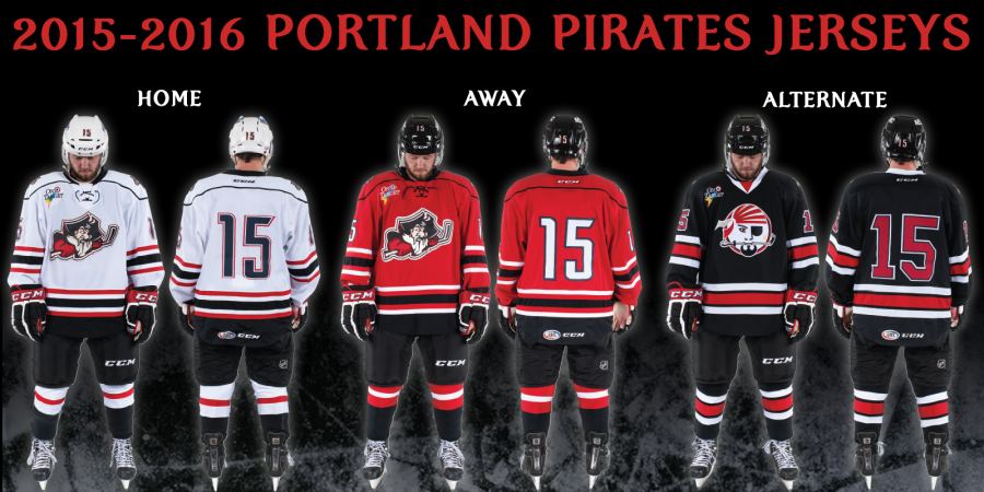
Said Portland Pirates COO Brad Church: “We feel the new game uniforms bring us a more traditional look that our players and fans will be proud of.
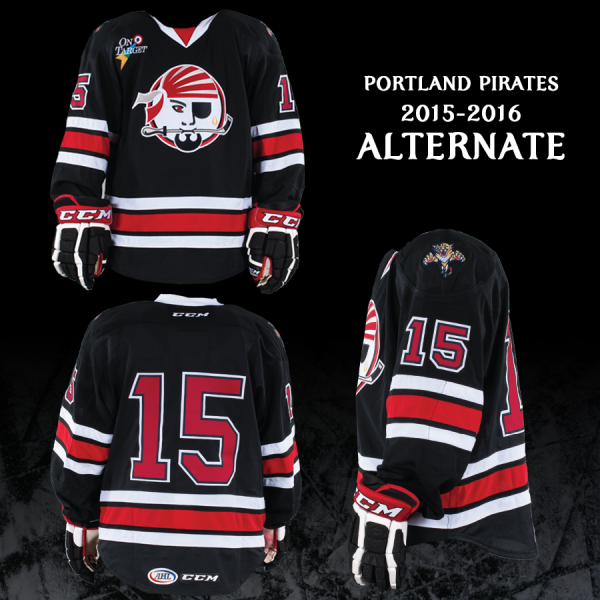
"We’re also excited to bring back our original 'Swash' logo and our original uniform design in our alternate jerseys. This is a design that our fans have been asking for, and we are very happy to make this design a reality.”
The throwback third jersey is not an exact replica of what was worn in 1993. But it is a design Icethetics readers may have seen before. In fact, you may have seen all three before — right here.
On July 25, 2012, this was our concept post for the day. Scott Markiewicz submitted these three jerseys and I defy anyone to spot a significant difference between them and what the Pirates just unveiled.
In fact, apart from the affiliate logos on the shoulders, the only variation I could find was the color of the material behind the laces on the red jersey. (And one other I'll get to in a sec.) That's kind of insane.
Scott tweeted that he based the designs off the jerseys worn by the OHL's Owen Sound Attack. Fair enough. That means it's a template Reebok already has in stock and therefore easier to reproduce.
But as he says, what are the odds? Even if we assume Owen Sound was the inspiration, the third jersey is the smoking gun in my opinion. It's dead on with Scott's design. Down to the stripes and number font.
Hard to believe that's just a coincidence.
This may actually be the first ever example of a professional hockey team using a jersey design that was originally posted on Icethetics.
Unfortunately, even if this is true, Scott is unlikely to get any official credit for the design. Still has to be nice to see your ideas come to life though, right?
By the way, I mentioned one other small difference earlier. Take a closer look at the numbers. Correct me if I'm wrong, but it sure looks like they're blue on the white jersey — and trimmed in blue on the other two.
It's not referenced in the press release, but could this be a subtle nod to their new NHL affiliate in south Florida? Or am I just seeing things?