
Designing the ’90s NHL, Part 2: Expansion & Relocation
/If you haven't read Part 1 yet, you should start there.
When we left off with NHL logo designer Ken Loh, it was the mid-1990s. His famed "Burger King" crest — a design he thought was dead — found its way onto a new Los Angeles third jersey. And a bold proposal for the Philadelphia Flyers fell flat.
REPLACING AN ICON
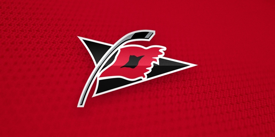
Then in 1997, the Hartford Whalers relocated. The loss of one of the greatest sports logos of all time put the pressure on The Mednick Group, as the NHL hired the agency to create a logo for the new Carolina Hurricanes — or was it "Hurricane"?
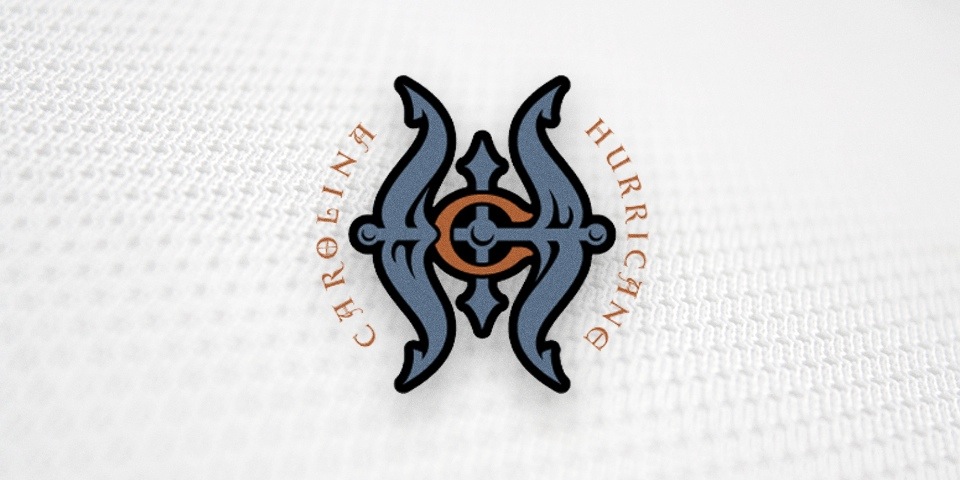
Obviously, these designs never made it to the NHL and the team ultimately went with the plural form of its name. But there's always a great story behind work like this. Ken writes:
I wanted to make a historical nod to the Hartford Whalers since that’s where the team came from. I like teams to have history. The fans who grow up in cities around the world should have a long-standing connection to a franchise and its history.
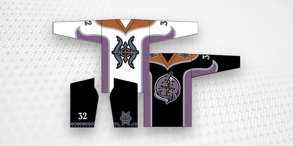
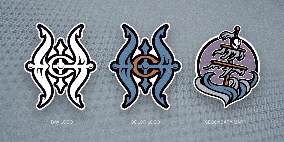
The logo was intended to be the primary mark for the team, since it was a new franchise. At first glance, you’ll probably see “C” and “H” for Carolina Hurricane. But if you look more closely, you’ll notice that the overall “H” form has a “W” intertwined, being formed by the vertical anchor rod in the middle.
I actually wanted it to read more like “HW” than “CH.” Deep down, I was hoping the team wouldn’t move or change its name, but could adopt a variant of the HW emblem.
It's comforting to know that when it became necessary to replace the iconic Whalers logo, some of the people involved were desperately trying to find a way to let it live on.
In the end, it wasn't even a designer that created the logo the team ultimately selected. It was a copy writer at the firm named Peter Thornburgh.
"Ironic that a writer's design beat out a bunch of professional designers," Ken said, "but he had been honing his craft designing logos for his own fantasy football teams for years. Many of us are still in the same [league] together [25 years later]!"
When Peter created the Hurricanes logos, he already had the NBA's Minnesota Timberwolves under his belt. And to think his original plan was a medical degree.
Makes you wonder where some of the talented designers behind The IceHL are headed.
GENERATING BUZZ
By this point, you may feel Ken's contributions to the NHL have been minimal. After all, his work on the Flyers fizzled. He lost out to a writer on the Hurricanes job. And his vision for the Kings all but vanished in a jersey that saw action in no more than a half-dozen games.
Kicked. Beaten. Down. But not out.
Ken's final project for the NHL would prove to be his most successful when, on Nov. 11, 1997, the owners of a new expansion franchise stood before reporters to announce its official name and logos. Meet the Columbus Blue Jackets by Ken Loh.
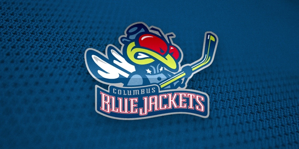
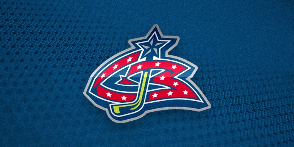
"I'd love to credit another designer, Van Duong, who worked with me on the Blue Jackets logo," Ken said. "He is one on the best designers I've ever worked with. He really helped put some of the finishing touches on Stinger and was also the main designer on the CB mark."
Ken said Van was also involved in developing designs for an NHL All-Star Game in the mid-90s.
While it's true "Stinger" and the Blue Jackets moniker didn't immediately win over many Columbus fans, Ken's work satisfied his client and will live on in the hockey history books. For seven seasons, the Jackets wore his blue, red and electric green marks before the bold fashion statements of the '90s were slowly purged from the NHL.
"I am a traditionalist when it comes to sports and logo design," Ken said. "I was being pushed to develop marks that had more appeal for kids, while I attempted to maintain a stronger sense of tradition and professionalism.
"I felt some of the direction the designers were being given at the time was more appropriate for school or camp teams, and didn’t have the lasting appeal that pro franchises — or even collegiate ones — should maintain.
"I am happy to see that Flying Elvis has stood the test of time though. Twenty years later, it doesn’t feel old yet."
WHERE ARE THEY NOW?
Ken Loh doesn't make sports logos anymore, but his design sensibilities have been employed by great companies. After spending time at Yahoo! and Oakley, he is now a driving force behind Apple's online shopping experience. Find him on Twitter at @kloh.
Scott Mednick, founder of The Mednick Group, moved on to the Hollywood film industry. His credits include Where The Wild Things Are, 300 and the upcoming reboot of Teenage Mutant Ninja Turtles. Find him on Twitter at @ScottMednick.
Finally, I know I promised never-before-seen logos Ken designed for another NHL expansion team. However, I now realize they're better suited to the third and final chapter of this story. You won't want to miss that. Stay tuned!
CONTINUE READING: Part 3: Epilogue