
Is This the Isles' New Third Jersey?
/ Picked up on a story from Puck Daddy this afternoon. Seems they may have found a potential leak of the New York Islanders' new third jersey set to debut this fall.
The image below, uploaded to Flickr yesterday, comes from the account of a user named roblgraphicd. And as Greg Wyshynski points out in his blog post, the Isles currently employ a graphic designer by the name of Robert Lawlor Jr. The account includes any number of samples of Islanders design work. You can draw your own conclusions.
So the question is this: Are we looking at the Islanders' new black third jersey?
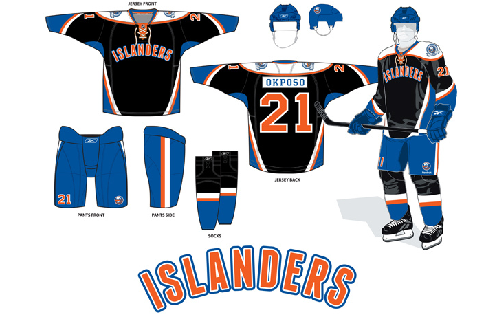 Is this the New York Islanders' new black third jersey or just a concept? / Flickr
From the designer:
2011-12 Season will be the first in which the Islanders take part in the NHL Alternate Jersey program. Featuring modern panels and a somewhat retro type treatment, the jersey also includes the 40th Anniversary logo as a shoulder patch.
First off, he's forgetting that the current home jersey started out as an alternate jersey in 2008. And that they actually had an orange third from 2001 to 2007. So it won't be the first time by any stretch. Second, there's nothing retro about this jersey. It's all super-modern. And not in a good way.
The most prevalent rumors this summer have put the Isles in a black alternate sweater this fall. But more recently, as I wrote in the July edition of the NHL JerseyWatch, I was told that the primary color would be blue and the jersey would feature grey and orange trim. Can't say if that's true or not.
Even if this is not the final design, the fact that it seems to come from a graphic designer who works for the Islanders tells us at the very least it could be a prototype considered by the team. That in itself is newsworthy on this blog. We always enjoying seeing concepts from the pros.
Now if you want my thoughts, I'm of two minds on this. On one hand, it's just nuts enough to be an actual NHL jersey. On the other, I would've hoped the Islanders' had learned their lesson about insane jersey design. This is way too trendy for its own good. Wordmark on the front. Mismatching nameplate on the back. Black. And for what's worth, the design seems to be based in part on the Phoenix Coyotes' third jersey template.
When the Isles launched their Reebok Edge jerseys in 2007, they were quite ugly. They've since rectified the problem by going back to their roots with beautiful throwbacks. But I guess somebody at the top still wants the Isles' to have at least one oddball uniform in the arsenal. And this would surely do the trick.
I can't give you a definitive answer on its legitimacy. I can just show it to you and let you make up your own minds until I have something more concrete to report. And once again, excellent find by Puck Daddy!
Quick follow-up. As pointed out in the comments, it seems the Robert Lawlor Jr. in question has suddenly had his name removed from the business directory of the Islanders' website. As proof that it was there before, I managed to grab this screenshot of that portion of the page.

I really hope no one lost a job over this. And I'm not sure what this action says about the supposed "leak." Either 1) the guy posted something online that he shouldn't have and got the sack, or 2) he's a former employee who posted a concept online and when it got the team's attention, they finally remembered to take his name off the online employee roster. However, that assumes the name Robert Lawlor Jr. is tied to the "roblgraphicd" Flickr account, which hasn't been fully established yet. Though there is more evidence...
If you click on the "New York Islanders" set on his Flickr account, the user's employment is described. Looks like he just began working for the team last October and was still working there until now. Here's a copy of the text in case it disappears later as well.
New York Islanders
October 2010-PresentDesign creative materials to support teams needs. Developed print and web marketing, as well as all team specific graphics for Nassau Coliseum, Islanders Team Stores and ice rinks affiliated with the organization.
SELECT ACCOMPLISHMENTS INCLUDE
Successful completion of 2011-12 season Islanders Yearbook undertaking role of sole designer. Utilized 2D barcodes to procure quicker fan engagement for promotions and ticket offers. Developed a streamlined photo editing and archiving process. Adaption of design elements across various projects strengthening brand. Mentored design internship participants, assessing skills and developed roles for each within department.Reference: Erik White
Creative Services Manager
For the record, the Isles' online business director does indicate an Erik White as the creative services manager. Again, I don't know what any of this means exactly, but there are at least some more details for you to digest.
And now the jersey design is gone from the Flickr account. Again, still not proof of anything.
The Islanders have now officially commented on the apparent third jersey leak via Twitter.
@NYIslanders: That is one of the 3rd jersey designs we are considering. At the appropriate time we'll announce the #Isles official 3rd jersey.
So now we know it's at least a prototype the club is looking at. Whether or not it's where they land remains to be seen. They didn't specify when the official announcement will take place.