
Going to the Next Level
/


Those who have been avid readers of Icethetics from the beginning — I'm talking back in the NHLToL days — will no doubt recognize the logos above, and just as equally the unusual cyber-moniker of the artist that created them. GhettoFarmBoy, known in the real world as Matt Kauzlarich, partnered up with NHLToL to showcase some of the best concept art that has ever graced these pages.
“It was undoubtedly the most popular concept art series Icethetics has ever hosted.”He launched a series we called Rebranding the NHL, in which he would redesign the logos and uniforms of teams he felt were in need of a new look. It was undoubtedly the most popular concept art series Icethetics has ever hosted.
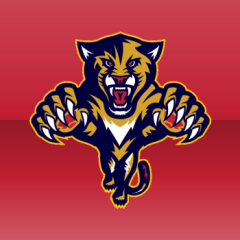
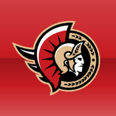
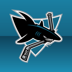
It all began in August 2007 when I posted Matt's Thrashers concept on NHLToL. It continued that week with the Islanders, Senators and Bruins. Before long, readers were begging for more. Matt rebranded the Ducks, Devils, Sharks, Capitals and Panthers before we officially joined forces in May 2008.
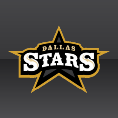
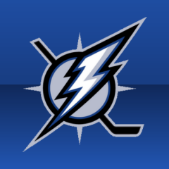
Under the partnership, all of Matt's new rebrands would make their world premiere here. His Lightning rebrand was first out of the gate. In the next few months, he also reworked the Sabres and, finally, the Stars on August 6, 2008. The year flew by but it was one of the most memorable for NHLToL/Icethetics readers.
Unfortunately, the blockbuster partnership was short-lived as Matt's work was getting noticed. Despite starting work on a highly-anticipated St. Louis Blues rebrand, Matt has never gotten around to finishing it. But that's because he's been busy selling his talents to pro teams — right where they belong.
I'm disappointed to say that I have not had much contact with him in the last two years, but by chance the other day I came across his portfolio. I was thrilled to discover that he was the artist behind what I consider one of the best-looking teams in minor pro hockey.
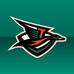
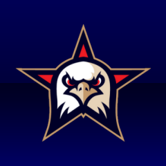
 Last summer, when the Quad City Mallards unveiled their new logos and uniforms, I marveled at the artist's ability to make a mallard duck look intimidating. No other IHL team looked this good. Quietly, though, I was struck by how familiar the new look seemed, as though I'd somehow seen it before. It must've been my subconscious connecting the dots. The design has Matt's fingerprints all over it.
You know, it seems the only logo-related news on the blog lately has dealt with the dark side of logo design — infringement. It's refreshing to be able to share a success story with you guys — an Icethetics concept artist who's gone on to much bigger and much better things.
I'd love to be able to offer details of Matt's sports design journey in his own words, but sadly he has yet to reply to my emails. Busy guy, I'm sure. Hopefully we'll hear from him soon. And maybe even one day we'll satisfy that Blues rebrand curiosity.