
Panthers Unveil 3rd Jersey!
/ Last night just prior to their game, the Florida Panthers unveiled their brand new third jerseys. The sweaters are primarily dark blue with gold accents and introduce an entirely new color to the scheme — light blue.
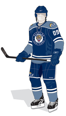
The Cats then debuted the new sweaters in the game against the Pittsburgh Penguins. It shouldn't go without saying that these jerseys do feel awfully reminiscent of the Winter Classic sweater the Pens introduced in 2008 — which later became their third.
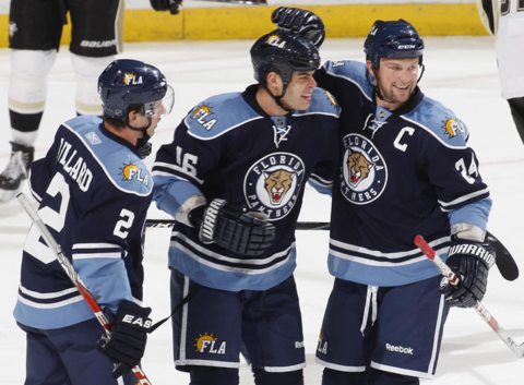 Keith Ballard, Nathan Horton and Bryan McCabe in their new threads
It also seems to borrow elements from the Minnesota Wild home and St. Louis Blues third jerseys. So unfortunately it's not a totally original look. Having said that, I like them a lot more than the home and road looks. It's a solid design and when you really get down to it, they look like hockey jerseys should.j
 Where the design falls down is that new secondary mark on the helmet, pants and shoulders. Yes, the Sunny FLA. Why? I'm intrigued by the irony that Reebok starts introducing abbreviation-based NHL logos and uniforms just after dumping their own abbreviated (Rbk) logo. (I know, I can't blame Reebok for everything.)
Despite that, I wouldn't be surprised to see that panther head logo soon take over as the team's primary mark. They've already chopped off the legs. Seems like a natural progression. What's disappointing is that along with that will probably see the end of red in South Florida. But it's been a staple since 1993 when the team first joined the league.
 In fact, their original road jerseys were red. But suddenly in the last couple of years the red jersey was relegated to third status when the dark blue alternate was promoted. Then in the Age of Reebok, the red jersey went away completely. Fans hoping to see it return with this third were left disappointed as it's not even an accent color. In fact, they just added another shade of blue.
Still, it's always nice to see a team try something different. I have to give the Panthers credit for going out on a limb. But traditional sweaters in a non-traditional hockey market just seem to clash. St. Louis and Minnesota got it right. Nashville and Florida need some work.
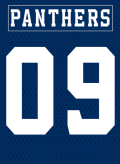
I'll finish my analysis with something positive. I do like the custom type used for the lettering on the nameplate as well as the numbers. At first glance, it looks like a standard block font, but look closer.
The Panthers have said the jersey will be worn for 12 home games this season — including last night's — but I have yet to come across the schedule. If I do, I'll be sure to add it to the calendar in the sidebar.
So what do you guys think of the new threads?