Introducing the Utica Comets

Canucks' AHL affiliate unveils name, logo and uniforms

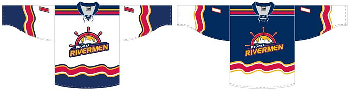
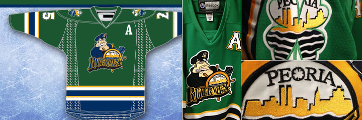
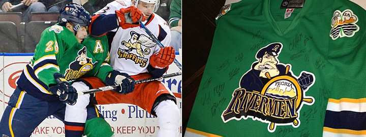
The AHL's Peoria Rivermen have been searching for a new home over the last several weeks after the Vancouver Canucks purchased the franchise and announced it would be leaving Illinois. This afternoon at a press conference in Utica, N.Y., the team officially became the Utica Comets.

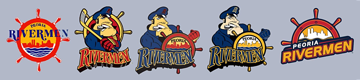
The new logo was first to be unveiled. Its shield design gives it an almost soccer-like quality. But the flying puck leaves no doubt this is New York's newest hockey team. The crest is styled after the look of the Canucks, the club's owner and NHL affiliate. Which is good because the jerseys belong to Vancouver too.

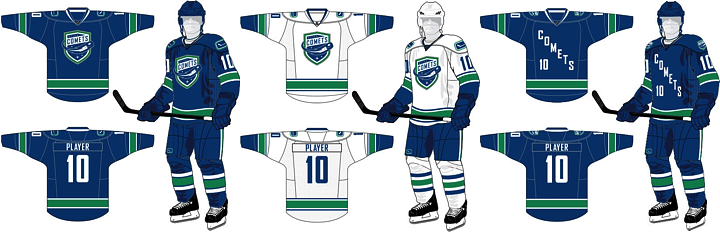
Utica Comets home, road and alternate jerseys (via Canucks website)

Comets to wear modified Canucks sweaters

Also unveiled at today's news conference were the new home and road uniforms, which are essentially Canucks jerseys with a different crest. And rather than using the Canucks' primary logo on the shoulders, it's the secondary mark — the stick in the rink. 

This has naturally led to questions from readers about whether it "means something" for the Canucks' future. I think it has more to do with aesthetics (the orca logo doesn't have any green) than anything else. And they're actually not alone. The Worcester Sharks wear on their shoulders the same shield logo the San Jose Sharks wear on their pants.

I like the simple carryover from the Canucks on the home and road designs. But that third jersey doesn't do it for me. There's clearly an effor there to call back to a Comets jersey from an earlier era, but text and numbers on the front rarely find favor with me.

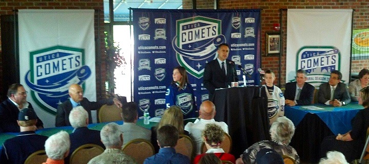
Comets announce name, logos and uniforms at press conference (via Facebook)

New name a nod to the region's hockey history

Today's announcement marks the return of AHL hockey to Utica. The city had previously been home to the Utica Devils (who are now, somewhat ironically, the Abbotsford Heat) but that was 20 years ago. The franchise left town in 1993.

The name Comets has a long history in the area. Nearby Clinton, N.Y. was home to the Clinton Comets starting way back in 1927 — though they didn't pick up the Comets moniker until 1949. The team played in a number of leagues over the years but they made their name after joining the Eastern Hockey League in 1954. Can you name the other EHL team that's now a member of the AHL? It's the Charlotte Checkers.

The Canucks posted a neat infographic on their website that delves into the history a bit. It explains how the new logo was inspired by the old Clinton Comets logo. The mixture of Canucks elements really brings it all together if you ask me.

It's a great, simple design that accomplishes everything it needs to as far as establishing an AHL franchise in a new city. Sure we'll hear complaints about the text in the logo, the puck, and probably even cracks about the lack of creativity in the jerseys themselves. But consider the amount of time the organization had to put this all together.

The Canucks bought the Rivermen franchise in April. That's just two months to get logos designed and approved and put jerseys and other merchandise into production. That's a very fast turnaround for something like this. And it's rather impressive to see what the end result was.

Comets to begin play in Utica this fall

The Comets will hit the ice in October and have this inaugural season logo to mark the occasion. Looks familiar, right? Like the Canucks' 40th anniversary logo from a couple years ago? Certainly a logo design time-saver if I ever saw one. That said, it's well executed.

For more on the new Utica Comets...

There was a lot put on the web today about the Comets, especially through official channels. So if you want to learn more, how about a nice link dump? 

After you get your fill, drop back by and share your thoughts on the new Utica Comets.

Rivermen, Raiders Unveil New Logos

Peoria's new SPHL team reveals logo, uniforms

On Saturday, the latest incarnation of the Peoria Rivermen franchise — now a member of the Southern Professional Hockey League — officially unveiled its logo and uniforms.

Peoria Rivermen new uniform designs (via Facebook)

I briefly went over the history of the Rivermen in Friday's post. The new look came just a day later via the club's new Facebook page, where they also posted the progression of Rivermen logos over the years.

Rivermen logo progression, 1984—present (via Facebook)

The branding efforts are an attempt to capture history and tradition of the Rivermen franchise which has existed in some form for nearly 30 years. That's quite a run. For a deeper look, I recommend this article from Dave Eminian of the Peoria Journal Star. The write-up mentions that the logo and uniforms were designed by Carie Hanawalt.

The old Rivermen franchise of the AHL was recently purchased by the Vancouver Canucks and will no longer play in Peoria. So there will be a new name and a new location for the team at some point but nothing has been announced yet.

WHL's Prince Albert Raiders start "green movement"

The other big logo unveiling last week happened in the Western Hockey League. The Prince Albert Raiders decided to highlight their green and introduce all new logos and uniforms.

New jerseys modeled at Raiders unveiling (via Facebook)

Take a good look at those jerseys. They're Reebok Edge, but a brand new template we've ever seen. Factor in the colors, and what are the odds we're looking at the next Dallas Stars uniform with a different logo on the front? It was an IceHL GM, Mike Kelly, who first mentioned this via Twitter. And I have to agree.

Then again, it would be surprising for a couple of reasons. First, if Reebok is going to go out of its way to generate an entirely new sweater template, why would they do it for a junior league team. It's more likely that it'd be for an NHL club — like Dallas. But then if all that is true, why allow the junior team to hold its unveiling first — three weeks before the NHL club?

It could be a simple solution, like maybe Reebok works up new templates every year — some of which may or may not end up in use in the NHL. It could just be a way of expanding their own product line. In any case, it's something worth talking about.

What's your take? Both on the Raiders' new look as well as the possibility that they're a preview of the Stars' redesign. And how about the new Rivermen?

May Minor League Report

All this work on the IceHL's 13 Weeks of R&R project has kept from doing my real job on Icethetics — updating the blog with actual news. In other words, there's a lot to catch up on.

Hartford Wolf Pack officially return to AHL

Well that didn't take long. After playing parts of three seasons as the Connecticut Whale, the Hartford Wolf Pack identity has made a glorious comeback — thanks to their NHL parent club, the New York Rangers.

The Wolf Pack were established in 1997 when the Binghamton Rangers moved to Hartford. Then in 2010, Howard Baldwin happened. His effort to recapture Hartford Whalers failed miserably with the rebranding of the franchise as the Connecticut Whale.

Connecticut Whale, 2010—2013

We applauded the judicious use of green but not the name or the terrible logo. Within two years, Baldwin was gone — which probably says more about his management style than his taste in sports branding. But we're all grateful nonetheless that the Pack is back.

And not for nothing, but the New York Rangers' AHL affiliate is now operated by the parent company of the Philadelphia Flyers, is it not? Global Spectrum is running things these days and it would seem they have two masters. Interesting.

The Rivermen are dead, long live the Rivermen

Speaking of the AHL, some craziness took place on Monday. The Vancouver Canucks who recently acquired the Peoria Rivermen franchise from the St. Louis Blues, announced the team would not operate out of Illinois next season. They don't know where exactly yet. Just not Peoria.

So it seemed the end of a brand that has existed for nearly 30 years. But the Rivermen are plucky. They won't go quietly. After 12 years in the IHL between 1984 and 1996, the franchise transferred to the ECHL for about a decade. Then in 2005, they got the upgrade to the AHL. In 2013, they move down — way down — to the SPHL, that's the Southern Professional Hockey League. (It exists!)

The SPHL is home to teams like the equally plucky Columbus Cottonmouths and the Pensacola Ice Flyers. And now it's also home to...

Bloomington Blaze switch from CHL to SPHL

The Bloomington Blaze are jumping the sinking ship that is the Central Hockey League for the equally crummy SPHL. A lateral move at best. But one they apparently feel is necessary.

The Blaze were founded just two years ago after the folding of the IHL's Bloomington PrairieThunder. (All these minor leagues you've probably never heard of.) They begin play in their new league this fall.

Now that we're on the CHL, we might as well talk about their newest expansion team.

Brampton gets Beast to replace lost OHL team

Earlier this year when we learned the OHL's Brampton Battalion were moving to North Bay, Ontario, it seemed like the good people of Brampton would be without a team. But that's when the Central Hockey League jumped in, expanding into Canada for the first time.

On April 27, the Brampton Beast were revealed to the world. Along with a very vanilla CHL-like logo. I won't pass judgment too hard since somebody was obviously trying. (I just don't know what they were trying for.) In any case, the Beast begin play in the fall. Like Peoria, hockey fans of Brampton won't miss a beat.

For the record, the North Bay Battlion also begin play in the OHL this fall. They will keep the same logo they had in Brampton.

The AHL Will Look Different Next Fall

In this post, I'm hoping to catch us all up on some recent AHL news I haven't had a chance to write about. There will be new affiliations and some relocations and just general upheaval.

Canucks buy Rivermen, could move them to B.C.

We start in Illinois. Earlier this month, the Vancouver Canucks agreed to purchase the AHL's Peoria Rivermen from the St. Louis Blues. The deal, announced April 1, means starting next season, we'll have a couple of NHL/AHL affiliate swaps.

Obviously, the Canucks will be aligning with their new asset in Peoria. Only they don't appear to be staying in Peoria. According to the Vancouver Sun, the club will pack up and find a new city closer to the west coast. Where might that be?

Heat may leave Abbotsford for Utica, N.Y.

The Abbotsford Heat and owner Calgary Flames are in a spot of trouble. Things aren't really working out in B.C. See, British Columbians don't seem all that eager to cheer on the future of their enemy. Most of them are Canucks fans after all.

So where does that leave us? The Flames are apparently content with nearby Abbotsford, but clearly a Canucks-affiliated team would be a better draw. If the Rivermen find themselves in B.C. next season, where would the Heat go? I can't say, but it would be the franchise's fifth home in a decade.

From 1993 to 2003, the Saint John Flames played in New Brunswick. After that, there was a two-year suspension of the franchise followed by relocations every other year from Omaha, Neb. in 2005 to Moline, Ill. in 2007 and finally to Abbotsford in 2009.

UPDATE (4/16): A number of you have correctly pointed out that Utica, N.Y. is apparently the most likely place for the Heat to move given a February report that the Flames may sign a 10-year affiliation agreement with the city. What's funny is that Utica is where the franchise was based 20 years ago — prior to being in New Brunswick. Only then, then were affiliated with New Jersey and known as the Utica Devils. Will they keep the Heat moniker or go with something better?

Blues likely to enter affiliation with Wolves

So back to the Rivermen. They'll be ending their arrangement with the St. Louis Blues, who'll presumably pick up the Canucks' sloppy seconds, the Chicago Wolves. Geographically, it makes sense too. So no surprise there.

Aeros may leave Houston for Des Moines, Iowa

What is surprising, however, is that we could be witnessing the end of a 20-year run of pro hockey in Houston, Texas. The Houston Aeros apparently can't come to terms on a new arena deal. You know what that means. Relocation, relocation, relocation.

Word is, they've been eyeing Peoria — should the Rivermen be moved by the Canucks. In which case, my money says the storied Rivermen identity never skips a beat. The Aeros become the "new" Rivermen and the "old" Rivermen get a completely new identity in Abbotsford or elsewhere.

But if the Canucks can't get the Rivermen out of Peoria, the Aeros would still have to find a new home. The Minneapolis Star-Tribune believes Des Moines, Iowa could be a good possibility. It's closer to NHL affiliate Minnesota Wild but less convenient when it comes to air travel and call-ups.

So there you have four AHL teams that could look very different next fall. But they won't be alone.

Other leagues will look different, too

Elsewhere, other changes are in the works:

  • The OHL's Brampton Battalion are on the move. The league approved the relocation to North Bay, Ont. back in November. It doesn't appear their name or logo will change — they have already been renamed the North Bay Battalion, according to the team's official website.
  • Brampton, Ont. loses one CHL for another. The Central Hockey League swooped in with an expansion team for 2013-14, which recently got its official name — the Brampton Beast. (Think the IceHL's Boulder Beasts might have something to say about that?) The club doesn't have a logo yet, but this is the CHL's first foray into Canada.
  • The CHL will also welcome the St. Charles Chill this season. You may recall the team named a winner in its logo design contest back in November.
  • UPDATE (4/16): JanBan (comments) reminded me that the QMJHL's P.E.I. Rocket will be rebranding this summer. Their new name, announced last September, is P.E.I. Islanders. You can currently get 50% off Rocket merchandise from the team store.

If I've overlooked anything, please let me know. We'll have a lot to keep an eye on this summer as teams move around and new logos get unveiled. Stick around!

AHL Clubs Also Celebrate the Irish

This past weekend was chock full of green jerseys all across the hockey universe. Yesterday, you got a comprehensive look at the various NHL tributes to St. Patrick's Day. Now it's time for a trip to the minors. Here are the AHL teams that went green this weekend.

Let's begin with the Binghamton Senators, who gave their alternate logo a bit of a recoloring for the occasion. The big difference between how the NHL and AHL celebrate the day o' green — apart from the variety of designs you'll see here — is the fact that in the AHL, they're not just warm-up jerseys. They're full on game sweaters.

Photos from Binghamton Senators via Facebook

That, of course, means plenty of pictures. So head over to the B-Sens' Facebook page and get a good look at this unique uniform design. There's a huge photo album for your enjoyment.

Next up, the Chicago Wolves were in on the St. Patrick's Day fun as usual.

Photos from Chicago Wolves via Facebook

Once again Facebook is the medium for a boat load of game photos. This is one of my personal favorites from the weekend. Definitely a more classic look and feel.

The Hershey Bears opted for green plaid on this day of St. Patrick. And I'm not sure they were better off for it. If the Wolves' jersey was toward the top of my list, this one was toward the bottom.

Jersey rendering from Hershey Bears via Facebook

The plaid aside, it's just a very dark and busy jersey. I'm not saying it's badly designed, but I wouldn't want one. It's a little bit much.

Photo by Anthony S. Fiore Jr. via Facebook

So far, the only game photo I've seen comes by way of Anthony S. Fiore Jr. who posted this to the Bears' Facebook page on Sunday night.

The Lake Erie Monsters marked St. Patty's Day with a black sweater and a recolored crest. Somehow the green lake makes the monster look a bit scarier.

Photos from Lake Erie Monsters via Facebook

The Monsters posted another photo on Facebook Sunday night which gives us a better glimpse at the shoulder patch and the name and numbers on the back. It's really a nice-looking sweater!

Not ones to miss out on any specialty jersey fun, the Peoria Rivermen sported green on Sunday. At first glance, the crest looks unchanged. But on closer inspection, the eagle-eyed will note the the "O" in Peoria has a four-leaf clover forming its center.

Photos from Peoria Rivermen via Facebook

Green is good and this is a brilliant example of that. And looking at this jersey, it occurs to me that this is a color scheme we rarely see in hockey. Green, blue and gold makes for a really sharp look. On Facebook, the Rivermen posted a photo collage that shows the finer details of this sweater.

Photo from Peoria Rivermen official website

They also shared this shot of a green jersey autographed by the team. And this report wouldn't be complete without a look at the sweater in action during Sunday's game against the Griffins.

Thanks to our good friend and designer Aaron Masik, the San Antonio Rampage looked pretty sharp in their green threads over the weekend.

Photo by Aaron Masik (@MASIK8) via Twitter

The Rampage tweeted a look at the jersey design on Saturday and prior to the game, Masik shared the above photo of the sweater itself by way of Twitter. Unfortunately, there isn't much to see in terms of action photos. At the time of this writing, I've found one shot on the team's Facebook page and it's not that great.

And lastly, there's the St. John's IceCaps, both wearing green and being green by recycling last season's green St. Patrick's Day jerseys.

Photos from St. John's IceCaps via Flickr

The IceCaps were kind enough to share a few photos from this Saturday's game both on Flickr and with a full game gallery on Facebook. Once again, they looked good in green.

I tried to catch everybody, but if there are any teams I've missed, let me know and I'll add them.