
A Look Back at the Infamous Slug
/Taking a quick break from the somewhat fun but tedious work of creating new Jersey Galleries to keep the blog fresh. (By the way, Montreal is up next.)
 Today marks the start of a new era for the Buffalo Sabres as a new owner takes the reigns. So you might wonder why I'm using the old logo in this post.
Charlie from Sabres Not Slugs directed me to a discussion last week on the SportsLogos.net forums regarding the genesis of the 2006 uniform and logo. The team's creative services director, Frank Cravotta, posted some early sketches to his online portfolio — which were later removed.
As luck would have it, that doesn't mean they're gone from the Internet at all.
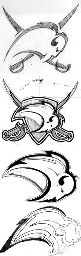 Early sketches of 2006 Sabres logo / Frank CravottaVery cool to see the evolution of a mark that was so despised — and to see it from its earliest stages when it both looked like a bison and incorporated the swords for which the club is named. But the question remains, why were they removed at all? Usually that signals an artist claiming work not his own.
Well, that's not exactly the case here, as explained by Kristopher Bazen, a member of the team involved in the rebranding efforts. He wrote about the process and the harsh condemnations the logo received.
I have several rounds of work where you can see how the "Buffaslug" took shape, so when I was given a heads up ... and saw the work online, I felt the need to speak up. I spoke to Mr. Cravotta and stated how the postings of some images could be misleading, due to the fact that the re-brand was a collaborative effort, and I thank him for removing those images in such a timely manner.
It's funny, I never really thought I'd be speaking on behalf of this project, especially since they've all but abandoned the mark, but since I'm on the subject, I guess I'll let it rip! The thing that frustrates me the most is a lot of people have no idea of the amount of work that goes into these projects, yet fire off at the mouth (or keyboard) like they are seasoned veterans at this stuff. ...
The truth of the matter is there was months of work that came from our team before this logo was decided upon. It's common for designers to work up a ton of sketches and options to please a client, but when the client has their own idea of how things should look.
Honestly, I'm thankful because I've grown thick skin by reading people's bashings and critiques. I don't believe I'm a bad designer, despite people calling for me (or should I say, "the designer") to be castrated, among other things. Does anyone remember www.fixthelogo.com, an online petition to have the Sabres logo scrapped immediately after the unveiling? I sure as hell do! That sucked because I was a young designer just trying to do my job and service a client, and happy for the opportunity to be able to accomplish a childhood dream.
In the end, I've learned to chalk it up as a learning experience and move on. I am happy to report that since that catastrophe, I've worked on other sports identities and luckily, response has been rather positive. I won't go into detail on that stuff, but I just figured I'd clear the air on that. ... It's all good!
Bazen has it right. As I've learned, you can never please everyone, so you just have to accept that people will shoot their mouths off even over things they know nothing about. But almost everyone is guilty of that at some point, myself included.
So with all the bad-mouthing this logo received during its short tenure, especially on websites like Icethetics, I felt it only fair to present the other side of the story. Consider it presented.
We seem to be a little concept-heavy these days, but I think most of us enjoy seeing the "what-might-have-beens." So continuing on that note, Cravotta had also posted a few of the early designs of the new third jersey the Sabres launched this year. It was also removed.
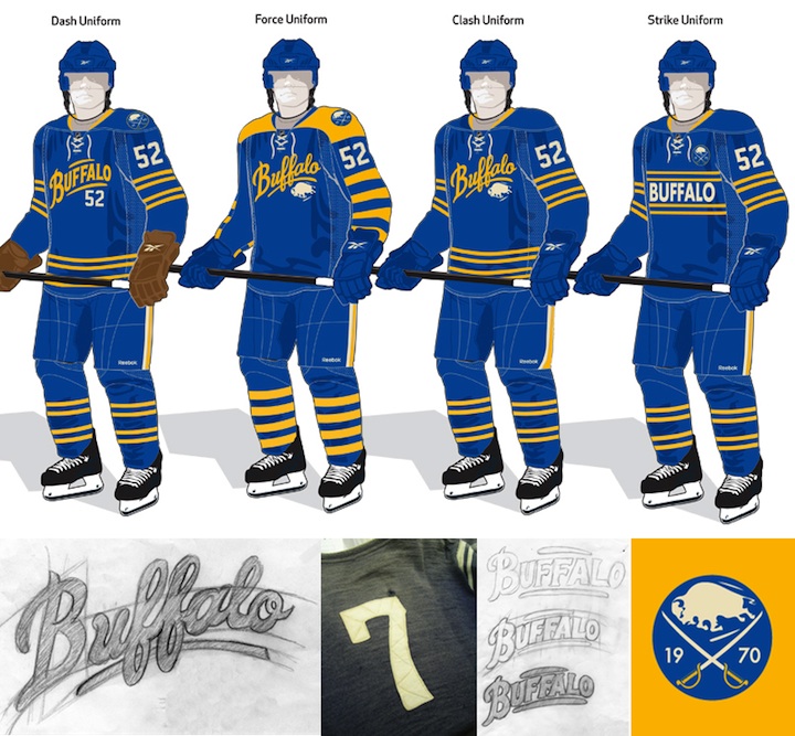 Early sketches of the 2010 Sabres third jersey / Frank Cravotta
Again, it's fun to see the options that were considered. Personally, I think my favorite of the four is the "Force Uniform" as it incorporates more gold. But they're all very cool. And I like that Cravotta included a picture of the number stitching that was the inspiration for the final design.
Lastly, since this seems to be a tale of two artists, I'll finish with the other one. Bazen's portfolio features a lot of sports branding and identity work, including other NHL teams. Here's a little preview.
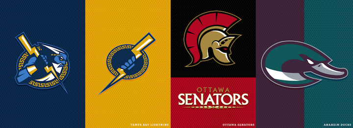 NHL identity concepts / Kristopher Bazen
If you want to see more, check out his website.