
Rangers, Hawks Reveal Stadium Jerseys
/
Photos from New York Rangers
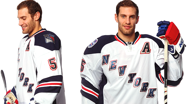
Rangers set to sport white at Yankee Stadium
The New York Rangers unveiled their NHL Stadium Series uniform today. And if you read last night's blog post, you weren't surprised by what you saw.
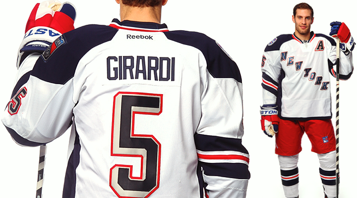
Our first taste came by way of a goofy video starring Dan Girardi. He enters the Rangers locker room to scope out the new jerseys hanging in the stalls. He's then horrified to find that in his stall is a Yankees jersey — not again! Yuck, yuck, yuck. No.
For a white jersey, it's pretty slick. White jerseys tend to be bland, if you ask me, so I was impressed by how this one turned out. (Not so much with Pittsburgh.) I really like the sleeve striping. It's a style not seen with any other team and it's uniquely New York.
 Photos from New York Rangers
On seeing the full uniform, one of the comments that was repeatedly expressed on Twitter was how much it reminded folks of the Hartford Wolf Pack — the Rangers' AHL affiliate. Well, yeah. The Wolf Pack's original uniforms were modeled after the Rangers' Lady Liberty jerseys in 1997.
In other words, they're not copying a minor league team so much as digging into their own recent history a little. Personally, I wish they would've gone a little farther.
This was the perfect opportunity to resurrect the Statue of Liberty logo that graced the team's third jersey for 10 great years between 1997 and 2007. The perfect opportunity! One game, not intended for throwbacks. Plus in terms of striping and colors — navy blue, specifically — this jersey was tailor-made for Lady Liberty.
Like I said, it's not a bad jersey, but I might've actually paid for one myself if it had that logo on it. (A Brad Richards one, of course!)
 Photos from Chicago Blackhawks
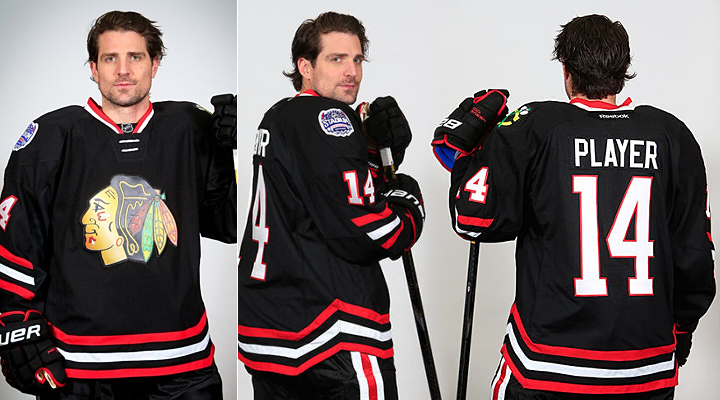
Chicago goes "back in black" for outdoor game
The Chicago Blackhawks caught us by surprise this morning when they suddenly announced plans to unveil their Stadium Series jersey later in the day. Two hours later came a teaser photo. Two hours after that, we got the whole jersey. (They just beat Sharking at its own game. Remember Hurricaning and Sabering?)
Like the Rangers, the Hawks gave us a cheesy video — this one set to the first 20 seconds of AC/DC's "Back in Black." The music plays under behind-the-scenes video of Patrick Sharp and Andrew Shaw sporting the new sweater for a photo shoot.
Once again, though, last night's post previewed this look. The Hawks are essentially bringing back their black third jersey from the late '90s. It was a good one. The biggest difference here is in the striping.
 Photos from Chicago Blackhawks
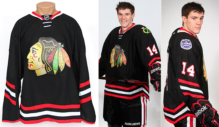
Some will no doubt bemoan the half-stripes on the sleeves. But for whatever reason, I think it works here. Those colors really are striking. The only thing I'm still not sold on is the whole angled thing. Will it really make a difference in terms of visibility, as all the marketing mumbo-jumbo claims?
But there is one thing I really dislike about this jersey. It's front and center.
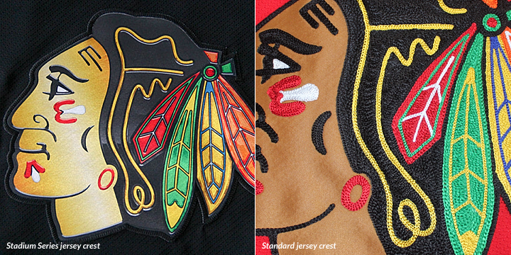
Compare this screen-printed mess with the traditional stitching of a Blackhawks crest. You're right, there is no comparison. If Reebok is trying to cheapen their product, they're on the right track. Good luck getting anyone to drop $300 on something that looks like it came out of an ink-jet. I hope this doesn't become a trend.
For now, I'll chalk it up to the rush job. As we heard from L.A. Kings management, these jerseys were all pumped out within a matter of months by the same design team. That's just asking for a poor product. Hopefully future events like this will be better planned.
Your turn to weigh in! What do you think of these new sweaters?