
20 Years After the Redesigned Penguin
/
Design firm reveals work that led up to new logo in 1992
It was the summer of 1992. The Pittsburgh Penguins had just completed two consecutive Stanley Cup victories. Enter a controversial new owner and a controversial new logo. Now, the company that Howard Baldwin hired to design that new mark is taking a look back at how it all came together.
First of all, believe it or not, it wasn't Baldwin's idea to rebrand the Penguins in the first place. He was just following through on a plan that had already been set in motion prior to his arrival. Vance Wright Adams was the Pittsburgh firm he called upon to come up with the team's modern new look.
And no matter what you think of that look, it's always refreshing to see the design process and some of the options that were rejected on the way to the final look. Vance Wright Adams is now sharing a few of them with all of us two decades later.
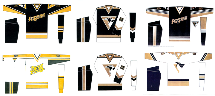
A nickname jersey proposed before it was "cool"
These are some of the hand-drawn options that were considered during the design process. Note that Vance Wright Adams came up with a "PENS" jersey long before those "BOLTS" and "SENS" jerseys ever became a reality. And what do you think of the more realistic looking penguin trapped inside the gold triangle?
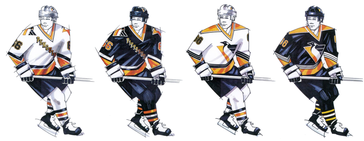
Vance Wright Adams proposed the Penguins use 4 jerseys
According to a video produced by the Penguins to introduce their new look, VWA actually proposed four jerseys that season — two homes and two roads. The NHL wasn't too keen on that, of course. But those four sweaters might've looked a little something like what you see above. Really like the black one on the right!
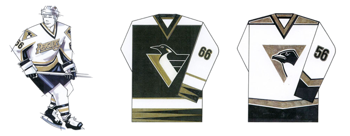
Vegas gold was a possibility long before it was a reality
And here's proof that Vegas gold was in the running long before the third jersey it was introduced with in 2000. That third jersey, by the way, resurrected the classic skating penguin eight seasons after it was retired. Only two years after that, the new streamlined penguin was relegated to the shoulder patch by owner Mario Lemieux. And when Reebok came along in 2007, it disappeared from the uniforms for good, ending a 15-year run.
See more concepts and sketches from Vance Wright Adams
You can find more high-resolution uniform concepts and sketches from Vance Wright Adams by visiting their website. I highly recommend it. I also have to send up a huge thanks to those guys for posting their old work. It's not often we get to see this stuff but always a treat when we do.
Vance Wright Adams is also responsible for creating the AHL's Wilkes-Barre/Scranton Penguins logo as well as logos for a number of other teams.
Now I'll leave you with the video the "Back-Checking the Penguins" video produced by the team to launch their new look back in 1992.