
What's New in the New Season
/The NHL opened its shortened 48-game 2013 season tonight with a few changes and new logos hitting the ice. So let's run down what's new in the new season.
Kings, Bruins start ugly Stanley Cup banner trend
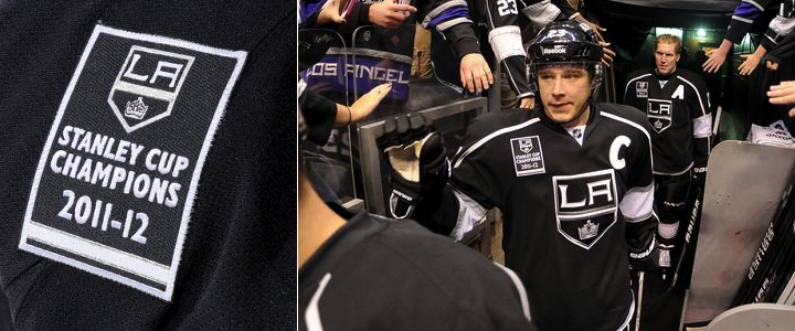
We begin with what I consider a pretty ugly trend over the last two seasons. This afternoon, the Los Angeles Kings raised their 2012 Stanley Cup championship banner. Then each player skated out wearing that same banner as a shoulder patch.

Now that's just tacky. I'm all for being proud of an accomplishment like this, but doesn't a sweater patch go a little bit too far? Is the 20-foot banner hanging in the rafters not enough?
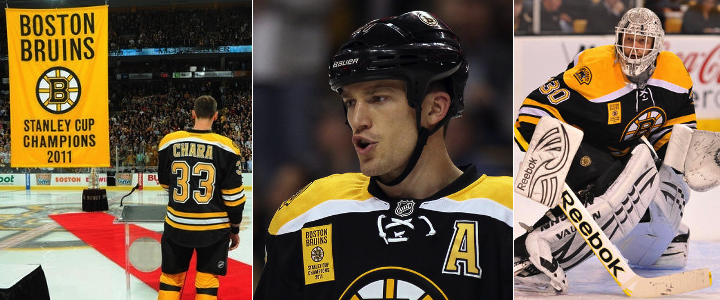
But the Kings aren't the only guilty party. Last year, the Boston Bruins started this awful trend by wearing their banner on their sweater as well. Just uncalled for.

Come on. We all know you won. Nobody missed the banner raising. The patch is unnecessary. Fittingly, both of these teams lost the games where they flaunted their titles. The Bruins fell to the Flyers 2-1 last year. And earlier today, the Kings were stung by the Blackhawks 5-2. Serves them right.
We'll note that the Chicago Blackhawks, after raising their 2010 Stanley Cup championship banner, did not wear any kind of gaudy patch to commemorate their commemoration ceremony. Nor the Red Wings or Penguins in 2008 and 2009. So kudos to them.
Before I wrap this up, I do want to point out that at least the Kings and Bruins weren't as bad as the AHL's Hershey Bears — who you may remember actually wore the logos of the teams they beat for championships back in 2011.
Lightning and Stars mark 20th anniversaries
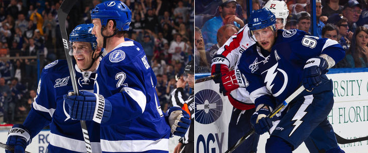
Next up are a couple of sweater patches we can't argue with. First, the Tampa Bay Lightning turned 20 in 2012 — but the lack of hockey between October and December means their celebration starts a little late. But better late than never. It's a cool logo!

The Lightning's 20th anniversary patch is a simplified version of the full logo unveiled over the summer. And for what it's worth, this isn't the first time we're seeing it — just the first time it's making an appearance on the ice. The logo debuted in June at the draft.
The Ottawa Senators, who joined the NHL with the Lightning in 1992, celebrated their 20th anniversary last season while assigned All-Star Game hosting duties.
The Dallas Stars moved from Minnesota in 1993 — a year after the league expanded to Ottawa and Tampa. But they're also marking 20 years during this lockout-shortened season.

This is the first we've seen this logo. It prominently features the American Airlines Arena Center — home of the Stars — as well as the skyline of the city of Dallas. It's a pretty sharp logo even if there is a lot going on.
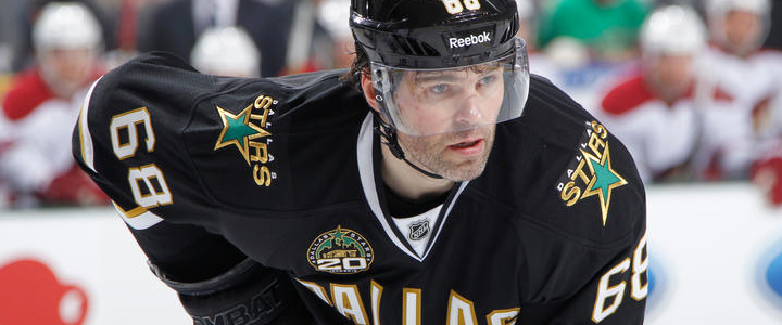
Here you can see it being worn by newcomer Jaromir Jagr.
Capitals reverse colors on socks
This last bit of "news" would get a big shrug from a lot of hockey fans. But not Icethetics readers. Hold everything because the Washington Capitals have changed their socks!
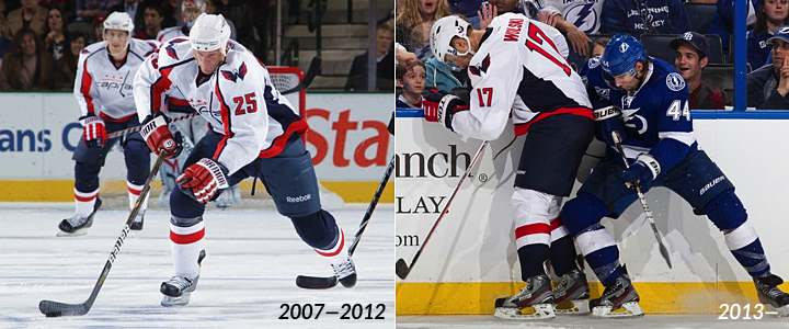
I think that visual aid tells you all you need to know. But just in case, they've reversed the colors. On the road uniforms, the blue is now used on the bottom half going into the skate instead of the top half coming out of the pants. The configuration is now more like what we see in the rest of the NHL.
Presumably the socks on the home uniforms will see the same change — red on top, blue on the bottom now. But we'll find out for sure when the Caps open their home schedule on Tuesday against the Jets. Unless they wear their third jersey, that is. But the next home game would be Thursday.
Did I miss any 2013 uniform changes? If so, shoot me an email or comment and I'll update this post as needed.