
Top 10 Worst NHL Logos of All Time
/Guess this is it. The final 24 hours of existence. The end of everything. You know, or not. But let's just say armageddon is coming. Might as well finish tallying up the best and worst logos in history of North American pro hockey.
We began with the Top 10 NHL logos. It only makes sense that we'd bookend the week with the worst. So here they are. In my estimation, these are the 10 worst logos the NHL has ever seen.
1. Columbus Blue Jackets

In 2000, when the Columbus Blue Jackets took the ice for the very first time, they were wearing this dreadful thing on their shoulders. You'd think I was making that up. But I'm not. In those days, electric green and powder blue were part of the club's color scheme. And this funny-looking bug was originally meant to be part of their primary logo. It's a relief they wised up. Their current primary logo would definitely be in my Top 15.
2. Buffalo Sabres
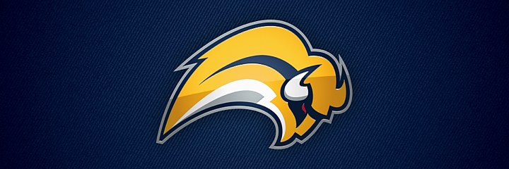
The No. 1 spot was a toss-up between the Blue Jackets bug and the Buffaslug. (But come on, the green bug, obviously!) The yellow buffalo got a lot of stick during its brief lifespan. All warranted. Someone earlier this week told me to separate the people and events surrounding these logos from my judgment of the actual design itself. As if this were an objective exercise. That's impossible. If these logos were standalone pieces of artwork, they would mean nothing and would therefore be impossible to rank. Part of what gives a logo its personality is what it represents. But even if I could separate things, I'd still consider this to be an awful design.
3. Boston Bruins
Need to add one more shoulder patch to the worst logos list. This logo and its successor (often nicknamed Winnie-the-Pooh) shows us why the Boston Bruins should stick to their classic spoked-B and stop trying to put actual bears in their logos. That said, they did get it right with the new shoulder patch in 2007. I will say, though, that this logo is good for one thing. You know those "guess how many" contests? We held one at my workplace recently. How many marshmallows are in this huge jar? Closest guess wins. You could do a similar contest counting the number of sharp points in this logo. But then someone would have to actually sit there and count them all.
4. Tampa Bay Lightning
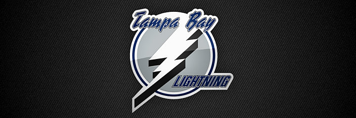
Here. Proof I checked my homerism at the door. I love Phil Esposito to death, but that man should've hired a logo designer instead of scrawling something on a napkin way back when. He is credited with designing the Tampa Bay Lightning's original logo which debuted in 1992. And that's too bad. It was sort of a relief to me when they updated it in 2007 with a better looking bolt. But why leave Tampa Bay at the top? They finally fixed it last year. It just missed my Top 10 and I am sad about that.
5. New York Islanders

We mock it every chance we get. The New York Islanders introduced this spray-tanned fisherman in 1995 for no apparent reason. They already had their perfect logo. And it only took the team two and a half years to realize and correct their mistake. And that was before social media! Guess fans protested well enough back then with their wallets.
6. Phoenix Coyotes
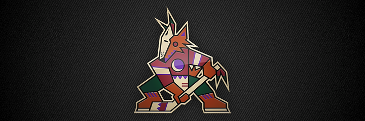
This one is a controversial pick. I get the feeling there are just as many of you that love this logo as hate it. But it does seem to be one of those marks that elicits a strong reaction. Nobody just says "meh" when they see it. You either love it for having a distinctive style. Or you hate it for being weird. Personally, I love it. But I will always consider the Picasso desert dog one of the worst logos in NHL history and something never to be repeated.
7. Ottawa Senators

The Ottawa Senators had a perfectly good logo when they debuted in 1992. Then they came up with their first third jersey in 1997. And it had this multi-colored mark on the front. And we all asked, "why?" Turning the guy's head to make the logo more three-dimensional takes the logo to a weird place. And it just looks bad. The Sens thought they fixed the problem in 2007 by adding bolder lines and sharper corners. But they didn't. Long live the 2D head.
8. Vancouver Canucks
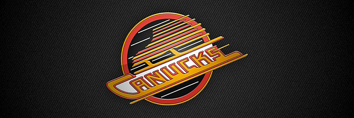
I anticipate my Vancouver friends will fillet me for this one. But I just can't stand it. Why all the lines? The Canucks had a pretty good thing going with the stick-in-the-rink mark. Boring, maybe. But it wasn't terrible. This and the color change in 1978 were just uncalled for. But they kept it around for 20 years until they brought in the orca.
9. Atlanta Thrashers

When this logo debuted in 1999, I was impressed. The colors were new and unique and I thought the bird looked pretty cool. But the perspective that only time can bring showed me the error of my ways. For one thing, the hockey stick was completely unnecessary. This logo would be instantly improved if they lost that. But then they were trying to get people to watch hockey in Atlanta. And not to pile on, but after someone once described this logo to me as a bird stirring itself into a pot of soup, I've never been able to look at it the same way. Still, I was sorry to see them move. And that brings us to...
10. Winnipeg Jets

This logo is so bad that when it was first leaked online, I refused to believe it was legitimate. It looks like an exploding airplane. Not a great visual. And while I appreciate the symbolism of the compass pointing "True North," I still only ever see a detonating jet. And that's not the icon that should represent a hockey franchise.
I'm anticipating a lot of disagreement so I'm curious to see what you guys have to say about this particular list. But get your complaints in quick. Don't forget the world is ending soon.
And if it doesn't, well let's do the world's largest hockey logo ranking project in 2013! It'll be a big endeavor but I think it would be hugely entertaining to learn about what makes a hockey logo popular or not. And at the same time, it'll be free market research for the next team that wants to do a rebrand. What do you guys say?