
St. John's IceCaps Unveil Name, Logo
/ The worst kept secret in the American Hockey League became official this morning. True North's Manitoba Moose have officially become the St. John's IceCaps. (Note that's one word, not two. And in upper and lowercase, reads like this: St. John's IceCaps.)
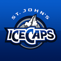
As you'd expect, the IceCaps' colors line up with their NHL parent club, the Winnipeg Jets. Two shades of blue and two shades of gray/silver. Only the IceCaps wisely left out the red maple leaf.
The primary logo makes heavy use of the wordmark, but that's not surprising considering the name. And it's not a bad name, it just doesn't lend itself well to imagery the way that, say, "Jets" does.
Perhaps the best thing about this mark is its easter egg. At a glance, it's merely snow cover atop a rugged mountain. But when you really look, there's a sort of stylized "N" and "L" carved out for Newfoundland and Labrador — which also happen to be shaped like the actual map boundaries. That's a very cool feature. (Pun.)
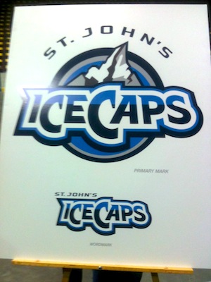 St. John's IceCaps logos / @markdenineIf you're like me, you're satisfied — even pleasantly surprised — by this logo but just hoping they drop the "St. John's" bit at the top when it comes time to slap it on a sweater. Regulars may be a bit surprised to find that I like a logo that's basically a wordmark, but there are always gray areas.
I don't care for the Anaheim Ducks' wordmark because, well, a duck is an easy thing to put into a textless image. IceCaps can be more challenging. You don't want to lose your brand identity trying to create a logo that's too clever for its own good. Especially in the minors.
And you can argue all you want with the name choice, but I can't say I mind it. Yes, it breaks some critical rules by including the word "ice" and running it all together with a capital letter in the middle, but it's just one of those throwback things.
From the press release:
“Caps” not only perfectly complements the name in the literal translation of an icecap, it is also pays tribute to the St. John’s Caps, a Newfoundland Amateur Hockey Association team which played in the former provincial senior hockey league.
Along with this logo, the IceCaps unveiled a new wordmark, which includes the same elements as the primary — just repositioned. You can see it on the poster used at this morning's unveiling event (above) thanks to Mark Denine, who tweeted this photo for us.
There were no secondary marks revealed today, but I'm sure at least one shoulder of the uniforms will get the new Winnipeg Jets logo. Speaking of jerseys, they were not unveiled today either and will probably come out closer to the start of the season. I'd bet they use the same design as the Jets' jerseys, and we're not expecting to see those until early September. Maybe we see both at the same time.
I'll grant you this logo is no replacement for the Manitoba Moose, but it's certainly not as weak in terms of design as the Jets' new primary. Now it's your turn. Hit or miss by True North?