
More New Sweaters & Logos
/The summer is officially here and this is the time of year when Icethetics-related news really kicks into high gear. Yesterday we got our first look at the logos for the Winter and Heritage Classics. But there's still so much more going on this week.
New Islanders jersey seen in video

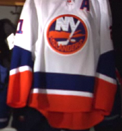 Islanders new road jerseyIt's not like it was a big secret anyway, but the New York Islanders have tipped their hand by posting a video online which clearly displays their new white road jersey.
In interviews with alumni and current team employees, the new sweater is part of a string of historic Isles threads in the backdrop. It's exactly what's been rumored. But I won't call it official until Friday when it's unveiled at the draft party.
The video, which in and of itself is worth a mention on this blog, delves into the history of Islanders jerseys and logos — including that all too hard to forget Fishsticks Phase from the '90s. I'd embed it, but some people have had problems loading Icethetics when I do that. Instead, a link.
New details on Kings throwback

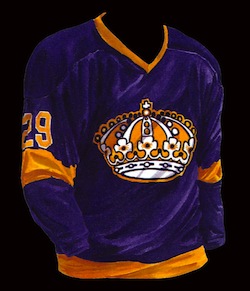 Kings set to wear throwbacksThe Los Angeles Kings and Vancouver Canucks will open the 2010-11 season just as they did exactly 40 years before. And they'll do so in a purple throwback jersey from the 1970s!
LA Kings Insider blogger Rich Hammond has once again said that the Kings will contribute to the Canucks' 40th anniversary celebration by donning vintage threads from their early years. He believes it will look like one worn between 1972 and 1980 (right). He also says it could be worn another three or four times throughout the season, but doesn't specify whether it would be worn against only the Canucks or other opponents too.
Retail sources have also claimed that the Canucks will have a white throwback jersey next season. If so, expect to see it debut on Oct. 9 for the season opener against L.A.
Sharks unveil multiple 20th year logos
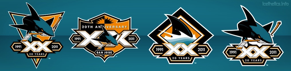
 The San Jose Sharks, never one to short us on logo options, will have five different 20th anniversary logos for use next season. The new marks were posted on the team's Facebook page yesterday.
The sleeve patch version was first posted on Icethetics a few weeks ago. A description of how it will be used on the uniforms was included in the press release:
All season long, the team will wear a 20th Anniversary San Jose Sharks patch on their sweater that will be placed on the left sleeve underneath the player’s number and above the stripe. The patch, which is 5¼” x 1¾”, combines the modern Shark with a powerful “double-XX” design, using the Roman numeral for the number “20” celebrating the team’s anniversary. This patch will also be placed on each player’s helmet.
I'm assuming they mean a sticker will be placed on the helmet, and that they're not actually going to sew a patch onto it. And as for the sleeve, it's unusual placement. Typically, you'd find an anniversary patch on the chest, but the players' numbers are in the way. Not sure why they don't just swap it out with one of the shark logos on the shoulders. Hopefully this doesn't clutter up the jersey too terribly.
In any event, if you were wondering what the other four logos will be used for, the Sharks' Facebook album describes them as (left to right, image above) primary crest, anniversary shield, classic fin and leaping shark. They're all well-designed and fit within the brand.
Blue Jackets unveil 10th anniversary logo

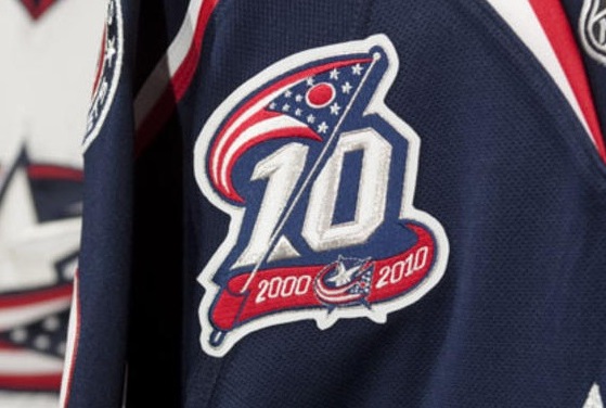 Blue Jackets' 10th anniversary patchThe Columbus Blue Jackets officially unveiled their 10th anniversary logo yesterday. It was first featured here on the blog a few weeks back.
Now the logo can be seen in patch form (right). And the team even has a whole press release about it on their website. Here's how it's described:
The logo features a representation of the state flag of Ohio flying on a silver flag pole above the stylized number "10" with a red and blue ribbon at the bottom featuring the team's official logo between the years 2000 and 2010.
The mark utilizes the team's primary colors of Union Blue, representing the color worn by the Union Army during the U.S. Civil War; Goal Red, in reference to the most exciting moment in hockey; and Capital Silver, signifying Columbus as the state capital of Ohio.
The release also points out the patch won't be worn on the sweaters until after the NHL Premiere games against San Jose in Stockholm. They'll have a special patch for that too, of course.
The Jackets' social media crew wasn't shy about sharing some pictures and video either. Enjoy these links to an image gallery and a neat video that reveals the logo.
AHL celebrates 75 seasons
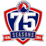 Obviously there's a lot going on in the NHL these days, but I didn't want to leave out the AHL. It's the league's 75th season and it also marks the first time that every team has had its own NHL affililate.
The AHL revealed its plans to celebrate the milestone along with a special logo (left) which will be used throughout the season. It was designed by Derek Abraham of Maple Leafs Sports & Entertainment.
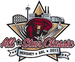 2011 AHL All-Star Classic logoCelebration plans include all teams wearing a special jersey patch along with a handful of teams opening the 2010-11 season in throwback uniforms. The 2011 AHL All-Star Classic will be hosted by the Hershey Bears and will feature players in vintage uniforms as well.
I'm including the logo in this post because I somehow overlooked its unveiling back on April 3. The AHL All-Star Classic will take place January 30-31, 2011. The game itself returns to an East-West format.
With the recent addition of the Oklahoma City Barons, there are now 30 AHL teams all with individual affiliations. I know it has nothing to do with the blog, but this might make for an interesting logo tournament: NHL logos vs AHL logos.